MONITOR CALIBRATION FOR PHOTOGRAPHY
Knowing how to calibrate your monitor is critical for any photographer who wants accurate and predictable photographic prints. If your monitor is not correctly reproducing shades and colors, then all the time spent on image editing and post-processing could actually be counter-productive. This tutorial covers basic calibration for the casual photographer, in addition to using calibration and profiling devices for high-precision results. Furthermore, it assumes that tossing your old monitor and buying a new one is not an option.
 Digital Image File
 Color Profile
 Calibrated
Monitor
ADJUSTING BRIGHTNESS & CONTRAST
The easiest (but least accurate) way to calibrate your display is to simply adjust its brightness and contrast settings. This method doesn't require a color profile for your monitor, so it's ideal for casual use, or for when you're not at your own computer and need to make some quick adjustments.
The images below are designed to help you pick optimal brightness/contrast settings. A well-calibrated monitor should be able to pass both tests, but if it cannot, then you will have to choose which of the two is most important. In either case, make sure that your display has first been given at least 10-15 minutes to warm up.
(1) Mid-Tones. Having well-calibrated mid-tones is often the highest-priority goal. Such a monitor should depict the central square as being the same shade as the solid outer portion — when viewed out of focus or at a distance. The leftmost and rightmost squares should also appear darker and lighter than the solid gray, respectively.

© 2004-2015 Sean McHugh
Note: the above calibration assumes that your monitor is set to gamma 2.2.
If the central square is lighter or darker than the outer gray region, your display is likely depicting images lighter or darker than intended. This will also have a noticeable impact on your prints, so it's something that should be addressed.
If you are using an LCD monitor, first set your display to its default contrast (this will likely be either 100% or 50%), then adjust the brightness until the central square blends in. If you are using a CRT monitor (the larger "old-fashioned" type), then instead set it to maximum contrast. For both CRT & LCD displays, make sure that these are set to gamma 2.2 if available (most current displays come with this as the native setting).
Note: increasing the brightness of your display too much can shorten its usable life span. You will likely not need to have your display at its maximum brightness if the room isn't too bright, if the display isn't back-lit (such as in front of a window) and if the display isn't too old.
(2) Highlight & Shadow Detail. If you've followed the previous calibration, now your mid-tones will be reproduced roughly at the shade intended. However, it may also mean that the shadows and highlights will appear too bright or dark, or vice versa. You should be able to distinguish the 8 shades in each of the two images below:
 Shadow Detail
 Highlight Detail
The two adjacent shaded bands at each outer edge of this page should be just barely distinguishable. Otherwise you've likely reached the limit of what brightness/contrast adjustments alone can achieve. Alternatively, if maximal shadow and highlight detail are more important than mid-tone lightness, you can ignore the mid-tone image. In that case, first use brightness to control shadow detail and then use contrast to control highlight detail (in that order). When brightness is too high, solid black will appear gray, but when it's too low shadow clipping will make several of the darker 8 shades appear the same.
However, the above examples are just crude adjustments that only address small portions of the tonal range, and do not fix colors at all. There are somewhat more accurate methods out there for visual calibration, but ultimately, achieving truly accurate results requires systematic and objective measurements using a calibration device...
OVERVIEW: CALIBRATION & PROFILING
The colors and shades that a monitor reproduces vary with the monitor's type, brand, settings and even age. Unfortunately, unlike in the digital world, all numbers aren't created equal when it comes to monitors. A digital green value may therefore appear darker, lighter or with a different saturation than this color was intended to be seen:
| Digital Value of Green |
Monitor "X" |
Standardized Color |
|
|---|---|---|---|
| 200 | → | ||
| 150 | → | ||
| 100 | → | ||
| 50 | → | ||
| ← Color Mismatch → | |||
note: for the purposes of this example, "standardized color" is just one example of a desirable state that is well-defined in terms of universal parameters, such as gamma, white point and luminance.
Ideally, you would get your monitor to simply translate the digital values in a file into a standardized set of colors. However, this isn't always possible, so the process of monitor calibration actually requires two steps: (1) calibration and (2) profiling.
(1) Calibration is the process of getting your monitor into a desirable and well-defined state. This usually involves changing various physical parameters on your monitor, such as brightness from before, in addition to creating what is called a Look-Up Table (LUT).
The LUT takes an input value, such as green=50 in the above example, and then says "on 'Monitor X,' I know that it reproduces green=50 darker than the standard, but if I convert the 50 into a 78 before sending it to the monitor, then the color will come out how a green=50 was intended to be seen." An LUT therefore translates digital values in a file into new values which effectively compensate for that particular monitor's characteristics:
| Digital Value of Green |
LUT | Compensated Digital Values |
Monitor "X" |
Standardized Color |
|
|---|---|---|---|---|---|
| 200 | → | 200 | → | ||
| 150 | → | 122 | → | ||
| 100 | → | 113 | → | ||
| 50 | → | 78 | → | ||
| ← Colors Match → | |||||
(2) Profiling is the process of characterizing your monitor's calibrated state using a color profile. These characteristics include the range of colors your monitor is capable of displaying (the "color space"), in addition to the spacing of intermediate shades within this range ("gamma"). Other properties may also be included.
Profiling is important because different devices cannot necessarily reproduce the same range of colors and shades (a "gamut mismatch"). A perfect translation from one device's color into another's therefore isn't always possible. Color profiles enable color-managed software to make intelligent compromises when making these imperfect conversions:
| Original Image |
Standard "A" |
Color-Managed Software → |
Standard "B" |
Converted Image |
|---|---|---|---|---|
 |
 |
|||
| ← Gamut Mismatch → | ||||
| Wide Color Gamut | Narrow Color Gamut | |||
In the above example, Standard "A" has a greater range of greens than Standard "B," so the colors in the original image get squeezed from a wide range of intensities to a narrow range.
For details on how color spaces are converted, also see tutorial on "color space conversion."
MONITOR CALIBRATION DEVICES
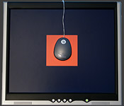
calibration device in-use
A monitor calibration device is what performs the task of both calibration and profiling. It is usually something that looks like a computer mouse, but it instead fastens to the front of your monitor. Special software then controls the monitor so that it displays a broad range of colors and shades underneath the calibration device, which are each sequentially measured and recorded.
Common calibration devices include the X-Rite Eye-One Display, ColorVision Spyder, ColorEyes Display and ColorMunki Photo, amongst others.
Before initiating a calibration, first make sure to give your monitor at least 10-15 minutes to warm up. This ensures that its brightness and color balance have reached a steady and reproducible state.
Just before the calibration starts, your calibration software will ask you to specify several parameters that it will calibrate to (the "target settings"). These may include the white point, gamma and luminance (we'll get to these in the next section). During the calibration process you may also be instructed to change various display settings, including brightness and contrast (and RGB values if you have a CRT).
The result will be a matrix of color values and their corresponding measurements. Sophisticated software algorithms then attempt to create an LUT which both (i) reproduces neutral, accurate and properly-spaced shades of gray and (ii) reproduces accurate color hue and saturation across the gamut. If neither are perfectly achievable (they never are), then the software tries to prioritize so that inaccuracies only correspond to tonal and color differences that our eyes are not good at perceiving.
CALIBRATION SETTINGS
Here's a brief description and recommendation for each of the target calibration settings:
White Point. This setting controls the relative warmth or coolness the display's lightest tone, as specified by the "color temperature." Higher color temperatures appear cooler, whereas lower temperatures appear warmer (yes, this is at first counter-intuitive).
| |
||
| Warmer Color Temperature |
Your Monitor's Native Color Temperature |
Cooler Color Temperature |
Even though the above shades appear slightly warmer and cooler, that's primarily because they're being compared side by side. If they were on their own, and were the brightest shade your display could show, then your eye would adjust and you would likely call each of them "white."
See the tutorial on white balance for additional background reading on this topic.
With CRT monitors, the standard recommendation is to set your display to around 6500K (aka D65), which is a little cooler than daylight. However, with LCD monitors it's become a bit more complicated. While many LCD's have a color temperature option, the back light for these displays always has a native color temperature. Any deviation from this native value will end up reducing your display's color gamut. For this reason, it's generally recommended to leave your LCD at its default color temperature unless you have a good reason to set it otherwise. Your eye will adjust to this native color temperature, and no warm or cool hue will be apparent unless it is being directly compared.
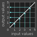
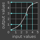
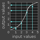
Display Gamma. This setting controls the rate at which shades appear to increase from black to white (for each successive digital value). This makes a given image appear brighter and darker for lower and higher gamma values, respectively, but does not change the black and white points. It strongly influences an image's apparent contrast:


Note: The above images assume that your display is currently set to gamma 2.2.
Older mac computers at one time used gamma values of 1.8, but they now also use gamma 2.2.
A display gamma of 2.2 has become a standard for image editing and viewing, so it's generally recommended to use this setting. It also correlates best with how we perceive brightness variations, and is usually close to your display's native setting.
Luminance. This setting controls the amount of light emitted from your display.
Unlike with the white point and gamma settings, the optimal luminance setting is heavily influenced by the brightness of your working environment. Most people set the luminance to anywhere from 100-150 Cd/m2, with brighter working environments potentially requiring values that exceed this range. The maximum attainable luminance will depend on your monitor type and age, so this may ultimately limit how bright your working environment can be.
However, higher luminance will shorten the usable life span of your monitor, so it's always better to instead move your monitor to somewhere darker if you can. Use the lowest setting in the 100-150 range where you can still see all 8 shades in the above image.
CALIBRATION: LOOK-UP TABLES
The Look-Up Table (LUT) is either controlled by your video card or by your monitor itself, so it will be used regardless of whether your software program is color managed — unlike with the color profile. The LUT is usually loaded immediately after booting up into your operating system, and is used identically regardless of what your monitor is displaying.
Whenever the red, green and blue values are equal, an accurate monitor should display this as a neutral gray. However, you'd be surprised how often this isn't the case (see below). The job of the LUT* is to maintain neutral gray tones with the correct gamma.
| R,G,B Input Values |
Monitor "X" |
Neutral Gray |
|
|---|---|---|---|
| 200,200,200 | → | ||
| 159,159,159 | → | ||
| 100,100,100 | → | ||
| 50,50,50 | → | ||
| ← Mismatch → | |||
*Note: this example is for a simpler 1D 8-bit LUT, as is most commonly used with CRT monitors.
A sample LUT that corrects Monitor "X" is shown below. It effectively applies a separate tonal curve to each of your monitor's three color channels:

")
Note: The table shown above is an 8-bit 1D LUT; there's also more complicated 3D LUT's which do not treat each color independently. However, the basic concept remains the same.
Without the above LUT, your video card sends an input color value of 159 (from a digital file) directly to your monitor as an output value of 159 (no matter what the color is). With the LUT, the video card looks up each red, green and blue value using the tonal curves. An input value of R,G,B=159,159,159 gets sent to your monitor as an output value of 145,155,162 (which is now perceived as neutral gray). Also, note how greater color corrections correspond to color curves which diverge more from a straight diagonal.
There's often several LUT's along the imaging chain — not just with the video card. The other LUT that is most relevant to monitor calibration is your monitor's internal LUT (as discussed later). If your monitor supports modifying its own LUT (few do), this will usually achieve more accurate calibrations than using your video card's LUT. However, unless the calibration software is designed for your particular monitor, it will likely end up using your video card's LUT instead.
PROFILING: COLOR PROFILE
The color profile specifies the target settings from your calibration, such as gamma, white point and luminance, in addition to measurements from the calibration, such as the maximum red, green and blue intensities that your display can emit. These properties collectively define the color space of your monitor. A copy of the LUT is also included, but this is not used directly since it's already been implemented by your monitor or video card.
A color profile is used to convert images so that they can be displayed using the unique characteristics of your monitor. Unlike with the LUT, you will need to view images using color-managed software in order to use a color profile. This won't be a problem if you're running the latest PC or Mac operating systems though, since they're both color-managed. Otherwise Photoshop or any other mainstream image editing or RAW development software will work just fine.
Whenever a digital image is opened that contains an embedded color profile, your software can compare this profile to the profile that was created for your monitor. If the monitor has the same range of colors specified in the digital image, then values from the file will be directly converted by the LUT into the correct values on your monitor. However, if the color spaces differ (as is usually the case), then your software will perform a more sophisticated conversion. This process is called color space conversion.
TESTING YOUR MONITOR CALIBRATION
Do not assume that just because you've performed a color calibration that this monitor will now reproduce accurate color without complication. It's important to also verify the quality of this calibration. If you end up noticing that your color calibration device was unable to repair some inaccuracies, at least you can be aware of these in the back of your mind if you perform any image editing that influences color.
The quickest and easiest way to diagnose the quality of a color calibration is to view a large grayscale gradient in an image viewing program that supports color management. Sub optimal monitor calibration may render this gradation with subtle vertical bands of color, or occasional discrete jumps in tone. Move your mouse over the image below to see what a poor quality monitor calibration might look like:
Example of a smooth grayscale gradation for diagnosing the quality of a monitor calibration.
Such a gradation is easiest to diagnose when viewed at your display's maximum size, and when alternating between having the monitor's color profile turned on and off. In Photoshop, this is achieved by using "Proof Colors" set to "Monitor RGB"; CTRL+Y toggles the monitor profile on and off. When "Monitor RGB" is turned on, this means that the monitor's color profile is not being used.
If color banding is visible, then this might mean that your monitor needs re-calibration. It's generally recommended to perform this once every month or so, depending on how important color accuracy is to your work.
Alternatively, your monitor's native color reproduction might be so far from optimal that the color profile represents an extreme correction. This could be due to the monitor calibration settings you're using, but could also be caused by the age of the monitor. In the latter case, a color profile is likely still a vast improvement over no color profile — but it comes with compromises.
LIMITATIONS OF MONITOR CALIBRATION
Unfortunately, there are limits to how accurately you can calibrate your display. With a digital display, the more you have to change your monitor from its native state, the more you will decrease the number of colors/shades that it can display. Fortunately, the bit depth of your monitor's internal LUT can influence how well it is calibrated, since a monitor with a higher bit depth LUT is able to draw upon a larger palette of colors:
 No Adjustment
(4 output shades)
 Low Bit Depth LUT
(2 output shades)
 High Bit Depth LUT
(4 output shades)
Note: A higher bit depth internal LUT does not mean that a monitor can actually display more colors at the same time, since the number of input values remains the same. This is why a higher bit depth LUT in your video card will not on its own achieve more accurate calibrations.
In the low bit depth example, the brightest (4) and darkest (1) shades are forced to merge with white (5) and black (0), respectively, since the LUT has to round to the nearest output value available. On the other hand, the high bit depth LUT can use additional intermediate values. This greatly reduces the likelihood of color banding and image posterization — even when the display is old and deviates substantially from its original colors.
If you have a new accurate display with an 8-bit LUT, then you'll likely get good calibrations; the LUT bit depth is just something to be aware of as your monitor ages. The vast majority of displays have an 8-bit LUT, although some have 6-bit or 10+ bit LUT's. Avoid LCD monitors that are marketed to the gaming community, because these sometimes sacrifice the bit depth of their LUT (or other aspects) in exchange for higher refresh rates — which are of no importance to viewing still images.
FURTHER READING
Despite all of this work with profiling and calibration, it still doesn't guarantee that prints will look as intended or expected. For more on this topic, also take a look at the tutorial on Soft Proofing: Matching On-Screen Photos with Prints.