
 Helpful Posts:
 Dear All,
Kindly give your feedback on my below images on suitability for the theme - Nature & Development, where the photograph could illustrate that nature and development can co-exist.
Regards,
Tejal
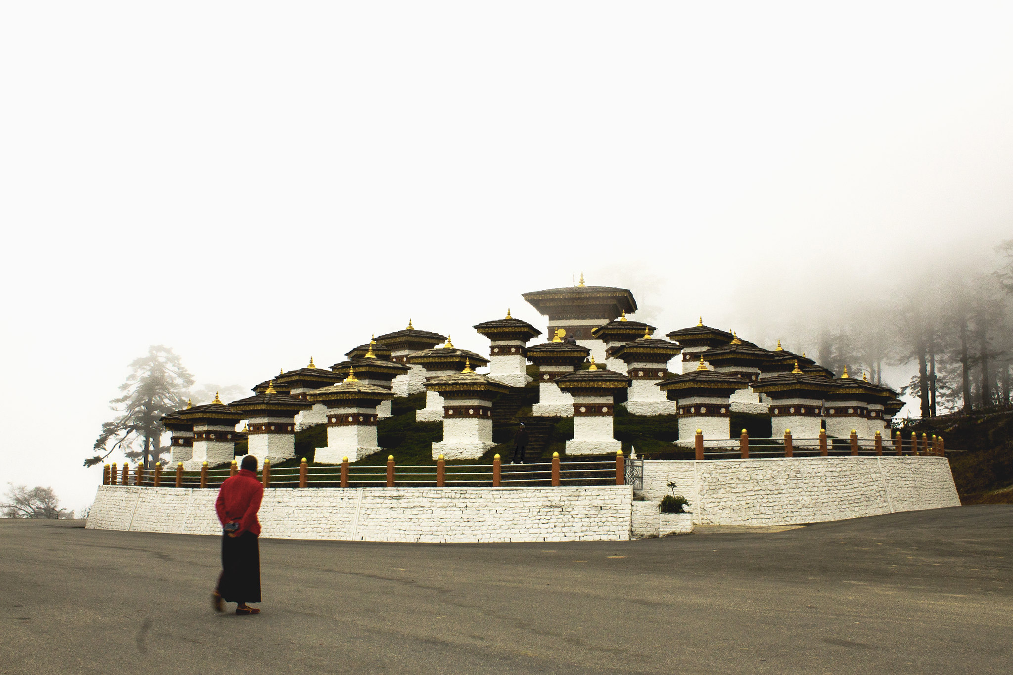
Color (4) by Tejal Imagination, on Flickr
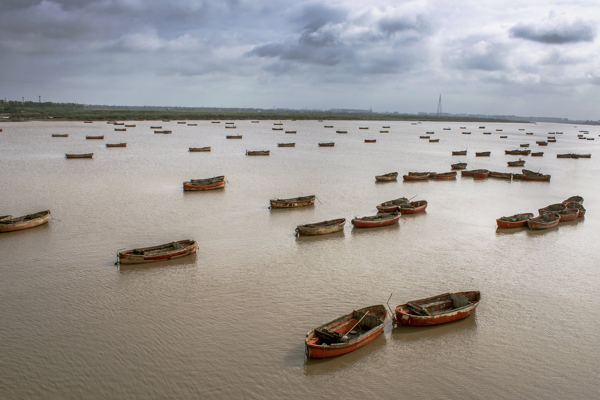
Color (5) by Tejal Imagination, on Flickr
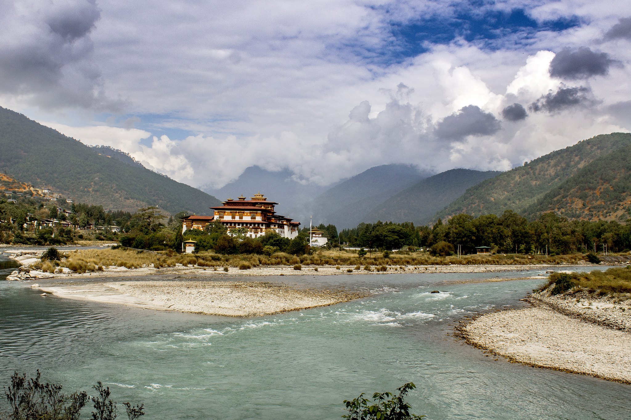
Color (3) by Tejal Imagination, on Flickr
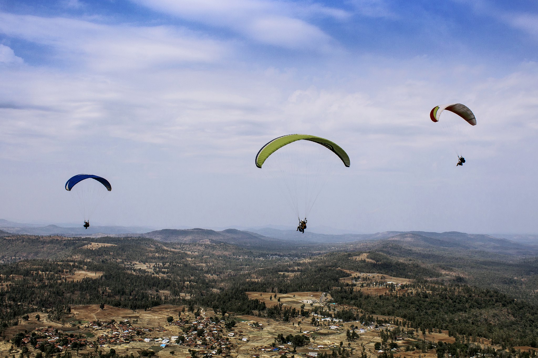
Color (2) by Tejal Imagination, on Flickr
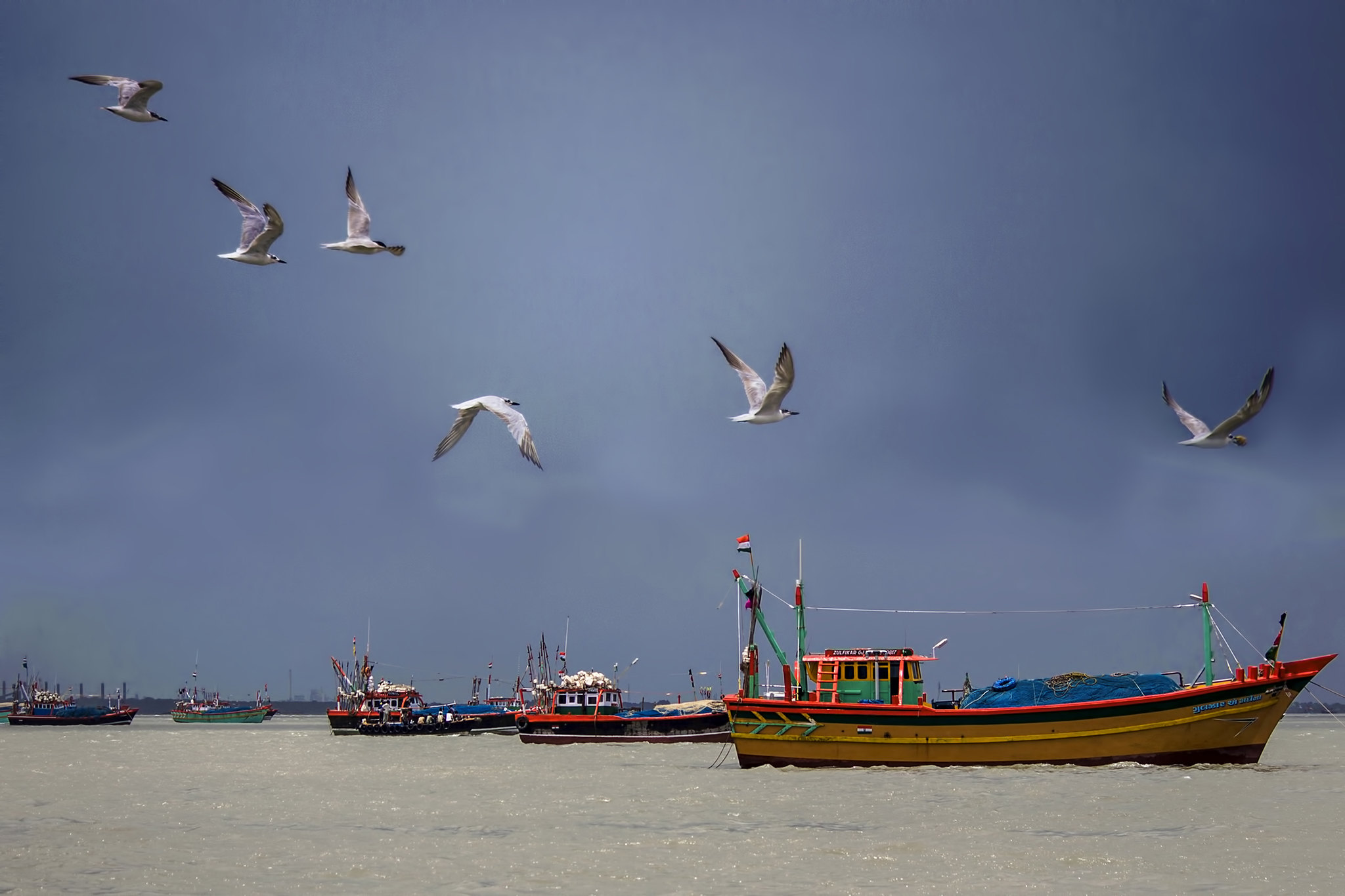
Color (1) by Tejal Imagination, on Flickr
Results 1 to 20 of 21
-
28th July 2016, 02:58 PM #1


- Join Date
- Mar 2015
- Location
- India
- Posts
- 2,069
- Real Name
- Tejal
Nature & Development (colour) - C&C are welcome
-
28th July 2016, 03:25 PM #2
- Join Date
- May 2011
- Location
- SE Michigan
- Posts
- 4,511
- Real Name
- wm c boyer
re: Nature & Development (colour) - C&C are welcome
Like them all...especially your PP
-
28th July 2016, 03:27 PM #3

- Join Date
- Dec 2009
- Location
- WNY
- Posts
- 36,717
- Real Name
- John
re: Nature & Development (colour) - C&C are welcome
Color (4) could use a little less sky.
Color (5) nicely composed, the foreground boats are nicely anchored with the visible cast shadows, the midground boats are a bit lost in space, might consider cloning out a few.
Color (3), (2), and (1) nicely done.
-
28th July 2016, 03:55 PM #4
- Join Date
- Mar 2015
- Location
- India
- Posts
- 2,069
- Real Name
- Tejal
re: Nature & Development (colour) - C&C are welcome
Thank you for your feedback. Originally Posted by chauncey


-
28th July 2016, 03:56 PM #5
- Join Date
- Mar 2015
- Location
- India
- Posts
- 2,069
- Real Name
- Tejal
re: Nature & Development (colour) - C&C are welcome
Thank you for your feedback and noted your suggestions. Will work on it. Originally Posted by Shadowman
-
28th July 2016, 07:14 PM #6
- Join Date
- Dec 2013
- Location
- Turkey
- Posts
- 12,779
- Real Name
- Binnur
re: Nature & Development (colour) - C&C are welcome
Nice set and good PP work Tejal
-
28th July 2016, 08:02 PM #7
- Join Date
- Jan 2009
- Location
- South Devon, UK
- Posts
- 14,423
re: Nature & Development (colour) - C&C are welcome
Pity about the blurred foot in #1.
Maybe #4 could lose a bit of sky and go to a more panoramic size to concentrate on the fliers. But the current image doesn't really bother me and you certainly don't want to lose anything from the sides.
All the others look good.
-
29th July 2016, 04:58 AM #8
- Join Date
- Mar 2015
- Location
- India
- Posts
- 2,069
- Real Name
- Tejal
re: Nature & Development (colour) - C&C are welcome
Thanks Binnur Originally Posted by bnnrcn
-
29th July 2016, 04:59 AM #9
- Join Date
- Mar 2015
- Location
- India
- Posts
- 2,069
- Real Name
- Tejal
re: Nature & Development (colour) - C&C are welcome
thank you very much for your feedback Originally Posted by Geoff F
.
-
30th July 2016, 10:07 AM #10Moderator

- Join Date
- May 2008
- Location
- Windsor, Berks, UK
- Posts
- 16,739
- Real Name
- Dave Humphries :)
Re: Nature & Development (colour) - C&C are welcome
Hi Tejal,
I am writing this having also viewed, but not yet commented, in the later thread: Nature & Development (B&W) - C&C are welcome
I have slightly amended the title of this thread to match the other, I hope you don't mind, but I think it will help people becoming confused between the two (or perhaps it's just me).
Talking of confusion, I find the numbering of the shots in these threads, probably based on your order of processing, very confusing; here we have (4), (5), (3), (2), (1) in order of 1st through to 5th in your post - and the other thread is a simpler (!) reverse order; (5) = 1st, etc.
I'm not sure how this arises in your workflow and I appreciate that Flickr's link generation method doesn't help, but it would be really nice (in future) if you could manage to do what many do here: just have a simple numbering where the first image is number "#1", the second is "#2", etc. when requesting C&C.
I ask because if I say "#4" in my comment, I suspect half the readers will think I am commenting on the fourth image while the rest might have read the link and realise it is the first I am referring to. As if to prove my point; while John has commented in order, using your bracketed numbers, Geoff refers to a "blurred foot in #1", but clearly means the first image; numbered "(4)". In other instances, the subjects in the two 'confused' photos might not be so easy to differentiate, causing more head scratching (unwise at my age!).
I appreciate this will mean a change of your workflow, or more 'work' when posting here, but I think it will help everyone, yourself included.
Please don't be discouraged by my raising this, it is because I find your photography so engaging that I want to comment, so please do keep posting.
I'll do separate posts with my thoughts on these images (in both threads) later today.
Many thanks, Dave
-
30th July 2016, 11:36 AM #11
- Join Date
- Mar 2015
- Location
- India
- Posts
- 2,069
- Real Name
- Tejal
Re: Nature & Development (colour) - C&C are welcome
Thanks Dave for bringing this thing in my notice. I will take care of it for sure Originally Posted by Dave Humphries
. And will be waiting to hear from you on my pics.
-
30th July 2016, 11:40 AM #12

- Join Date
- Jul 2012
- Location
- Cheshire, England
- Posts
- 3,668
- Real Name
- Dave
Re: Nature & Development (colour) - C&C are welcome
All are good Tejal, but I find the colours and composition in the last one (boats and gulls) exceptional.
Dave
-
30th July 2016, 12:29 PM #13
- Join Date
- Mar 2015
- Location
- India
- Posts
- 2,069
- Real Name
- Tejal
Re: Nature & Development (colour) - C&C are welcome
Thanks Dave for your feedback Originally Posted by davidedric
.
-
30th July 2016, 01:18 PM #14

- Join Date
- Jan 2012
- Location
- Tulsa, OK
- Posts
- 2,359
- Real Name
- mark
Re: Nature & Development (colour) - C&C are welcome
All very good Tejal, I can't pick a favorite.
PP is really good on all.
-
30th July 2016, 01:36 PM #15Moderator
- Join Date
- May 2008
- Location
- Windsor, Berks, UK
- Posts
- 16,739
- Real Name
- Dave Humphries :)
Re: Nature & Development (colour) - C&C are welcome
Hi again Tejal,
I didn't reply yesterday to this thread in part because I didn't see the images matching the theme so well, let me expand ...
In the first (4), I see a lot of development and hardly any nature, so as to the theme, this doesn't really work for me. On a technical level, the image has some lateral CA, especially noticeable on the left hand side.
The second (5), fits the theme better, esp. if I consider the distant pylons and towers to be the 'development' and river to be the 'nature'. This image also has some lateral CA. If it were mine, I'd clone out all the boats crossing the frame edges. There's probably also some lens barrel distortion going on (e.g. not corrected in LR/ACR).
The third (3), fits the theme well, but would also look far better if the CA had been fixed.
In the fourth (2), I agree with the suggestion to remove a bit of sky by cropping the top edge, although in a series, it does usually help to maintain a constant aspect ratio. It arguably shows how development is detrimental to the landscape, but is fascinating to study none-the-less. It is probably my favourite of this series.
Tell me, did you take this from land, or were you also in the air? There is some CA (which is so easily fixed), but it is not so much an issue in this shot.
The fifth (1), my overwhelming thought was the tightness of the crop on the right hand side to that boat's bow, if possible, crop a little looser there, or extend the canvas and fill it by clone-extending what's at the edge of frame.
If mine, I'd consider cloning out one of the gulls, to make their number five (an odd number), I'd lose the one that's third from left (with only one wing clearly visible).
I hope those thoughts are helpful, having made you wait while I walked to get the shopping in and had lunch.
Cheers, Dave
-
30th July 2016, 03:29 PM #16
- Join Date
- Mar 2015
- Location
- India
- Posts
- 2,069
- Real Name
- Tejal
Re: Nature & Development (colour) - C&C are welcome
Thank you Originally Posted by mknittle
-
30th July 2016, 03:34 PM #17
- Join Date
- Mar 2015
- Location
- India
- Posts
- 2,069
- Real Name
- Tejal
Re: Nature & Development (colour) - C&C are welcome
Oh this is wonderful.... so detailed. Originally Posted by Dave Humphries
Many many thanks.
-
1st August 2016, 02:18 AM #18
- Join Date
- Jan 2016
- Location
- PRC
- Posts
- 152
- Real Name
- buy me a drink first.
Re: Nature & Development (colour) - C&C are welcome
Hi Tejal
I tried to comment yesterday but my tablet signal dropped out. These are strong images with good colour and composition. I'm glad to see the half-boat cropped, but it still seems that the horizon is a bit skewed. As for your theme, I'm not sure it fits so well. When I think "Nature and Development" I automatically think of monkeys stealing from foodstalls and elephants walking down the road beside taxis etc. But these might be cliches in India.
-
1st August 2016, 02:36 AM #19
- Join Date
- Mar 2015
- Location
- India
- Posts
- 2,069
- Real Name
- Tejal
Re: Nature & Development (colour) - C&C are welcome
Thank you very much for your valuable feedback. Originally Posted by Shanghai Steve
-
1st August 2016, 02:54 AM #20
- Join Date
- Jan 2016
- Location
- PRC
- Posts
- 152
- Real Name
- buy me a drink first.
Re: Nature & Development (colour) - C&C are welcome
Stop being so nice Tejal!
 I bet if someone commented
"Tejal, I think you should stop doing photography as you have no talent"
you would reply "I will try to take your advice on-board."


 Reply With Quote