Helpful Posts:
 Sorry, I missed that. The E207WFP is quite old, and with a TN display. That means it won't calibrate well, and colour and brightness will vary as you move your viewing position in front of the screen.Originally Posted by Keen Ai

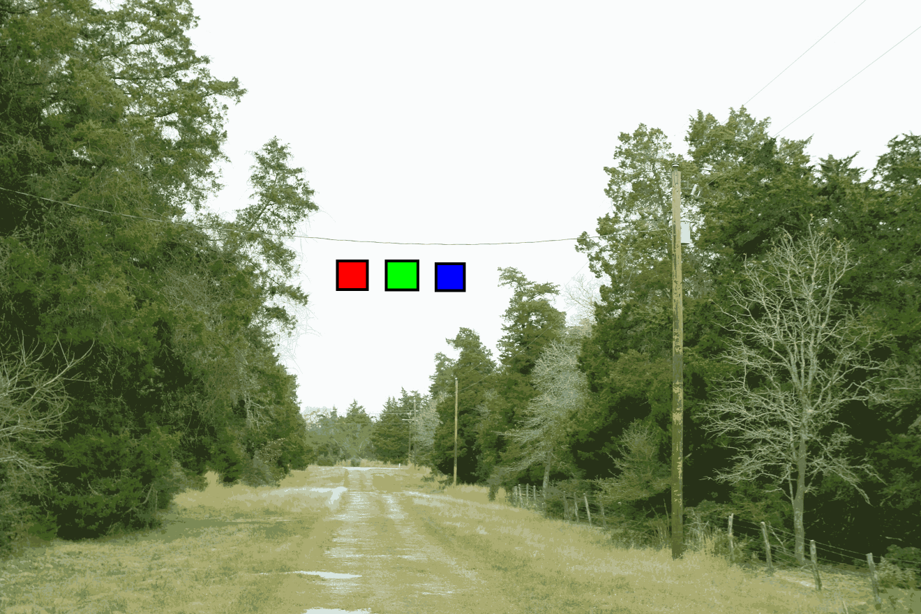
The cnet review (http://www.cnet.com/uk/products/dell...-monitor-20-1/) didn't like it much: "Unfortunately the E207WFP has more weaknesses than strengths. Its most glaring problem is its questionable image quality... it's absolutely awful at colour reproduction and reproducing tones at the extreme ends of the scale. It's unable to distinguish between similar light tones, so it can't properly display the subtle tonal nuances in clothing or flowers, for example."
That suggests that there's something wrong with the profiles iProfiler creates for the E207WFP. Using the sRGB profile won't be right (I mean, it's unlikely to reflect accurately the properties of the monitor) but it should make all three test images look the same, as you found. The same thing should happen when you use a custom profile. If it doesn't, then there's something wrong with the profile. You did check that iProfiler is creating v2 profiles (and not v4)?
As with the other monitor, sRGB is not the right profile, and for a wide-gamut monitor will be miles out in terms of colour rendition. Colours are likely to be over-saturated.
I can't figure that out either. As one poster said before, if you were previously using an sRGB profile with a wide-gamut monitor, that would display images over-saturated, and encourage you to turn down the image saturation. But why did they look OK from a professional print lab? Not sure about that.
That should produce better results - see the tftcentral review I linked earlier.
The article you linked looked right, but bear in mind that I don't have that monitor, and my knowledge of it is limited to what I've read in the tftcentral review. Note the warning in the article about not working well on hardware calibration on the second monitor. Probably make sure the Dell wide-gamut is set as the primary monitor.
I have an EIZO CS240 monitor which has similar hardware calibration capabilities. You can have multiple calibrations, and an app that comes with the monitor allows you to switch between calibrations with a couple of clicks. That changes the calibration in the monitor and - importantly - changes the profile in Windows. That saves you having to go to Control Panel -> Color Management and change the profile there (as well as changing the calibration in the monitor). I assume the Dell software does the same, but make sure it does if you want to switch calibrations. That is, there's a way of switching between CAL 1 and CAL 2 which switches both the monitor calibration and the profile setting for Windows.
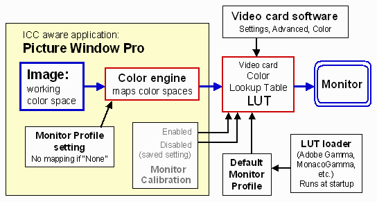
The profile set in Windows must always be in step with the current characteristics of the monitor for colour management to work.
The way I work: I normally use a native (wide-gamut) calibration. If I want to see how things look in sRGB, either I use soft proofing in Lightroom or Photoshop - which is not always terribly accurate - or I switch to an sRGB calibration in the monitor. That changes the monitor calibration and changes the profile in Windows. Note: if you switch calibrations on the monitor (and profile in Windows) Lightroom won't notice unless you exit and re-run the program. It checks monitor profile only once when the program starts. This is probably true of most programs.
Remember also that Lightroom uses lots of different colour spaces internally. Develop module always works in ProPhoto RGB colour space, whatever the image's colour space. To confuse things, it works in Adobe RGB in Library and most other modules except web module, where it works in sRGB! When Lightroom sends image data to the monitor it could be in any of these colour spaces. This is why it's important to have a correctly-functioning monitor profile when using Lightroom, otherwise conversion from these various colour spaces to the monitor's colour space won't work properly. If there isn't a monitor profile, I think Lightroom uses an sRGB profile, but if there's a faulty profile then goodness knows what happens! Lightroom didn't used to like v4 monitor profiles, but I think I read they they'd fixed it - or maybe were going to fix it.
Results 41 to 60 of 64
Thread: Help me! Color management...
-
28th December 2015, 09:00 PM #41

- Join Date
- Nov 2011
- Location
- UK
- Posts
- 244
Re: Help me! Color management...
-
28th December 2015, 11:12 PM #42
- Join Date
- Dec 2015
- Location
- Wisconsin, USA
- Posts
- 18
- Real Name
- Bryan N.
Re: Help me! Color management...
Yeah, I've had it for a very long time. I don't use it for any serious photo work, as I know it's junk, but I'm familiar with what my pictures should look like on it. Sometimes I use it as a test to see how pics looks on a different monitor; as we all know, clients monitors will vary wildly. In terms of my work flow, it's not part of the photo workflow. It's just a secondary display for things like excel, win explorer, skype, AIM, e-mail, etc. Originally Posted by Simon Garrett
Yeah I changed it to v2 (odd they have the default set at v4), and I had set the iProfiler software to the TN backlight setting. It's beyond me what I could have possibly done wrong during calibration so that the resulting profile for that monitor won't display those test images correctly. It almost seems like it has to be a problem with my GPU. But my GPU is only a couple years old, and the AMD series has a reputation for working well with color profiles. And the drivers are up to date. Originally Posted by Simon Garrett
I think the answer is that I was using an sRGB profile on an sRGB monitor. I didn't realize it at the time, or even when I created this thread originally, but someone in this thread pointed out to me that the -HM was only capable of sRGB color space. Originally Posted by Simon Garrett
What is causing this whole debacle for me, I believe, is that I went from a 100% sRGB workflow (minus the RAW exposures) on an sRGB monitor to not realizing the replacement monitor Dell sent me was a wide-gamut monitor, and then expecting that same workflow to work. It has been a process of discovery for me, with much learning.
My work demands do not require that I process RAW files in wide-gamut. I'm not printing in wide-gamut, and I'm not sharing in wide-gamut, so why on earth would I want to work in wide-gamut? It seems like a very small niche of people who would actually require this for their work, and most photographers (especially those who print and share in sRGB) get totally screwed up by this whole wide-gamut concept. Correct me if I'm wrong, but if I'm sharing pictures via web to clients in sRGB and printing in sRGB, it would be ludicrous for me to do edit work in a larger color space... right? The way I understand it, the pictures do not look the same in the wide gamut color spaces as they do in sRGB. I don't have time, nor do I want to soft-proof every single picture I might want to share or print in sRGB. That is just absolutely ridiculous, in my mind.
My old 100% sRGB workflow was just fine for my purposes, and I would very much like to regain that ability without dumping this wide-gamut monitor. I don't even need it set in a wide-gamut color space, so long as I can SET it to sRGB.
Yeah, the E207WFP doesn't allow hardware calibration anyway, so I wouldn't even try it. The -H is set as my primary display in the windows display settings, so it should be okay. Originally Posted by Simon Garrett
-------
From everything you've said, and I've read recently, I think what I'm going to do is try hardware calibration with the Dell software, and do it all in sRGB. *crosses fingers* I will let you know. And thank you, you've been extremely helpful and I very much appreciate the time that you and all the others have invested to communicate with me and help me figure out this most frustrating problem!
-Bryan
-
29th December 2015, 01:19 AM #43
- Join Date
- Nov 2011
- Location
- UK
- Posts
- 244
Re: Help me! Color management...
No argument with what you say, but one comment:
There are benefits from editing in the largest possible colour space, IMHO, even if the result is for the web or for a print service restricted to sRGB. Post processing in a narrow colour space can result in unnecessary distortions, even if the result is to be converted to sRGB. Editing calculations (by Lightroom, Photoshop or whatever) might result in intermediate results that have colours outside sRGB. Originally Posted by Keen Ai
An example: suppose an operation increases saturation. This might result in colours that are outside sRGB. If you're working in sRGB, they get clipped at the edge of sRGB, but if you're using a wider space then they will be accurately represented. If you subsequently reduce saturation then if you're working in sRGB, the previously-clipped colours now will be distorted, but working in a wider colour space the colours remain true.
I'm not saying that you would deliberately increase and then decrease saturation; that's just an example of how post processing can produce intermediate results that get clipped in a narrow working space.
As for soft-proofing to check on sRGB: personally, I find that's rarely necessary. Most colours in most pictures are within sRGB. Highly saturated colours are not especially common in nature. What you see from a ProPhoto RGB image on a wide-gamut monitor will be pretty much the same as on a sRGB monitor (because most of the colours will be within sRGB gamut). Now you could say that's a good reason not to bother with a wide-gamut monitor, and use a standard-gamut monitor (i.e. about sRGB), and I wouldn't argue with that.
If you shoot jpeg, then (IMHO) it's quite sensible to set the camera to sRGB and work in sRGB.
However, if you do significant amounts of post processing then I would argue that the quality is often better by shooting raw, and leaving the image in a wide, 16-bit colour space until post processing is done, and only then export to sRGB jpeg if necessary.
I'm not suggesting there's a right way and a wrong way - just different styles with their own advantages and disadvantages.
PS - when you say "most photographers... get totally screwed up by this whole wide-gamut concept" then I would agree! If you use a standard monitor (roughly sRGB gamut), shoot jpeg in sRGB, and set every available option to sRGB, then you will get approximately the right colours without knowing anything about colour management. If you use a wide-gamut monitor or use any colour space other than sRGB, then you'd better know something about colour management, because there be dragons.
-
29th December 2015, 04:28 AM #44
- Join Date
- Feb 2012
- Location
- Texas
- Posts
- 6,956
- Real Name
- Ted
Re: Help me! Color management...
For the Sigma X3F raws, I find it better for my purposes to use sRGB as the working space in their 'SPP' converter ("assign" in PS-speak?). The converted RGB image itself remains in 16-bit linear ROMM space while editing - but the review image's color-picker and histogram, being shown in sRGB, provides forewarning of clipped or bottomed colors after transformation later to sRGB. Originally Posted by Simon Garrett
Then I save as 16-bit ProPhoto TIFF - which are all native to RawTherapee - so the actual post-processing is done floating-point in a wide space and is saved as sRGB only for final output.
Not suggesting that's better than anyone else's methods. Main point is that I've been burned a few times by using ProPhoto as the working space in the converter (flowers, e.g.) and been rather disappointed by color clipping or bottoming when finally saving as sRGB.Last edited by xpatUSA; 29th December 2015 at 04:36 AM.
-
29th December 2015, 05:52 AM #45
- Join Date
- Dec 2015
- Location
- Wisconsin, USA
- Posts
- 18
- Real Name
- Bryan N.
Re: Help me! Color management...
I rarely shoot in jpeg, for any important work I always shoot RAW and edit the RAW files primarily in Lightroom, exporting to sRGB at the end.
This evening, I used the Dell UltraSharp Color Calibration Solution software to calibrate CAL1 in sRGB on the U2713HM, set the profile as the default in windows color management, and it looks awful. It's consistent across applications, but it doesn't look like my prints very well; instead, it looks relatively flat and desaturated, especially in the skin tones. Perfectly tan people are now nice and pale...
The sRGB/aRGB/proRGB test shots all look the same, so it's being color managed, but I just don't understand why it all (everything) looks so bad. All browsers, within LR/PS, windows pic viewer, etc. All bad.
Just for kicks, I set my OSD from CAL1 over to aRGB. Bam, looks great. So I guess I'm not using the hardware calibration anymore (the color temperature was way too cold anyway) but I am using the profile it created, and viewing everything in aRGB.
So once again, I have accidentally happened upon something that looks right! Oh boy! In actuality, what I'm seeing now does seem like a wider color space. The reds, especially, are much more vivid on screen than in my prints.
@xpat -- I have no idea what you just said. Sounds like you have a completely alien workflow to me.
-
29th December 2015, 07:16 AM #46
- Join Date
- May 2014
- Location
- amsterdam, netherlands
- Posts
- 3,182
- Real Name
- George
Re: Help me! Color management...
Just for a good understanding for me. That's only possible when the monitor has a wide gamut? And doesn't work when the monitor has a smaller gamut then the selected color space? Originally Posted by Simon Garrett
George
-
29th December 2015, 10:05 AM #47Moderator

- Join Date
- Mar 2012
- Location
- Ottawa, Canada
- Posts
- 22,486
- Real Name
- Manfred Mueller
Re: Help me! Color management...
For Windows; in the Color Management Settings, with the Advanced tab, you can set the rendering intents. This tells Windows how to handle out of gamut colours (OOG), so even if you do not have a wide gamut screen, the operating system will handle things as best it can. This lets you use a wide gamut colour space, like ProPhoto (or AdobeRGB) on any screen. Originally Posted by george013
http://windows.microsoft.com/en-US/w...ement-settings
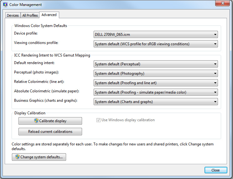
Last edited by Manfred M; 29th December 2015 at 10:10 AM. Reason: Added screen shot
-
29th December 2015, 10:22 AM #48

- Join Date
- Aug 2015
- Location
- Isle of Skye
- Posts
- 60
- Real Name
- Colin
Re: Help me! Color management...
A lot of information here so I'm not going to add anything further to avoid confusion. However, there is a useful tool on the X-rite web site that allows you to see just what profile is actually loaded and in use for each display and it might be useful to you.
http://www.xrite.com/product_overvie...SoftwareID=539
-
29th December 2015, 10:49 AM #49
- Join Date
- Nov 2011
- Location
- UK
- Posts
- 244
Re: Help me! Color management...
Not to my understanding (though I always stand to be corrected!) Originally Posted by george013
I think it can be beneficial to shoot raw and post-process in a wide colour space but use a standard-gamut monitor (which most people shooting in raw probably do). IMHO the benefits of processing in a wide colour space are:
- to avoid distortion caused by clipping from processing in a narrow colour space
- future proofing - one day I might want to use a wider gamut monitor, or print on a printer capable of wider gamut
-
29th December 2015, 11:01 AM #50
- Join Date
- Aug 2015
- Location
- Isle of Skye
- Posts
- 60
- Real Name
- Colin
Re: Help me! Color management...
I'm not sure I understand your first point. What do you mean by distortion? Coming from a wide colour space to a narrow colour space will result in clipping but I can't see that processing from start in a narrow colour space would cause distortion - whatever that means?to avoid distortion caused by clipping from processing in a narrow colour space
future proofing - one day I might want to use a wider gamut monitor, or print on a printer capable of wider gamut
Of course Lightroom uses a combination of Prophoto + sRGB so there is little choice.
-
29th December 2015, 11:35 AM #51
- Join Date
- Nov 2011
- Location
- UK
- Posts
- 244
Re: Help me! Color management...
See my post above including "An example: suppose an operation increases saturation". To give another example: suppose you are calculating financial accounts, and you know that there will never be any transactions and balances above $1m. You could restrict calculation to 6 digits (plus 2 for cents, I guess). However, there could be intermediate calculations that might exceed $1m. For example, if you are calculating an average, you might need to sum lots of numbers below $1m, and before dividing by the count you have an intermediate result that could be above $1m. Originally Posted by Codebreaker
Processing image data in sRGB colour space, where pixel values can't go beyond sRGB limits, may result in truncation of values of intermediate operations (depending on the operation being performed) even though the original data was within sRGB gamut. I'm not sure how real that problem is with normal post processing operations, and if I were shooting sRGB jpeg then I'd probably leave the images in sRGB jpeg. But shooting raw, I reckon it's worth keeping the image in a wide colour space in 16-bit until the final stage, and exporting to sRGB jpeg (if that's what's needed) only at the last stage, after post processing. And I keep the master copy in a wide colour space, 16-bit anyway!
I'm not saying this as a must-do, just my way of thinking about it.
-
29th December 2015, 01:13 PM #52
- Join Date
- May 2011
- Location
- SE Michigan
- Posts
- 4,511
- Real Name
- wm c boyer
Re: Help me! Color management...
This thread reminds me of a snake eating it's tail...never-ending snafu.
-
29th December 2015, 02:47 PM #53
- Join Date
- Nov 2011
- Location
- UK
- Posts
- 244
Re: Help me! Color management...
If you mean colour management is a bit of a mess, I'd heartily agree. That's partly because it wasn't designed from the ground up, but was built as a series of kludges on what was already there. Also, colour science is itself very complex, built on simplfied models of human colour perception (which is itself horrendously complex, varies between people, circumstances etc, and probably not fully understood). Originally Posted by chauncey
At the same time, once one has set up colour management (calibrated and profiled monitor, and use of colour-managed software such as Lightroom, Photoshop and most but not all photo software) then it just works. No more "why did it come out that colour" moments. If the colour isn't right, I know it's down to me.
-
29th December 2015, 03:02 PM #54
- Join Date
- Feb 2012
- Location
- Texas
- Posts
- 6,956
- Real Name
- Ted
Re: Help me! Color management...
George, Originally Posted by george013
The bit depth of a file is not related to the gamut** of color in the file. However the bit depth does affect the number of possible colors , as we all know.
** by "gamut", I mean the area enclosed by primary colors on a 2D chromaticity diagram, or volume on a 3D gamut diagram.
Let's go back to the days of the long-forgotten Commodore 64 home computer with it's 4-bit color driver - a total of 16 possible colors. If I could connect that old computer to a hypothetically perfect monitor with 100% Adobe RGB (1998) primaries - the visible gamut would be "aRGB" - the same as the monitor - and totally unrelated to the 4-bit driver's color depth.
Such nostalgia - as an owner of a BBC 8-color home computer back then, I remember being quite jealous!
When the monitor has a smaller color-space than the file's color space, the file data is passed to the monitor via software that transforms the file color space to the monitor color space (but without changing the file data itself).
Norman Koren (founder of Imaging Resource) seems to know a bit about it ;-)
Source: http://www.normankoren.com/color_management_2A.html
Hope that helps.Last edited by xpatUSA; 29th December 2015 at 06:44 PM.
-
29th December 2015, 03:36 PM #55
- Join Date
- Feb 2012
- Location
- Texas
- Posts
- 6,956
- Real Name
- Ted
Re: Help me! Color management...
Please call me Ted or @xpatUSA. Originally Posted by Keen Ai
Yes, I was replying to Simon Garrett, not recommending a workflow for your good-self.
As to "alien" my workflow is probably just that for most people here, because I use Sigma cameras only and have no Adobe products on my computer. Not bragging, just sayin'.
Good luck with your quest!
-
29th December 2015, 05:37 PM #56
- Join Date
- May 2014
- Location
- amsterdam, netherlands
- Posts
- 3,182
- Real Name
- George
Re: Help me! Color management...
That's exactly the point I don't understand. Originally Posted by Simon Garrett
Just my thoughts. I think it's exactly on topic.
I take a picture. The camera registers the different values of the R,G and B channels and converts them to a digital value.
When viewing on a screen it uses those values to create a picture on that same screen. A value of 255 of a color tells the monitor to use the maximum of his capability to produce that specific color, the wavelength belonging to that color.
The gamut of a screen describes the range of the colors it can produce, the range in wavelength belonging to a color. If that range is bigger, we speak of a wider gamut.
The idea of color managment, as I understood, is to try to make the picture on the screen to look as much as possible on the picture in real live. Output should be as close to the input as possible. For the different gamuts a recalculation will be done.
This having said, I think one should be aware of the fact that a digital photo doesn't have colors just as it has no metric dimension. It gets color by the use of a screen, printer. Just the way it gets a metric size.
One more thought. Why is it better to work with an Adobe color-profile on a RGB screen. It looks to me that you are working with wrong colors by definition. Sometime I hear the argument that Adobe has more colors. The amount of coolrs on a 24-bit screen will not change. But if the bigger gamut implies a bigger range in wavelenght and the colordepth is 8-bit, then the parts of the wider gamut are bigger. I'm not meaning the PP, which can be up to 16-bits but just the vissible colors on the screen.
It's quite fragmentic, I hope you can understand what I mean.
George
-
29th December 2015, 07:34 PM #57
- Join Date
- Feb 2012
- Location
- Texas
- Posts
- 6,956
- Real Name
- Ted
Re: Help me! Color management...
Me again.
Followers of this thread might find this interesting, clear and informative:
http://www.dpbestflow.org/color/colo...color-profiles
.
-
29th December 2015, 07:41 PM #58
- Join Date
- May 2011
- Location
- SE Michigan
- Posts
- 4,511
- Real Name
- wm c boyer
Re: Help me! Color management...
Let me see...I bought a camera, discovered that I liked photography, and got into PS aboutIf you mean colour management is a bit of a mess
the same time>eventually got a computer and proper monitor and used X-rite stuff.
In spite of being the dimmest bulb in the closet, colors seem to turn out OK...why have I been so lucky?
-
29th December 2015, 08:05 PM #59
- Join Date
- Nov 2011
- Location
- UK
- Posts
- 244
Re: Help me! Color management...
One or two points here not quite right.
Wavelength is not the same as colour! Our eyes have three sets of cone cells with response similar to a camera sensor, and roughly like this: Originally Posted by george013

Wavelength in nanometers along the horizontal axis.
Colour is the combination of the stimulations of the three types of receptor in our eye, not the wavelength.
Colours can be represented on the CIE xy chromaticity diagram:

Only those colours round the curved edge correspond to single wavelengths of light (the blue numbers are the wavelength in nanometres). The other colours - the vast majority of of colours - can be created only by combinations of at least two (normally at least three) wavelengths of light.
But the important thing: colour is not wavelength, but the sensation we perceive from a combination of multiple wavelengths of light.
Different colour spaces can represent a different subset of colours that the eye can perceive (not wavelengths). Colour spaces can be represented on the CIE xy chromaticity diagram (sorry, the background colour isn't very good): Originally Posted by george013

The Adobe RGB colour space, represented by the orange triangle, includes a greater range of colours than sRGB (dotted triangle), for example. The R, G and B values to needed to represent a particular colour in one colour space will be different from the RGB values for the same colour in any other colour space.
These three (sRGB, Adobe RGB and ProPhoto RGB) are standard colour spaces. You could think of them as "virtual devices", but they won't correspond exactly to any real device. Any real device such as a monitor will have its own unique colour space, and a monitor profile describes the colour space of the monitor. A monitor colour space can also represented by a triangle on the CIE xy diagram - a unique triangle different to any other. The triangle with the dashed line - similar to the sRGB triangle - represents a typical standard gamut monitor's colour space.
When displaying a colour on a monitor screen, colour management means taking the RGB values in the image colour space (sRGB, Adobe RGB or whatever) and mapping the numbers to create the corresponding RGB values for the same colour in the monitor's colour space.
I think that's the wrong way to look at it. Originally Posted by george013
Within a computer editing program (e.g. Photoshop, Lightroom or whatever) the program will use a standard colour space - very often the colour space the image is encoded in. Likely options are sRGB, Adobe RGB or ProPhoto RGB.
But the monitor is very, very unlikely to have a colour space corresponding exactly to any of these standard colour spaces. As I said above, each monitor has its own colour space. So in order to display the correct colours on the monitor, the program has to convert all the RGB values from the internal space (sRGB or whatever) to the monitor's colour space. Many narrow-gamut monitors are approximately sRGB, but not exactly.
It's almost always the wrong thing to edit in the monitor's colour space and so one is almost always editing in the "wrong colours", as you put it.
In other words, whatever colour space is used by the program, there will always be a conversion to the monitor's colour space if the correct colours are to be seen. In terms of displaying the right colours on the screen, it doesn't matter what colour space is used internally, there's always a need for conversion. That's what colour management does.
Now, if you don't use colour management, you can get very approximately the right colours by using a normal gamut monitor (very approximately sRGB) and then using sRGB in the program. Without any conversion colours will be roughly right, but only roughly right. But with colour management, colours should always be more accurate.
I think that talking about the number of colours is a bit misleading. Originally Posted by george013
As you can see from the diagram of colour spaces above, Adobe RGB can represent a greater range of colour than can sRGB. If you use 8-bit encoding, then each colour space uses 3 values in the range 0 to 255 to represent colours. Using 3 8-bit numbers to represent colour gives around 17 million possible combinations. In the case of Adobe RGB, those 17 million combinations represent a larger range of colour.
Sorry for the rather long answer, but your post suggests that your understanding of colour and colour spaces is not quite right!
-
29th December 2015, 08:13 PM #60
- Join Date
- May 2014
- Location
- amsterdam, netherlands
- Posts
- 3,182
- Real Name
- George
Re: Help me! Color management...
I don't know what you exactly mean. When I speak of colors in my post I mean the R,G and B channels/colors. Originally Posted by xpatUSA
And to me a range is something between 2 limits..
It's the sRGB color space and not gamut.
About your picture. If you mean a 4-bit color depth, then there're 4096 colors, 16 per channel, together 4096.
A picture doesn't have a gamut. That belongs to the screen. If you mean the colorspace, I wouldn't know.
George

 Reply With Quote