
 Helpful Posts:
 I understand what you're doing and completely agree with you. But why is in photography warmer more red while it is warmer more blue.Originally Posted by GrumpyDiver

George
Results 21 to 27 of 27
Thread: Is Lightroom WB tool Accurate?
-
29th January 2015, 10:43 PM #21

- Join Date
- May 2014
- Location
- amsterdam, netherlands
- Posts
- 3,182
- Real Name
- George
Re: Is Lightroom WB tool Accurate?
-
29th January 2015, 11:05 PM #22Moderator

- Join Date
- Mar 2012
- Location
- Ottawa, Canada
- Posts
- 21,956
- Real Name
- Manfred Mueller
Re: Is Lightroom WB tool Accurate?
It's not more blue, but rather too little blue. Originally Posted by george013
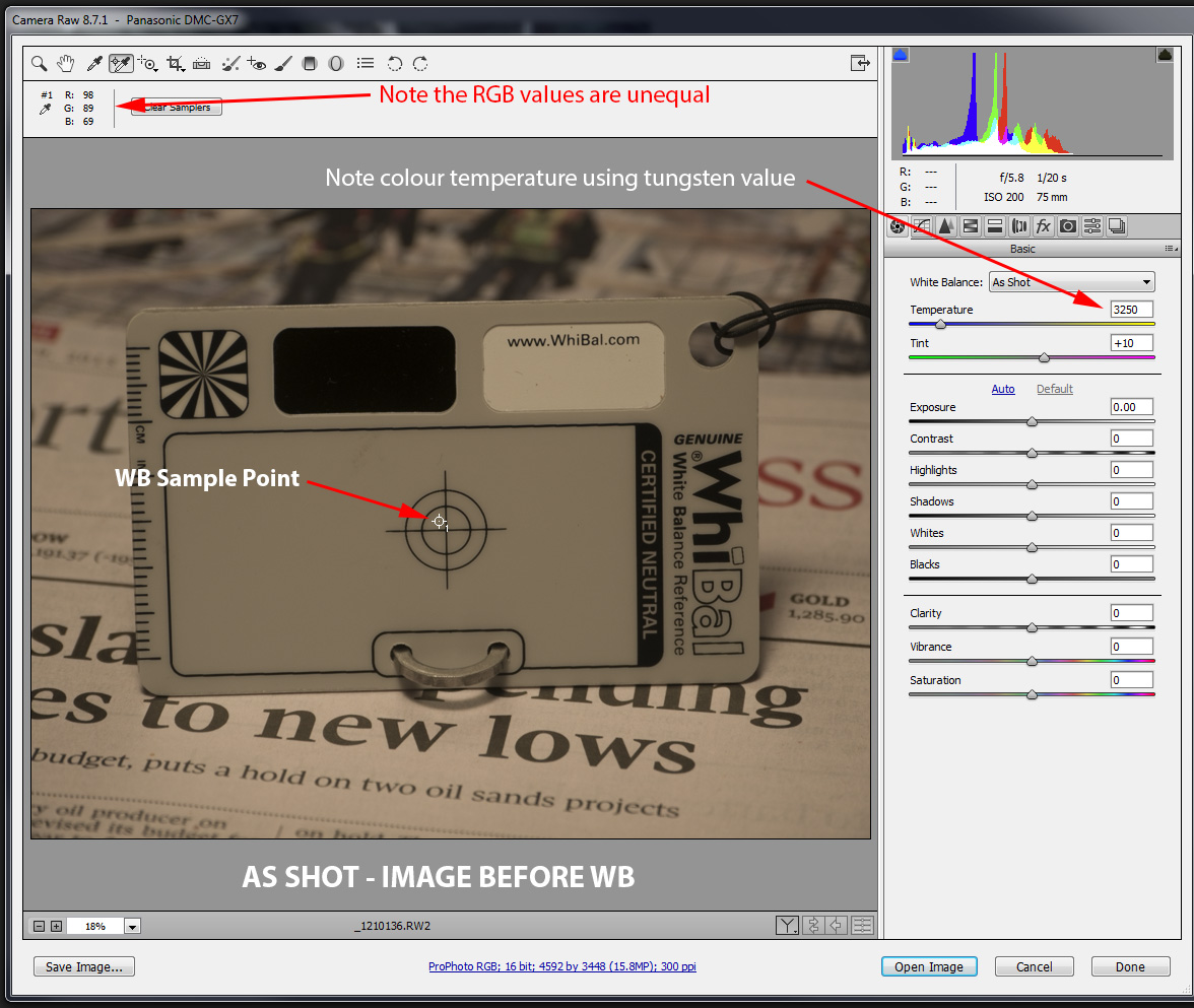
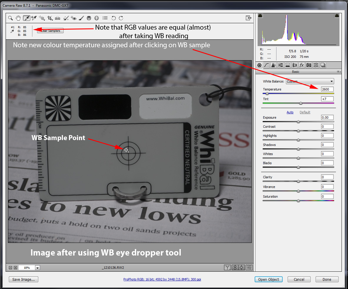
If you look at the colour values of the original I have:
R = 98
G = 89
B = 69
We always have to look at the colours and their complements:
Red / Cyan, Green / Magenta and Blue / Yellow. Excessive yellow is the same as not enough blue, excessive red is the same as not enough cyan, which we see in this case. If we dial back the individual R, G and B values equally in the colour balanced image, we lighten the shot, if we increase the values equally, we darken the shot.
-
29th January 2015, 11:23 PM #23
- Join Date
- Nov 2011
- Location
- UK
- Posts
- 244
Re: Is Lightroom WB tool Accurate?
In photography, based on human emotion and experience, we tend to think of red/orange being associated with warmth - fire, sunlight etc. And we think of blue being cold - we associate blue with cold.
But white balance is usually related to so-called black-body radiation. When you heat a body - any material - it glows with a band of wavelengths with peak intensity at a characteristic colour. The colour is associated with the temperature of the body radiating heat and light, and goes from red to yellow to blue as it gets hotter. Think what happens to a tungsten light as you increase the power with a dimmer: the greater the power applied, the hotter the filament gets, and it goes from dim red-orange to yellow-white (it would probably break before getting to blue).
So in colour temperature, red is the cold end and blue the hot end - the opposite way round to normal human "feel" of colour.
Is that what you were asking?
-
30th January 2015, 12:29 AM #24

- Join Date
- Jul 2014
- Location
- Michigan U.S.
- Posts
- 1,132
- Real Name
- Nick
Re: Is Lightroom WB tool Accurate?
I think I've heard something along these lines. Have you ever noticed how the hottest flames in a camp fire are blue and the cooler ones are yellow? That I have heard is associated with it. Originally Posted by Simon Garrett
-
30th January 2015, 06:53 AM #25
- Join Date
- May 2014
- Location
- amsterdam, netherlands
- Posts
- 3,182
- Real Name
- George
Re: Is Lightroom WB tool Accurate?
That was the question. Now the answer. Originally Posted by Simon Garrett
In Dutch there is a saying that if you are getting angry you are getting overtemperatured, hot. And if you are very angry you're wihite-hot angry. Comming from heating iron, it first gets red and white.
It's not just a feeling, there is also a temperature scale, black box hot 10000 is blue, photography 10000 is red. There must be more.
George
-
30th January 2015, 05:06 PM #26

- Join Date
- Dec 2011
- Location
- New England
- Posts
- 8,634
- Real Name
- Dan
Re: Is Lightroom WB tool Accurate?
Wikipedia has a very clear explanation of this, including the fact that the relationship in physics, used in photography, is the reverse of the common psychological notion of warm and cold colors.
-
30th January 2015, 05:51 PM #27
- Join Date
- Feb 2012
- Location
- Texas
- Posts
- 6,956
- Real Name
- Ted
Re: Is Lightroom WB tool Accurate?
And here is an in-depth article about Spanish daylight:
http://www.usna.edu/Users/oceano/ray...O_CCTpaper.pdf
From which I get that "accuracy" of WB is not real important for cameras sold world-wide?
Meanwhile let's not forget that other component "tint", the lines normal to the locus below:

[edit]
Didn't mean this post to be a thread-stopper, so I'll explain a bit more about the above. The diagram is similar to part of the traditional CIE 1931 xyY gamut diagram, which itself often used to show how "small" the sRGB gamut is and how so much "bigger" Adobe (1998) is. The above diagram serves the same purpose but u,v replace the x,y axes. These axes are more representative of how we see color differences. Now we see that "daylight" D55 lies not on the 'black body' locus but a bit above it - while still retaining the color temperature of 5,500K. This offset away from the theoretical black body can be called the "tint", if you like. Note also that the "old" CIE illuminants 'A' and 'C' are quite a bit below the locus.
A long time ago in a previous life here, I asked: "what is the correct WB setting for a light source?" - by which was meant, for example, a luminous watch in the dark or a traffic light on an unlit street. No need to answer that question here.
To my own satisfaction, I worked the correct WB out to be Illuminant 'E' above. Which you can only get if your camera provides CCT/tint as a WB option. Alternatively, you could shoot RAW and select "As Shot" in ACR and set 5500 in the temperature slider and so much on the tint slider. I used to know, but I can't remember how much the tint slider moves to get to 'E'.
Which is a pity, because no less a personage than Eric Chan (the ACR man) told me.Last edited by xpatUSA; 31st January 2015 at 08:53 PM. Reason: added more blurb

 Reply With Quote