
 Helpful Posts:
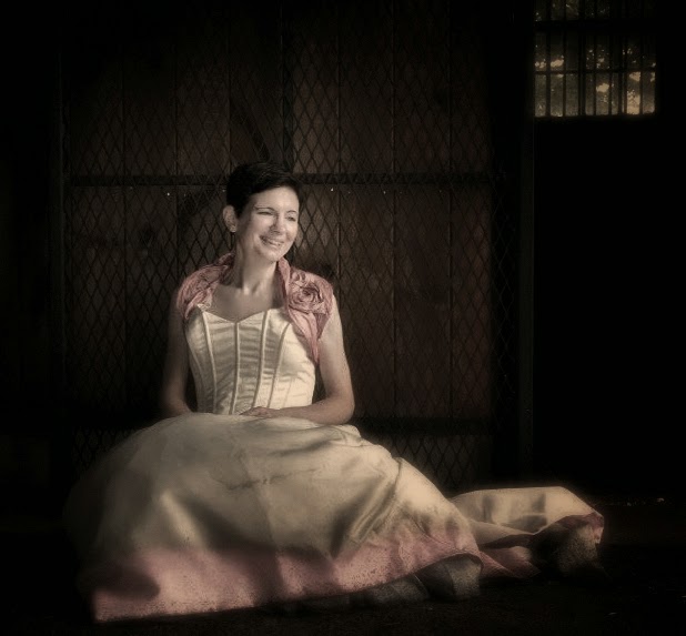
 Took these yesterday for someone who wanted to wreck her wedding dress... It was another cloudy day and the location was a horse farm. Due to the variety of colors, I made the pictures more muted. Interetsted in constructive feedback. Thank you
#1
#2
#3
Results 1 to 20 of 31
Thread: Various colors - C&C welcome
-
20th July 2014, 03:30 PM #1


- Join Date
- Jul 2014
- Location
- Connecticut
- Posts
- 2,103
- Real Name
- Kim
Various colors - C&C welcome
-
20th July 2014, 06:27 PM #2
- Join Date
- Dec 2013
- Location
- Turkey
- Posts
- 12,779
- Real Name
- Binnur
Re: Various colors - C&C welcome
Hi Kim . I like the composition in #1 but it is very pale for me, I would add some clarity and vibrance to the image. IMO glasses distract in #2 . I find #3 nice, if there was more empty space on the left instead of on the right it might look better but it is very nice this way too

-
20th July 2014, 06:46 PM #3
- Join Date
- Jan 2009
- Location
- South Devon, UK
- Posts
- 14,897
Re: Various colors - C&C welcome
For me, Kim, the first image is looking a fraction more faded than muted. So I would add a little bit of Vibrance to it, as Binnur mentioned. And I also agree with him about a different crop for #3. Maybe a square crop if you can't get anything else to work?
-
20th July 2014, 07:04 PM #4
- Join Date
- Dec 2013
- Location
- Turkey
- Posts
- 12,779
- Real Name
- Binnur
Re: Various colors - C&C welcome
Hi Geoff. I just would like to say that I'm not a 'he' , please see my profile photo

 Originally Posted by Geoff F

-
20th July 2014, 08:54 PM #5Moderator

- Join Date
- Mar 2012
- Location
- Ottawa, Canada
- Posts
- 22,500
- Real Name
- Manfred Mueller
Re: Various colors - C&C welcome
A few thoughts:
Image 1 - I don't find that the dark, in shadow side of the stable adds anything to the image. I'd be tempted to see what it looks like cropped away. If you want to keep the windown, crop just to the right of it; I suspect that will work too.
Image 2 - Good balance between the horse and bride; the positioning of the two works quite well.
Image 3 - A very heavy-handed vignette here. No subtlety at all; look at turning it back a bit so it isn't in the viewer's face quite as much. Also, much like my comment on Image 1 - a severe crop on the camera right side; alll that grass adds nothing to the image. You might want to consider a square crop here.
-
21st July 2014, 12:18 AM #6

- Join Date
- Dec 2009
- Location
- WNY
- Posts
- 36,716
- Real Name
- John
Re: Various colors - C&C welcome
Nice, appears to be more sharpness on the horse in the second and third image. Was that intentional?
-
21st July 2014, 12:21 AM #7
- Join Date
- Jul 2014
- Location
- Connecticut
- Posts
- 2,103
- Real Name
- Kim
Re: Various colors - C&C welcome
Thank you. Yes, the horse was blending in to much (IMO). Originally Posted by Shadowman
-
21st July 2014, 12:25 AM #8
- Join Date
- Jul 2014
- Location
- Connecticut
- Posts
- 2,103
- Real Name
- Kim
Re: Various colors - C&C welcome
Thank you. Your comments are very helpful. On the first image, I did crop the window out and didn't like it as much. I like your idea to crop out the black, I will give that a try. On the second image, I was concerned that cropping it tight would impact the image. I had to crop the left as there was a bank jump I didn't want included. I'll try as you suggested and see how it looks. I agree about the vignette. Originally Posted by GrumpyDiver
-
21st July 2014, 12:28 AM #9
- Join Date
- Jul 2014
- Location
- Connecticut
- Posts
- 2,103
- Real Name
- Kim
Re: Various colors - C&C welcome
Thank you. Concerning the first image, I do have a more vibrant version. I will post later. I agree about the glasses, but they are a big part of her personality and she didn't want to remove them for most of the pics. Agree on third. There was a bank jump on the left side that I didn't want to include. Originally Posted by bnnrcn
-
21st July 2014, 12:29 AM #10
- Join Date
- Jul 2014
- Location
- Connecticut
- Posts
- 2,103
- Real Name
- Kim
Re: Various colors - C&C welcome
Thank you for the feedback. I have a more vibrant first image that I will post later. See my other comments on image 3 - will try a square crop as suggested. Originally Posted by Geoff F
-
21st July 2014, 01:23 AM #11
- Join Date
- Jul 2014
- Location
- Connecticut
- Posts
- 2,103
- Real Name
- Kim
Re: Various colors - C&C welcome
Here's the more vibrant version with the crop done as suggested.

-
21st July 2014, 03:44 AM #12

- Join Date
- Apr 2012
- Location
- Chino Hills, California, USA
- Posts
- 483
- Real Name
- Rob Castro
Re: Various colors - C&C welcome
Hi Kim. I'm probably the only one who likes the muted color look. I dig it. Quite frankly, I sense you might have held back on muting the colors. I think it should be more muted. Keep on shooting :-)
-
21st July 2014, 08:21 AM #13
- Join Date
- Dec 2013
- Location
- Turkey
- Posts
- 12,779
- Real Name
- Binnur
Re: Various colors - C&C welcome
Hi Kim
I think you pushed the vibrancy slider too much, the lady has a very pink face and the colours on the dress don't match the ones in the other photos. You can adjust it anyway. I like the crop.
I also wonder about Rob's suggestion because he has a different style in photography.
-
21st July 2014, 08:29 AM #14
- Join Date
- Dec 2013
- Location
- Turkey
- Posts
- 12,779
- Real Name
- Binnur
Re: Various colors - C&C welcome
Hi Rob
I really wonder about your suggestion. Could you please explain how a more muted look would be optained with PP ? Just desaturating colours or reducing contrast?  I would very much like to see the result. Without knowing that you have an artistic style I would think that it would look bad, but I know that you have a style !
Originally Posted by juznobsrvr
Last edited by bnnrcn; 21st July 2014 at 08:36 AM.
-
21st July 2014, 09:48 AM #15
- Join Date
- Jul 2014
- Location
- Connecticut
- Posts
- 2,103
- Real Name
- Kim
Re: Various colors - C&C welcome
The colors in the latest version are true to how she/the dress looked. The part of the dress around her neck was that rich, and she had a lot of pink tones in her face. Originally Posted by bnnrcn
-
21st July 2014, 09:50 AM #16
- Join Date
- Jul 2014
- Location
- Connecticut
- Posts
- 2,103
- Real Name
- Kim
Re: Various colors - C&C welcome
Thanks Rob. Personally I love the muted. I typically like to go with what pleases my eye... I would like to see you mute out a version as well if you don't mind. I love your work and would love to see your style on it. Originally Posted by juznobsrvr
-
21st July 2014, 10:51 AM #17

- Join Date
- Oct 2011
- Location
- Cornwall
- Posts
- 1,861
- Real Name
- Mark
Re: Various colors - C&C welcome
I thought you were a he as well!! Originally Posted by bnnrcn
 you should use your profile pic as your avatar then there would be no mistakes made I join my boat in Istanbul next Sunday ive never been to turkey so im realy looking forward to it and this time i get to take my camera!!
-
21st July 2014, 11:42 AM #18
- Join Date
- Apr 2012
- Location
- Chino Hills, California, USA
- Posts
- 483
- Real Name
- Rob Castro
Re: Various colors - C&C welcome
I may have misspoken, Kim. Actually, what I meant was more cowbells. Don't know why I said more muted colors. Truthfully, I don't see well in colors because I'm partially colored blind. Maybe that is why muted colors appeal to me. Since you asked for my version, I hope you will not hate me for this hacked up rendition of your work. Cheers. Originally Posted by KimC
-
21st July 2014, 12:27 PM #19Moderator
- Join Date
- Mar 2012
- Location
- Ottawa, Canada
- Posts
- 22,500
- Real Name
- Manfred Mueller
Re: Various colors - C&C welcome
Nice Pp work Rob - that is essentially the crop that I had in mind in my comment.
-
21st July 2014, 03:07 PM #20
- Join Date
- Dec 2013
- Location
- Turkey
- Posts
- 12,779
- Real Name
- Binnur
Re: Various colors - C&C welcome
I hope you will enjoy Istanbul Mark. I'm actually fed up with it and I ran away after getting retired
Originally Posted by Mark von Kanel
Last edited by bnnrcn; 21st July 2014 at 07:31 PM.


 Reply With Quote