
Recently, I started using a Grey card for establishing the white balance more systematically. I hope to get a better control on color. Since the brain is adapting to the weirdest light conditions while we take pictures or browse prints, I am looking for an external reference. By the way, my computer screen is calibrated and I examine prints under a 6500K lighting.
Now, the Grey card is obviously not the whole thing. Most demonstrations of the use of Grey cards are based on situation, where you want to reproduce colors accurately and to correct for possible biases in the light at time of exposure. This functions very well but does obviously not apply to a sunset or a landscape under a very cloudy sky. A white balance based on the Grey card may totally ruin the atmosphere of the picture. On the other hand, if one sets a light temperature of say 6500 through all pictures to preserve or even underline the specific light conditions prevailing at the time of shooting, one may get exaggeratedly colored pictures, from fire red to deep blue.
I am interested to hear from you what is your general strategy in handling colors in landscapes, and what helps you in appreciating the colors of your pictures. A reference to a good book on that subject would also be appreciated.
Reto
P.S. It would be fine to have an extension on the WB topic in the Cambridge in Colour tutorials.
 Helpful Posts: 0
Results 1 to 13 of 13
Thread: Getting better control on colors
-
2nd January 2010, 05:16 PM #1

- Join Date
- Jun 2008
- Location
- Bern, Switzerland
- Posts
- 41
- Real Name
- Reto
Getting better control on colors
-
2nd January 2010, 08:00 PM #2

- Join Date
- Jul 2009
- Location
- Massachusetts
- Posts
- 343
Re: Getting better control on colors
Recommended readings:
Color Confidence: The Digital Photographer's Guide to Color Management By Tim Grey
Color Management in Digital Photography: Ten Easy Steps to True Colors in Photoshop by Brad Hinkel
Fine Art Printing for Photographers: Exhibition Quality Prints with Inkjet Printers by Uwe Steinmueller and Juergen Gulbins
At times it's necessary to calibrate your printer as well, but definitely make custom print profiles for the different types of print paper that you use.
-
2nd January 2010, 10:19 PM #3
- Join Date
- Dec 2008
- Location
- New Zealand
- Posts
- 17,660
- Real Name
- Have a guess :)
Re: Getting better control on colors
Hi Reto, Originally Posted by rhadorn

The industry standard reference text is "Real World Color Management" by Fraser, Murphy, and Bunting (2nd edition). I've also got Tim Gray's book mentioned by Amberglass. Tim's book is very readable whereas RWCM goes a LOT deeper and covers a much broader base (but can most definately "make your head hurt").
Gray cards are great for getting white balance "technically correct" but that doesn't mean that it's "visually correct"; sunset landscape is one example where you don't want "technically correct"; shooting by candle light would be another (as you've already alluded to). At the end of the day, visually correct wins everytime - but - you have to be careful. Visually adjusting portraiture to be "visually correct" is a recipe for disaster (cue gray card), but with landscape it's perfectly acceptable (necessary in fact).
Just to make things even more confusing ... the industry standard temperature for evaluating colour is 5000 kelvin, not 6500 kelvin - but of course, 5000k kelvin is very yellow to work with (so like you, I run a 6500 kelvin environment), but you WILL get colourshifts when viewing your work under natural light.
Let me know if you need more info - colour management is kinda my "forte".
-
3rd January 2010, 08:20 PM #4
- Join Date
- Jun 2008
- Location
- Bern, Switzerland
- Posts
- 41
- Real Name
- Reto
Re: Getting better control on colors
Thank you for your supporting answers.
I have the Steinmüller / Gulbins book in electronic form and have learned a lot from it. I am sure the one by Frazer will help me further (I have already the one on sharpening).
I actually did not yet calibrate ma printer but I am using the generic profile for my paper and printer combination with good results. I know that a profile for my specific printer would bring still more accuracy but my problem at the moment produces much greater variations than the gain I would have with a dedicated profile.
My problem is no so much in understanding color management than in settling my own judgment about colors in the first place. When is a picture too saturated, when too little? Shall I damp or exaggerate the color characteristics of light at shooting time? My guess is that a precise measure of light characteristics may help in building a procedure around a reference. Depending on what you want the picture to state, you can correct for color shifts, or make them even more conspicuous, or correct them halfway... This is more a matter of style (?!) and experience than of knowledge and would best be elaborated on in a workshop or an apprenticeship. Yet this forum is also a good place for this kind of issue.
I checked the book by Steinmüller / Gulbins for what they say about white balance. Hmmm...
- "We assume you have the white balance of your image as you like it." (Tuning colors)
- "The light actually has two different color temperatures. In this situation, the global white balance should be selected to correct for the main light source, in this case, the sun." (Removing blue shadow cast)
That's all.
To rephrase my question in your terms, Colin: does the knowledge of what would be technically correct help defining what is visually correct to you? Practically: do you use a Grey card for landscape photography or not? If yes: does this technical reference help you determining what is visually correct to you? In which way?
Reto
-
3rd January 2010, 08:50 PM #5
- Join Date
- Dec 2008
- Location
- New Zealand
- Posts
- 17,660
- Real Name
- Have a guess :)
Re: Getting better control on colors
Hi Reto, Originally Posted by rhadorn
For pure landscape, no, I don't use a gray card for 2 reasons; (a) it would give a visually incorrect result, and (b) since I'm always shooting into the light I'd have to turn around and shoot with the card behind me.
If the landscape had people in it though then it gets far more difficult in that there is a conflict between visually correct landscape and the need for technically correct skintones. Probably a good example is this shot ...
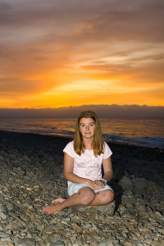
Obviously a need for a visually correct background ... but the subject was illuminated with a 5500 kelvin flash ... and normal skintones would have looked out of place (although they would have been correct). Off memory I hand tweaked them into what was (hopefully) an acceptable compromise.
In reality I mostly use a gray card for normal portraiture.
-
13th January 2010, 07:17 AM #6New Member
- Join Date
- Jan 2010
- Posts
- 1
Re: Getting better control on colors
I recommend getting a ColorChecker chart and using the X-Rite ColorChecker Passport program (free to download) to generate a Lightroom/Photoshop RAW profile for your camera. This gives you a sense that the colors are correct. You can then add warmth to the photo as you like.
-
14th January 2010, 10:09 PM #7

- Join Date
- Dec 2009
- Location
- WNY
- Posts
- 36,716
- Real Name
- John
Re: Getting better control on colors
While visiting the Grand Canyon, arrived around 2:00PM on a partly cloudly/partly sunny day, I was amazed by the beautiful pastels and rusty pinks of the canyon walls. The view was beautiful but my photogapher's eye told me that any photos I took would probably be overexposed and I made adjustments to my camera's white balance, tried shorter shutter speeds, and decrease the aperture. I also shot a few photos with the camera set on automatic, thinking I'll adjust later with my software. It's good to know when the colors in your photograph are wrong because of the temperature of the light, but sometimes we can change the colors of nature in error, not accepting our own view of beauty. Originally Posted by rhadorn
-
14th January 2010, 10:13 PM #8
- Join Date
- Dec 2008
- Location
- New Zealand
- Posts
- 17,660
- Real Name
- Have a guess :)
Re: Getting better control on colors
In situations like that you just can't beat a gray card for an accurate white balance reference. Also steepinging the A & B curves whilst in LAB mode is great at driving colours apart in canyon scenes. Originally Posted by Shadowman
-
14th January 2010, 11:05 PM #9Administrator
- Join Date
- Apr 2008
- Location
- California, USA
- Posts
- 1,473
- Real Name
- Sean
Re: Getting better control on colors
Hi Reto, thanks for the suggestion. I've added it to the list here: Suggestions for New Tutorials? Originally Posted by rhadorn
-
14th January 2010, 11:23 PM #10

- Join Date
- Sep 2009
- Location
- Burton on Trent, UK
- Posts
- 4,788
- Real Name
- Steve
Re: Getting better control on colors
It's all very complicated but I use a grey card possibly incorrectly, in the hope I might capture more detail; and then throw it all away.
Now the computer is King and I range through balance to get what I most like even choosing something not in the Kelvin range but adding a little more of red or green or blue or less.
My photo's are now balanced by eye; sometimes it's right sometimes it isn't.
-
15th January 2010, 05:40 AM #11
- Join Date
- Oct 2009
- Location
- USA - California
- Posts
- 445
Re: Getting better control on colors
I don't understand the argument for not using a grey card. While I do understand - and agree with - the concept between the differences of "visually correct" and "technically correct" - that dosn't help you at all on what degK to set your camera to when taking the shot. I have been making a practice to use a grey card on all of my shots (or at least at the start of a shoot) - and use that as a starting point for tweaking into "visually correct" instead of choosing any random kelvin temp to put on my camera, or (worse) automatic mode.
Is there any reason to not use a grey card - even if you only want/use it as a starting point?
-
15th January 2010, 06:41 AM #12
- Join Date
- Dec 2008
- Location
- New Zealand
- Posts
- 17,660
- Real Name
- Have a guess :)
Re: Getting better control on colors
As a "rule of thumb" if I'm shooting a reflective object then I'll use a gray card, but if I'm shooting into the light (eg sunset) then it's pretty much a waste of time because it's irrelivent; in the latter situation visually correct is all that matters (assuming RAW). Originally Posted by KentDub
-
16th February 2010, 01:40 PM #13
- Join Date
- Jun 2008
- Location
- Bern, Switzerland
- Posts
- 41
- Real Name
- Reto
Re: Getting better control on colors
Looking around in the Forum, I discovered that the discussion about color control went further after a break of about 2 weeks. Thanks to all for the support and to Sean (?) for taking up the challenge of clarifying the use of a neutral reference in difficult contexts as a support for making editing choices - appropriate editing choices for various kinds of results.
It is also my experience, Colin, that reading off a reference card sometimes gives incorrect results. My point is that understanding why the reading is incorrect, I would possibly be able to make better measurements. I got a new example for this. I took a picture of two big trees against the sky, on a sun lit hillside. The macadam of the small road in the foreground came out to have a magenta bias. My reading of the WhiBal card was possibly faulty. Why?
My present hypothesis is that the grass behind me reflected on the card and forced the camera to compensate for it. I did not make any systematic experiment about this. The reason for that hypothesis is that the producers of the WhiBal card insist upon the importance to avoid flares on the glossy patch on the card. My point is that if the main light source can reflect, then secondary sources do so also. And if that secondary source (the grass) covers a great area, you cannot avoid all reflections, since there is always an angle, which will favor it. Maybe I should make a complementary reading of the card turned down, to have an idea of the bias generated by the surroundings. I know, there is that Spyder Cube, which may help taking several references at a time...
A Grey card is obviously useless when photographing the light source, like you do, Colin. But probably you have a general strategy, like setting the balance on 'sunny day', like the good old films, and get so the characteristic difference of sun raises and sun sets. This would be a balancing strategy, even if you don't use a card.
Anyway, the key to all this is the appreciation of the result. This is also the point, where the contributors to this thread seam to divide. Some trust their taste (what I like is o.k.), their judgment (this IS what I like and in that sense visually correct) and their technique (I know what to do to get it visually correct). Others like to use some technical support (a reference), not to stay with it but rather to know what they do, when exploring the possibles.
At that point, we are not far away from the discussion about styles we had a few months ago. If I would produce postcards or pictures for calendars, I would probably know what is visually correct. Making pictures mainly for my pleasure, I have to find out...
Reto

 Reply With Quote