
 Helpful Posts: 0
Results 1 to 8 of 8
Thread: Fractured
-
13th August 2013, 07:02 PM #1


- Join Date
- Aug 2011
- Location
- Wick, Caithness, Scotland.
- Posts
- 2,609
- Real Name
- Sharon
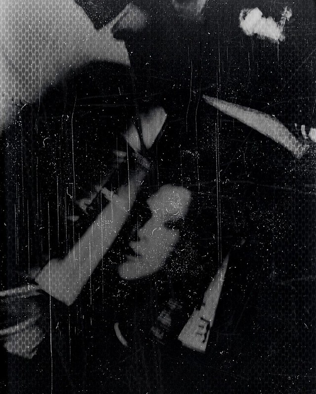
Fractured
-
13th August 2013, 08:35 PM #2

- Join Date
- Dec 2009
- Location
- WNY
- Posts
- 36,717
- Real Name
- John
Re: Fractured
Very nice use of pattern, texture, imagery.
-
13th August 2013, 09:16 PM #3
- Join Date
- May 2012
- Location
- northern Virginia suburb of Washington, DC
- Posts
- 19,064
Re: Fractured
The first word that comes to my mind is "haunting."
Consider toning down the very brightest part of the item in the top left corner, as that brightness is a little distracting. I realize that that's not the brightest part of the image, but it has that impact on me for whatever reason.
-
13th August 2013, 09:46 PM #4
- Join Date
- Aug 2011
- Location
- Wick, Caithness, Scotland.
- Posts
- 2,609
- Real Name
- Sharon
Re: Fractured
Thanks John.
Mike...do you mean the left outer corner edge?
I totally agree..it actually detracts a lot from the bright 'cloudy bit' ( technical term that!! so will damp it down.
Thanks Mike.
-
13th August 2013, 11:24 PM #5

- Join Date
- May 2012
- Location
- Carrollton, Georgia (USA)
- Posts
- 2,757
- Real Name
- Bruce
Re: Fractured
Sharon, the first thought that came to my mind when I saw this photo was a childhood lost. I thought of that when I saw the girl's face in what appears to be a magazine. The whole pic again reminds me of some dark place.
Bruce
-
14th August 2013, 01:43 AM #6
- Join Date
- May 2012
- Location
- northern Virginia suburb of Washington, DC
- Posts
- 19,064
Re: Fractured
Yes. Your explanation is more accurately detailed than mine. You make a good mind reader. Originally Posted by Daisy Mae

-
14th August 2013, 02:06 AM #7
- Join Date
- Jul 2012
- Location
- I live a stone's throw away from Cuyahoga National Park (NE, Ohio)..
- Posts
- 1,247
Re: Fractured
Great image. I agree with Mike's comment.
Karm
-
14th August 2013, 03:00 PM #8
- Join Date
- Dec 2011
- Location
- Québec,Canada
- Posts
- 696
- Real Name
- Louise
Re: Fractured
Sharon, you did it again, taking us in our dark places! I agree that the light parts on top are distracting. It could be a square picture, eliminating the top part, and lighten the rest of the picture ever so slightly. Am I influence by Donald B&W square pics?
I like very much the overall effect you have rendered.

 Reply With Quote