
OK guys and gals, this isn't in my comfort zone, so critique and comments encouraged.
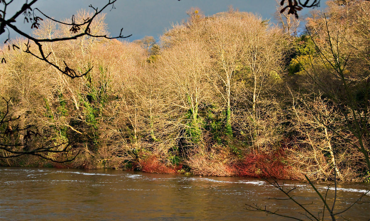
It just looked so 'nice' with the far river bank sunlit and grey storm clouds looming behind, plus the trees without leaves and the ivy still going strong, plus the red and the green - hence the caption.
Nikon D5000 + 18-200mm at 36mm, 1/180 @ f11, iso1000
NB Must be viewed full size (at 1200px width)
Thanks,
 Helpful Posts: 0
Results 1 to 20 of 21
Thread: Autumnal opposites
-
25th December 2009, 04:19 PM #1Moderator


- Join Date
- May 2008
- Location
- Windsor, Berks, UK
- Posts
- 16,774
- Real Name
- Dave Humphries :)
Autumnal opposites
-
25th December 2009, 06:04 PM #2
- Join Date
- Aug 2009
- Location
- Canada
- Posts
- 3,113
- Real Name
- Wendy
Re: Autumnal opposites
Hi Dave: This is the kind of shot that I like to take, and that I have trouble with. really like the colours, but if it was my photo, I know I would be trying to make adjustments. I think for sure that I would crop the bit of a branch top right, and I might crop a bit at the right so that the branches at the bottom right were coming in at the corner. In my twisted mind that just kind of balances the two forground objects on diagonals.
I love the colours, and I know I'd want to play around with them, which I did. Hope you don't mind. See below for what I've done.
I think I like the crop, but I've probably really messed the colours up and made them look artificial. Might have lost a bit in the downsizing too. I don't know. I'm not really qualified to be Commenting on your work, but seeing as it's the type of photo that I like to take, I thought I'd give it a shot. I'm interested to see other's comments on your original
Merry Christmas...Family is waiting so I better get a move on.
Wendy
-
25th December 2009, 11:48 PM #3

- Join Date
- Sep 2009
- Location
- Burton on Trent, UK
- Posts
- 4,788
- Real Name
- Steve
Re: Autumnal opposites
I love the red and Wendy is on the right track as usual; but I would choose a middle course with saturation and probably try to keep the water cold. The sky I don't know really but would try a few things like desaturation.
Overall it is as usual a great picture.
-
26th December 2009, 09:10 AM #4Moderator
- Join Date
- May 2008
- Location
- Windsor, Berks, UK
- Posts
- 16,774
- Real Name
- Dave Humphries :)
Re: Autumnal opposites
Wendy, Arith,
Thank you for the comments, I appreciate the time you have both taken and I have read and given them some initial thought.
I'm going to refrain from answering them for a while longer to give more people a chance to comment without a) knowing what I have already done to it, b) knowing what I was trying to achieve and c) knowing my response to your comments - because it may restrain* or steer* their thoughts.
* I'm not sure these are the right words, but you get the idea
Dodgy metaphor time: I'd like to keep the canvas clean until all the paint has been delivered
Colin, I would appreciate your thoughts.
Thanks again,Last edited by Dave Humphries; 26th December 2009 at 09:20 AM.
-
28th December 2009, 09:17 AM #5Moderator

- Join Date
- Feb 2009
- Location
- Glenfarg, Scotland
- Posts
- 21,402
- Real Name
- Just add 'MacKenzie'
Re: Autumnal opposites
Dave
Okay. Christmas is over. We're back in the saddle etc etc.......
I like the colours. And your introductory explanation tells us why you went for the shot. The overall range of tone and mood (sun-kissed autumnal trees trimmed at the top by that gathering sky and, at the bottom, by the untamed river) gives us a sense of both calm and action all being evident at the same time; i.e. there's impending drama.
I did look at it for a while and wonder whether it needed a stronger focal point; i.e. what was in there that said 'Hey, look at me, I'm the main point of interest'. That's still in the 'undecided' pile.
Like Wendy, I think that dark intrusion at the top (branch) has to go. I would go for a clone rather than a crop (more work - but it would keep the maximum amount of sky).
But the thing that throws me (though it shouldn't), is the river bank rising in the frame from right to left. Something keeps telling it me it should look more horizontal across the frame. And I can't figure out why. It's some sort of optical illusion caused by thinking I'm looking straight across the river at 90 degrees to the opposite bank, when I'm not.
If you were facing more upstream or downstream, the bank would run more from bottom to top and it would clearly be seen to do so. In this image you're at a slight angle to the opposite bank (not facing at 90 degrees to it) and it gives a slight effect. So it's throwing my simple brain (or maybe I've just had too much wine in the last 72 hours).
-
28th December 2009, 09:49 AM #6Moderator
- Join Date
- May 2008
- Location
- Windsor, Berks, UK
- Posts
- 16,774
- Real Name
- Dave Humphries :)
Re: Autumnal opposites
Hi Donald,
Thank you, this is very helpful.
Anyone,
More comments please
Let me have it, both barrels
Thanks in advance,Last edited by Dave Humphries; 28th December 2009 at 11:10 AM.
-
29th December 2009, 12:44 AM #7
- Join Date
- Aug 2009
- Posts
- 2,342
- Real Name
- Steve
Re: Autumnal opposites
Let me have it, both barrels
Hi Dave, i think donald is pretty much spot on .
The colors and the trees are not enough to carry this image. It is dying for something of interest in the foreground...............a large rock;tree stump; a person in a canoe, anything of interest that would be a main subject.
I would also like to see more of the sky, perhaps a virtical composition would have worked better.
Lastly, the tree branches in the foreground need to go.
It's a pretty scene, but needs a clearcut subject and more sky in my opinion.(take that with a grain of salt, because i'm not much of a landscaper)
Last edited by Dave Humphries; 29th December 2009 at 12:59 AM. Reason: add quote tag
-
29th December 2009, 02:36 AM #8

- Join Date
- Sep 2009
- Location
- Washington (state) USA
- Posts
- 976
- Real Name
- Pops

Re: Autumnal opposites
This is what I would classify as a background picture. It is a mood setter, rather than a story teller. It is nice when a picture can be both, but being only one or the other is not, by definition, "not right."
I shoot many pictures which are only mood pictures. Sometimes, I even planned it that way.
I agree with the others about little nobby in the upper right corner. Because it is partially covering the tree behind it, cloning it out is going to be a bear. Keeping the texture and balance on the part of the tree which is now covered is going to be a job.
Short story, I like it.
Pops
-
29th December 2009, 08:57 PM #9Moderator
- Join Date
- May 2008
- Location
- Windsor, Berks, UK
- Posts
- 16,774
- Real Name
- Dave Humphries :)
Re: Autumnal opposites
Anymore feedback before I start on the defensive?
-
30th December 2009, 07:32 PM #10
- Join Date
- Mar 2009
- Location
- Coventry, UK
- Posts
- 304
Re: Autumnal opposites
I like the colours, but the foreground right hand side branches top and bottom do seem to distract me.
I think the top left foreground branch adds nice depth to the image along with the foam, I assume from the current on the outside bend of the river, with the red branches and the green leaves around the tree trunks gives a nice focal point.
I bet the sky appeared somewhat darker to your eye Dave than it appears in the image, maybe a bit of burning?
Keith
-
31st December 2009, 01:15 AM #11

- Join Date
- Dec 2009
- Location
- WNY
- Posts
- 36,716
- Real Name
- John
Re: Autumnal opposites
Dave,
The muted colors would be symbolic of an autumnal day, therefore the title would be appropriate for the image. I would suggest a panoramic view showing more of the leaves and trees. If you were using the branches as a border or frame I would include more if possible.
-
8th January 2010, 10:37 PM #12Moderator
- Join Date
- May 2008
- Location
- Windsor, Berks, UK
- Posts
- 16,774
- Real Name
- Dave Humphries :)
Re: Autumnal opposites
Hi Wendy, Originally Posted by ScoutR

Just realised I'd never got back to people on this") ( how rude ), sorry
( how rude ), sorry 
I tend to agree about the foreground branches being a distraction, when I was there, they seemed to give depth, but as shot, it had so many both left and right, I had to crop loads out. That left me with almost a square picture which looked odd, so I stretched it as far as I dare (and no one spotted that), which gave me my version.
In the summer, this is just a wall of leaves and you cannot see through to the river at all from this place
I like the clouds, so I don't think I agree with this crop, sorry.
But I do agree that mine would stand a bit of extra saturation, just not as much as this
Anyway, thanks for taking time out from Xmas dinner to PP and comment, it is appreciated.
-
8th January 2010, 10:43 PM #13Moderator
- Join Date
- May 2008
- Location
- Windsor, Berks, UK
- Posts
- 16,774
- Real Name
- Dave Humphries :)
Re: Autumnal opposites
Hi Arith, Originally Posted by arith
I'm not sure about the last bit!
When I came to PP it was the two red bushes that attracted me, and although I did increase the saturation, it wasn't enough, I see that now.
Good idea to desaturate the sky though, I hadn't thought of that, it would keep it neutral while I wound up the saturation for the bushes - when I was doing it, it just went a mucky blue, probably why I held back.
I'm not sure about making the water cold though; wouldn't that look odd, I mean it should reflect the CT of light on the trees shouldn't it?
Thanks for the ideas though,
-
8th January 2010, 10:50 PM #14Moderator
- Join Date
- May 2008
- Location
- Windsor, Berks, UK
- Posts
- 16,774
- Real Name
- Dave Humphries :)
Re: Autumnal opposites
Hi Donald, Originally Posted by Donald
I absolutely agree about the lack of a focal point or subject, I think that's why I am out of my comfort zone. The deep and meanful stuff had passed me by on this occasion
Agree the foreground tree intrusions are unhelpful as responded above.
I hadn't noticed the angle of the bank thing, and although it still looks OK to me; because I've been there a lot, I know exactly what you mean as I have said similar of others images in the past. I am in fact facing slightly upstream.
Thanks for your time and comments,
-
8th January 2010, 10:54 PM #15Moderator
- Join Date
- May 2008
- Location
- Windsor, Berks, UK
- Posts
- 16,774
- Real Name
- Dave Humphries :)
Re: Autumnal opposites
Hi Steve, Originally Posted by Steve S
Most comments I have already agreed with, the new thing you suggest is a foreground subect like a boat or canoe, good idea, they do frequent that area, just not on this occasion
Thanks,
-
8th January 2010, 11:37 PM #16
- Join Date
- Sep 2009
- Location
- Burton on Trent, UK
- Posts
- 4,788
- Real Name
- Steve
Re: Autumnal opposites
Just some ideas Dave; I like it as it is but find the sky a bit overpowering. cheers Originally Posted by Dave Humphries
-
9th January 2010, 12:35 AM #17Moderator
- Join Date
- May 2008
- Location
- Windsor, Berks, UK
- Posts
- 16,774
- Real Name
- Dave Humphries :)
Re: Autumnal opposites
Hi Pops, Originally Posted by PopsPhotos
Thanks for the kind words and fair comments.
Cheers,
-
9th January 2010, 12:41 AM #18Moderator
- Join Date
- May 2008
- Location
- Windsor, Berks, UK
- Posts
- 16,774
- Real Name
- Dave Humphries :)
Re: Autumnal opposites
Hi Keith, Originally Posted by Keith
Yeah, as I was saying above, there were lots of foreground branches, which I hoped might almost frmae the more distant vista, but it didn't work
Also agree that probably the sky looked darker
Thanks,
-
9th January 2010, 12:57 AM #19Moderator
- Join Date
- May 2008
- Location
- Windsor, Berks, UK
- Posts
- 16,774
- Real Name
- Dave Humphries :)
Re: Autumnal opposites
Hi Shadowman, Originally Posted by Shadowman
Yes, I would have loved to have got more in horizontally; but the gap in the trees this side of the river just wasn't wide enough.
Not sure if I could really have got the frame idea going either, given the pisposition of branches distances, trees and sky.
Thanks,
-
9th January 2010, 01:02 AM #20Moderator
- Join Date
- May 2008
- Location
- Windsor, Berks, UK
- Posts
- 16,774
- Real Name
- Dave Humphries :)
Re: Autumnal opposites
All,
I think, in summary, Pops has it nailed; it is a background/mood picture.
While not unpleasant, nor breaking any rules, nor technically bad, it is still a bit "nothing in particular" subject wise.
It has been well worth doing though, and it will help me (hopefully) not do the same again another time.
Many thanks to you all for your comments,

 Reply With Quote