
 Helpful Posts:
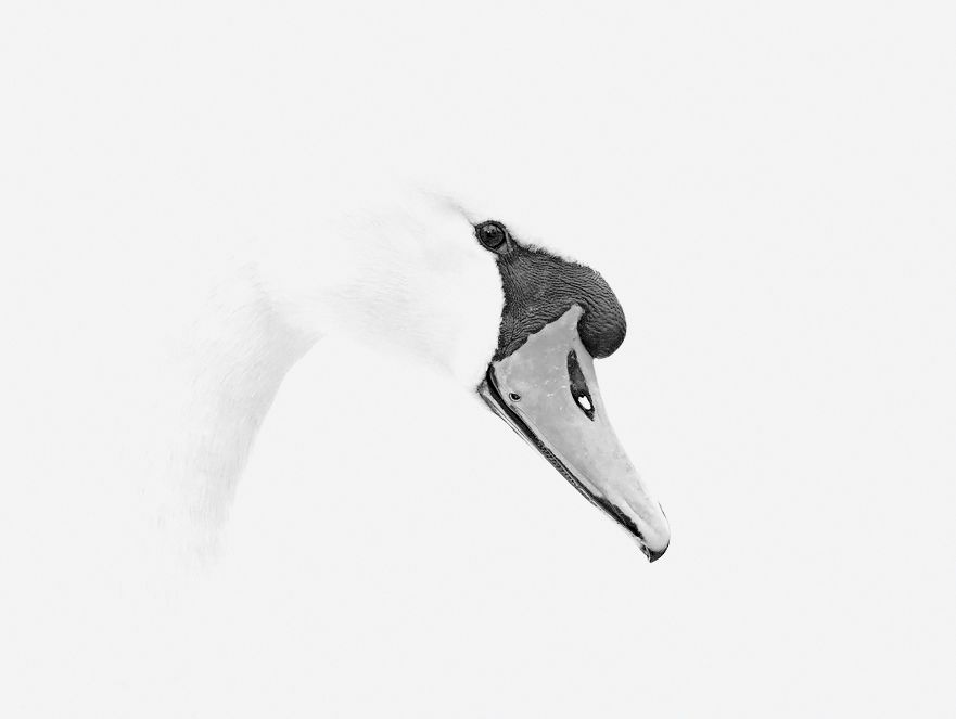
 Well, this is something very different to my normal style of bird photography. I fired the flash and purposely over exposed the shot then further lightened in PP.
Im happy the shot turned out just how I imagined it in my mind before pressing the shutter button, but I am just not sure it works.
Is it a nice, different picture, or is it just a load of old overly white bright rubbish? Be honest now.............
Results 1 to 16 of 16
Thread: Opinions please
-
6th April 2013, 09:07 AM #1


- Join Date
- Apr 2012
- Location
- East Sussex, UK
- Posts
- 101
- Real Name
- Andy
Opinions please
Last edited by AndyB1975; 6th April 2013 at 02:46 PM.
-
6th April 2013, 10:18 AM #2

- Join Date
- Aug 2012
- Location
- Los Angeles CA
- Posts
- 650
- Real Name
- Roger
Re: Opinions please
Too bright for me, but congrats on accomplishing what you wanted to do you never know until you try. Maybe try a tight crop?
-
6th April 2013, 01:51 PM #3Moderator

- Join Date
- May 2008
- Location
- Windsor, Berks, UK
- Posts
- 16,739
- Real Name
- Dave Humphries :)
Re: Opinions please
Hi Andy,
I really think it could work, but needs a much tighter crop, with a bit more texture on the neck and a tad more (slim radius) sharpening.
The crop is the most important though - you have done well with the subject so you don't need all that blank white.
Cheers,
-
6th April 2013, 02:44 PM #4
- Join Date
- Aug 2009
- Posts
- 2,342
- Real Name
- Steve
Re: Opinions please
I think i would give it a square crop and lower the exposure untill i could at least see, the outline of the head.
-
6th April 2013, 02:45 PM #5
- Join Date
- Apr 2012
- Location
- East Sussex, UK
- Posts
- 101
- Real Name
- Andy
Re: Opinions please
I've had a little play, added a little more Black Level, tiny bit of sharpening and tried a different crop. It didn't look right if I went tighter than this.
Im still not sure!

-
6th April 2013, 03:16 PM #6

- Join Date
- Nov 2011
- Location
- Essex, UK
- Posts
- 1,475
- Real Name
- John
Re: Opinions please
Hi Andy,
I like what you are doing here; well done.
I would have gone slightly darker myself, but if you are at the point where you think it's right then that's good.
As a point for futher discussion here's how far I would have pushed it; hope you don't mind.
Thanks for sharing.
Cheers
John

-
6th April 2013, 08:33 PM #7

- Join Date
- Jul 2011
- Location
- British Columbia, Canada
- Posts
- 7,244
- Real Name
- Christina
Re: Opinions please
I like the photo, and would like to try it myself. It reminds me of the Telus commercial photos, featuring wildlife... ie; with the white background focusing all the attention on the subject.
I think somewhere between your last edit and John's edit would be perfect.
-
6th April 2013, 10:39 PM #8

- Join Date
- Sep 2011
- Location
- Columbus, Ohio, USA
- Posts
- 1,960
- Real Name
- Kevin
Re: Opinions please
Very interesting treatment. I was thinking very much along John's edit when I saw your OP- I needed just a little more to appreciate it's form and texture and less of a puzzle to solve.
-
6th April 2013, 11:10 PM #9
- Join Date
- Aug 2011
- Location
- 51°59′N 5°55′E
- Posts
- 198
- Real Name
- Toño
Re: Opinions please
Hi Andy
It's very good that you managed to get the picture as you imagined it in your head, congrats! But the first edit does not completely work for me, it is like an eye floating in the air.
The tighter crop works a lot better, although I'd like some more space on the right side, and I would definitely prefer to see more of the head outline.
Toño
-
6th April 2013, 11:49 PM #10
- Join Date
- Dec 2011
- Location
- Cobourg, Ontario, Canada
- Posts
- 2,509
- Real Name
- Allan Short
Re: Opinions please
Andy I myself like the orginal posting, it has more of a dream like quality to it as the others want a more realist look. I was also thinking this is something more of what a painter or pencil sketcher would create as opposed to what most photographers would do. To me your first posting is stronger than any of the other postings as it is so different to what we usually see, it has so much negative space as as such we have to work to put it into some sort of context. We want to fill an image, to use all the space, when that does not happen we are not sure of if what we present is correct. Again to me this works very, very well.
Cheers:
Allan
-
8th April 2013, 08:14 AM #11
- Join Date
- Apr 2012
- Location
- East Sussex, UK
- Posts
- 101
- Real Name
- Andy
Re: Opinions please
Thanks for all your comments on this one. I've made my eyes hurt looking at this picture so much over the weekend!
Reading Allan's post above, I think he has hit the nail on the head. The original is as I thought of the picture before taking, lots of negative space etc and something you had to look at for a while to understand. I showed 2 people this pic on saturday night, it split opinion a little but both people had to look at it for a while before that properly 'got it', and I think I quite like that quality it has.
I did consider John's (JPS) edit (of course I don't mind John ), but I think to make it that much darker I would need to go back and change the way the original editing is done and in my mind its a little to dark and detailed and with the extra detail does also then need the outline of the head (which has been lost with my over exposing).
Im gonna work on a final crop as I think its needs to be somewhere between my original post and re-edited version.
It's certainly been a fun challenge and good to do something out of my comfort zone.
Once again, thanks for your comments, its appreciated.
-
8th April 2013, 12:16 PM #12
- Join Date
- Aug 2009
- Posts
- 2,342
- Real Name
- Steve
Re: Opinions please
I like your new crop, andy. The image is too bright, for me. I toned down the whites, sharpened, and brightened the eye. What do you think?.........................................
-
8th April 2013, 02:40 PM #13
- Join Date
- Apr 2012
- Location
- East Sussex, UK
- Posts
- 101
- Real Name
- Andy
Re: Opinions please
Cheers Steve, nice edit
I'm not sure on the tone down of the white, it looks a little grey on my screen (but it is a non calibrated work laptop). But, I do like the sharpening and brightening of the eye very much and will go and give my copy that treatment now too, thanks.
-
9th April 2013, 04:23 AM #14
- Join Date
- Aug 2009
- Posts
- 2,342
- Real Name
- Steve
Re: Opinions please
To tone down the whites, i used the curves tool. At the top right side of the curves line, move the top point down a little. I didn't make a new point on the line, i only dragged the right side down a little bit. (maybe a quarter of an inch) Originally Posted by AndyB1975

-
9th April 2013, 04:51 AM #15

- Join Date
- Jan 2011
- Location
- Seattle Washington
- Posts
- 3,550
- Real Name
- Paul
Re: Opinions please
Very nice image, Andy. I do like Steve's edit best.
-
9th April 2013, 01:25 PM #16
- Join Date
- Jul 2011
- Location
- British Columbia, Canada
- Posts
- 7,244
- Real Name
- Christina
Re: Opinions please
I too, love Steve's final edit.. Gorgeous photo that I'd love to hang on my wall.


 Reply With Quote