
Ok, next one for your judgement from my week in the north-west Highlands of Scotland.
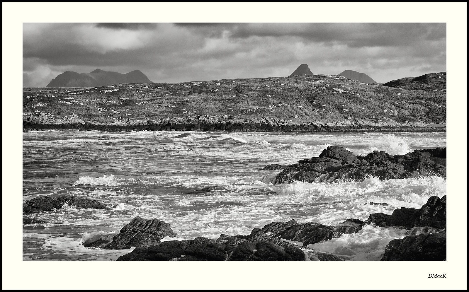
The question that I'm asking myself is - Is it too 'in-your-face'? What I mean is that I've been producing more subdued, lower contrast images and I feel this sort of takes you by the neck and shakes you. Maybe a bit too bold and brash. Or maybe just not good-enough.
It's not that I dislike it, but am trying to convince myself that it is 'good enough'.
I always find your comments help me make up my mind.
Canon 40D, EF 24-70 f2.8 L @ 51mm. ISO400. 1/500s @f11
 Helpful Posts: 0
Results 1 to 11 of 11
Thread: Achnahaird Bay
-
25th October 2012, 12:21 PM #1Moderator


- Join Date
- Feb 2009
- Location
- Glenfarg, Scotland
- Posts
- 21,402
- Real Name
- Just add 'MacKenzie'
Achnahaird Bay
-
25th October 2012, 12:28 PM #2
- Join Date
- May 2012
- Location
- northern Virginia suburb of Washington, DC
- Posts
- 19,064
Re: Achnahaird Bay
It's not at all too in-your-face for people like me who enjoy in-your-face images. I like the contrast, which is not typical of your images.
I don't like the mountain in the background on the right because I can't see enough of it; the middle part disappears behind the foreground. When I try cropping to eliminate it, the revised composition doesn't work for me.
It will be interesting to see what others think.
-
25th October 2012, 01:28 PM #3

- Join Date
- Aug 2012
- Location
- Peebles, Scotland
- Posts
- 125
- Real Name
- Kenny
Re: Achnahaird Bay
I agree with Mike, it's definitely not too in your face. I like the foreground and think that works very well. Where I feel it lack presence is the main piece of land which I think is slightly lost behind the excellent tones and strength of the see and the dominance of the hills behind. Not sure if a tad more contrast from the middle back might work?
-
25th October 2012, 01:29 PM #4
- Join Date
- Jan 2012
- Location
- Rotherham
- Posts
- 247
- Real Name
- Keith
Re: Achnahaird Bay
Reluctant as I am to make observations on the work of a B & W master such as yourself my humble opinion is that this is overdone. Too much sharpening perhaps? A little less Contrast maybe?
-
25th October 2012, 02:37 PM #5

- Join Date
- Oct 2011
- Location
- Cornwall
- Posts
- 1,861
- Real Name
- Mark
Re: Achnahaird Bay
i like this, a lot, as the others say the foreground is great but the mountains in the back lack the punch that the rest of the image has.
-
25th October 2012, 02:45 PM #6
- Join Date
- Apr 2012
- Location
- Vermont, USA
- Posts
- 103
- Real Name
- Werner
Re: Achnahaird Bay
I like the over all tones, they are not too contrasty for me but I agree with Keith, the rocks seem sparkly, maybe just from size reduction? It is definitely better in the larger size but still seems to sparkle a bit.
-
25th October 2012, 03:15 PM #7
- Join Date
- Jul 2011
- Location
- A Pacific Island
- Posts
- 941
- Real Name
- Andrew
Re: Achnahaird Bay
I do like a photo with more contrast than you usually offer and this one does have the full blacks and whites I prefer. A nice shot overall and I will agree with others that the mountains are a bit out of place. In general I find the photo is just too busy for me personally. The very hard textures at all levels from front to back pulls me through too fast even after multiple views. Rocks, turbulent water, rocky hills and clouds all yell for attention. For me there's no place or single subject for my eyes to rest and enjoy. If that makes sense.
-
25th October 2012, 03:26 PM #8Moderator
- Join Date
- Feb 2009
- Location
- Glenfarg, Scotland
- Posts
- 21,402
- Real Name
- Just add 'MacKenzie'
Re: Achnahaird Bay
Thank you all. Again, the comments are hugely helpful.
At the end of the day, I realise that I think, thanks to Keith's succinctly put comment, that it is overdone.
But even more than that, I think Andrew's comment immediately above made me realise what the central issue is - It is just not a good enough composition. Nice enough little holiday shot, but not an image to make it onto my website.
Thanks for taking the time to look and comment.
-
26th October 2012, 12:46 AM #9

- Join Date
- Apr 2012
- Location
- New Jersey, USA
- Posts
- 800
- Real Name
- Ken Curtis
Re: Achnahaird Bay
Hi Donald. When I saw your shot, I wondered whether it wouldn't show better in color. (I know that is a good reason to tie me to a stake and start a fire underneath.) I am not a B&W photographer, but my understanding is B&W is very good when there are shapes and textures that display better with just the tonal information.
I wasn't there to see this, but even though it is a gray overcast day, I suspect there is color information in the mountains, land formation (maybe an island) and the rocks in the foreground. Perhaps the contrast of the clouds and the white spray of the water would look great against whatever color was in the other objects. In the center of the image, it looks like there may be a wave rolling in. You captured it nicely on a diagonal. If the sea were a little bluish-gray, the white spray might show the wave well, but without the color information, it is harder to tell. I certainly like that you captured the rocks in the foreground and the ominous clouds at the top.
Not sure I agree with your last comment about the composition not being good enough. I think it might be how to best show off what is there.
My two cents worth...
-
26th October 2012, 06:10 AM #10
- Join Date
- Nov 2009
- Location
- Provence, France
- Posts
- 988
- Real Name
- Remco
Re: Achnahaird Bay
But don't forget that the picture was taken under highly unusual conditions:
direct sunlight
So I'd expect it to be a bit more contrasted than the usual Scottish pictures...
(*pulls tongue out of cheek*)
It might not be as good as some of your other work (I'm not even sure about that), but it still gives a good description of the situation and conditions (for me).
Edit: it's also one where the textures are a lot rougher than in most of your other work (on your site). Whether it's good enough, I don't know, but I think it needs a good bit of contrast.
RemcoLast edited by revi; 26th October 2012 at 06:20 AM.
-
27th October 2012, 09:14 AM #11

- Join Date
- Oct 2012
- Location
- Channel Islands
- Posts
- 112
- Real Name
- Ole Henriksen
Re: Achnahaird Bay
You may have overdone the "pop" just a tad here, but I don't mind that. To me the problem with this picture is that it's too busy. Too many different things going on in too many places, from the confusion of breaking waves in the foreground to the intrusion of the peaks in the background. I shoot waves in Guernsey and find I get the best pictures when I concentrate on a few at at time.

 Reply With Quote