
-
I often don't understand monochrome conversions - many that are posted on the web just make me think "Why?", and the answer usually completely eludes me. But there are some - and it seems to me that it is just a small proportion - for which the shapes, form or emotional content is more important than colour, and the conversion does seem to work. However, there is also no doubt that I have much to learn - so far I have attempted very little of this type of work.
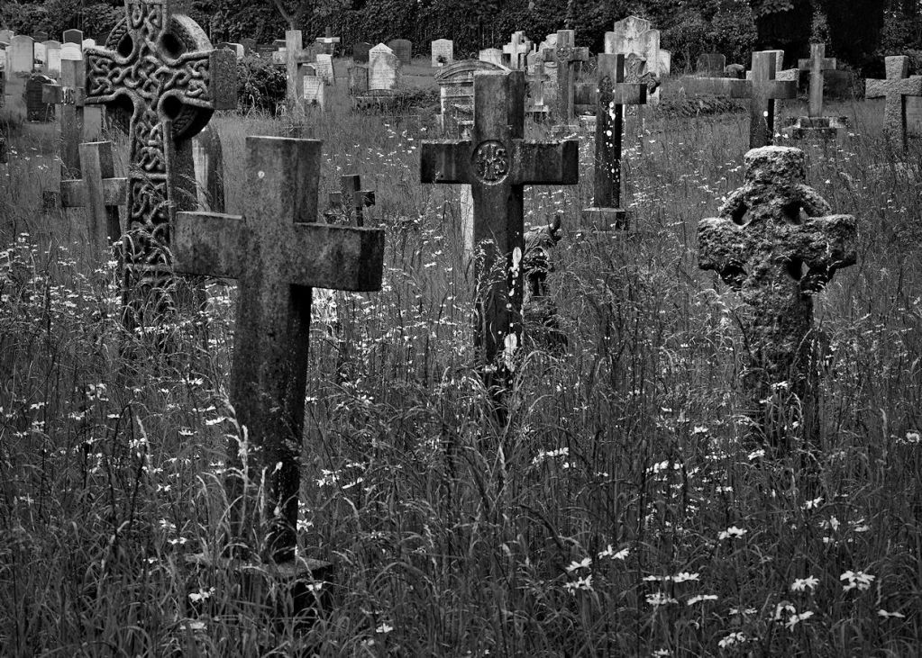
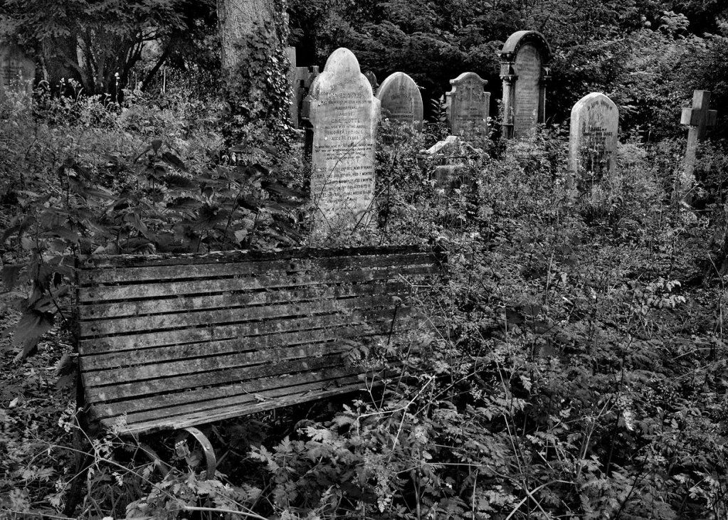
Then yesterday, while photographing an old church, as I wandered around the graveyard surrounding it, I came across a part of it that had been left unattended. The colours seemed irrelevant to the neglect and sadness of the scene, so I decided to shoot with the intention of attempting some conversions (but with no special software). Does anyone agree that monochrome seems appropriate for this subject? Also - C&C welcome on the black & white images.
Forgotten resting place 1:
-
Forgotten resting place 2:
Thank you for viewing.
Philip
 Helpful Posts: 0
Results 1 to 7 of 7
Thread: Forgotten Resting Places
-
20th June 2012, 11:45 AM #1


- Join Date
- Feb 2011
- Location
- Hertfordshire, England
- Posts
- 1,437
- Real Name
- Philip
Forgotten Resting Places
-
20th June 2012, 04:42 PM #2Moderator

- Join Date
- Feb 2009
- Location
- Glenfarg, Scotland
- Posts
- 21,402
- Real Name
- Just add 'MacKenzie'
Re: Forgotten Resting Places
Firstly, Philip, I do think that a subject like this is made for B & W. Originally Posted by MrB

You have in the past, as you indicate, expressed your view about wondering what the point of B & W is. I hope that your own work here helps make the point that it is about being subject-specific. Many subjects are made to be shot in colour. When the colour is a central part of the image, it would be silly to make a B & W image. But equally, I would argue, when colour is not the central part of the image, when line shape, tone and texture are what the image is about, then B & W is an effective way to show that.
The thing about B & W is that you can push things further in making your final image from your RAW starter file. To illustrate the point I have made the following. If you rather I had not posted this, please do say so and I'll remove it. Noting you write that you worked with no special conversion software, I restricted my action to relatively simple and straightforward actions using the GIMP. I applied quite an aggressive 'S curve' to increase the overall contrast and then applied Local Contrast Enhancement (LCE) to enhance the 'pop' in terms of the fine transitions between lines.
So, when working in B & W you can, as I write above, take things that bit farther. You are not trying to reproduce reality (because reality does contain colour) . What you are doing is offering the viewer your interpretation of a scene that was in front of your camera and for which you had a vision as to how is could be presented.

-
20th June 2012, 05:20 PM #3New Member

- Join Date
- Nov 2010
- Location
- Maryland
- Posts
- 5
- Real Name
- Tom
Re: Forgotten Resting Places
It seems to me that No. 1 would have had a very different mood if the flowers had been presented in color, even if only white against a backdrop of green. The mood would have been much livelier - inappropriate for a cemetery showing neglect. So I agree this is a great subject for B&W
-
20th June 2012, 05:55 PM #4
- Join Date
- Jul 2011
- Location
- A Pacific Island
- Posts
- 941
- Real Name
- Andrew
Re: Forgotten Resting Places
Philip, I too have misgivings about many of the b&w photos that are posted. Some even go the extent of adding "I didn't like this in colour so I converted it to b&w to save it". Wow. Anyway, to each his own so I don't usually make negative comments when it comes to composition or other treatments because that's a personal taste aspect of the photo and I'm in no position to say what's right or not. B&W conversions is another rant for another day.
I do like both of your photos in the b&w format. I have no substantial critique comments but would offer a couple of snippets on how I may have changed them.
In the first one I would have liked to see a similar photo taken a few steps to the right and turned to the left a bit. That position would have extended the graveyard further into the background. Your version has an abrupt halt with the wall of trees. I would have also kicked up the exposure a bit. Not better, just different.
The second photo has some great character and potential. An overgrown bench in an ancient section of a graveyard is stuff stories are made from. I would have tried a different process to bring out the bench a bit more and also pushed up the exposure here as well. Donald highlights the difference we each have in our tastes by taking his treatment to a more film noire version. Again, neither better, just different.Last edited by Andrew1; 20th June 2012 at 09:52 PM.
-
20th June 2012, 06:51 PM #5
- Join Date
- Feb 2011
- Location
- Hertfordshire, England
- Posts
- 1,437
- Real Name
- Philip
Re: Forgotten Resting Places
-
Donald, as usual, a very helpful post.
I think I am beginning to understand this, which is the reason for my comment that for many B&W images posted on the web their conversion seems inappropriate, whereas some seem to me to work well. Originally Posted by Donald
Of course I do not mind you posting your rework, Donald - it adds to all the other help you give, to benefit everyone. In this case, I find the way you have altered it quite fascinating. I had already increased the overall contrast and applied some local contrast enhancement, and I was expecting comments that I had gone too far!!! You have shown that it can, and perhaps should, be enhanced even further.The thing about B & W is that you can push things further in making your final image from your RAW starter file. To illustrate the point I have made the following. If you rather I had not posted this, please do say so and I'll remove it. ... I applied quite an aggressive 'S curve' to increase the overall contrast and then applied Local Contrast Enhancement (LCE) to enhance the 'pop' in terms of the fine transitions between lines.
Thank you for your time and comments, Donald.
Philip
-
20th June 2012, 06:53 PM #6
- Join Date
- Feb 2011
- Location
- Hertfordshire, England
- Posts
- 1,437
- Real Name
- Philip
Re: Forgotten Resting Places
Tom,
Thank you for commenting and for confirming my feelings about this particular scene.
Philip
-
20th June 2012, 07:14 PM #7
- Join Date
- Feb 2011
- Location
- Hertfordshire, England
- Posts
- 1,437
- Real Name
- Philip
Re: Forgotten Resting Places
-
Thanks to you also Andrew, for replying in support of both my impressions of some conversions and also regarding the use of B&W for this scene.
I can see what you mean here, but you can just see a hint in the image that beyond the neglected part is an area of more recent graves, which has been more carefully looked after. So yours is a good idea which would make a different but potentially good image, contrasting care and neglect. But when I shot this, I was thinking only of trying to find a viewpoint to exclude (most of) the new, to concentrate attention on the neglect of the old. Originally Posted by Andrew1
Many thanks for your time, and for sharing your interesting comments regarding the processing of the images.
Philip

 Reply With Quote