
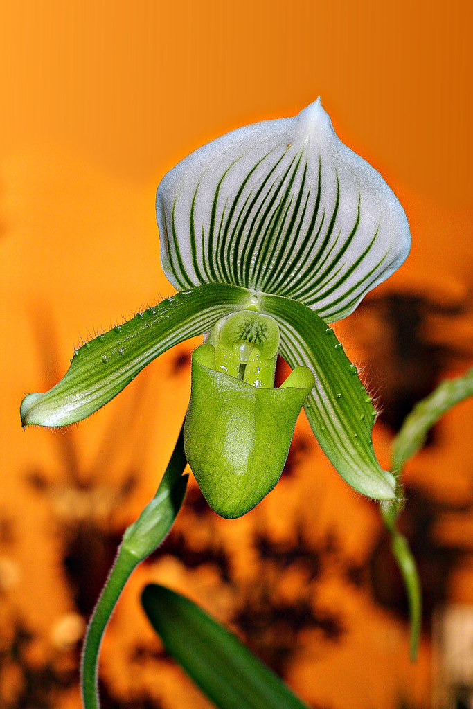
Hi All - Here's a sample orchid from a local orchid fair. I was particularly attracted by the green/white against orange background. Comments and crits as usual are welcome.
David
 Helpful Posts: 0
Results 1 to 8 of 8
Thread: Orchid
-
9th June 2009, 03:15 PM #1


- Join Date
- Apr 2008
- Location
- Cheshire and Dumfries & Galloway
- Posts
- 732
- Real Name
- David
Orchid
-
9th June 2009, 07:03 PM #2
- Join Date
- Mar 2009
- Posts
- 2,522
Re: Orchid
The orange background certainly gives this image impact. The orchid seems a little over sharpened or maybe it is just the texture of the petals.
-
10th June 2009, 12:36 AM #3

- Join Date
- Apr 2009
- Location
- Menominee, MI
- Posts
- 348
- Real Name
- Kori

Re: Orchid
I love the orange background also! Nice capture!
Thanks for sharing!
Kori
-
10th June 2009, 12:54 AM #4

- Join Date
- Jun 2008
- Location
- California,USA
- Posts
- 395
Re: Orchid
Hi David,
Nice shot esp the color selection.
- Any chance that you could have avoided the black portions in the orange background so that it would be a plain background?
- I see a glare (small one) on the green thick portion of the flower.
Am I too complaining?
~Ajith
-
10th June 2009, 11:50 AM #5
- Join Date
- Apr 2008
- Location
- Cheshire and Dumfries & Galloway
- Posts
- 732
- Real Name
- David
Re: Orchid
Hi Guys (including Batman44) - Thanks for the comments. Wirefox - I don't know enough about orchids to decide if this is oversharpened. Some of the flowers, this one included, seemed to me to have very sharp edges with many tiny hairs. Thus, I tried to sharpen to portray this. A problem does arise because these flowers also have very diffuse markings, thus oversharpening can destroy that subtlty. Overall, you've got a point.
Ajith - The original had a brighter, lighter band across the top. This I removed by creating a new layer and filling it with a gradient made from the LHS and RHS orange red colours. I then carefully, with a soft brush, erased what was not needed of that layer. I decided to leave the darker shapes in the lower half to give an impression of depth and to keep a bit of interest. It's the large phallic green leaf that bothers me most. As for the glare, yes you're too picky!!
Batman44 - Thanks.
Cheers
David
-
10th June 2009, 12:01 PM #6Moderator

- Join Date
- May 2008
- Location
- Windsor, Berks, UK
- Posts
- 16,768
- Real Name
- Dave Humphries :)
Re: Orchid
Oh well, if Ajith's going to be pedantic
, can I join in? ")
Hi David,
These are just my general ruminations, prompted by Ajith's comments, more along the lines of 'in a perfect world where everything is under the photographer's control' rather than the real world.
a) The pale, rectangular intrusion in bottom right corner is a distraction and shouldn't be there compositionally.
b) I think the background patterns contribute where they fall mainly below the bloom itself, so removal of the topmost one on right would help.
c) if one were an artist, or a flower arranger, I think a different arrangement of the two 'other' green elements at the bottom would improve the composition. I think they help, and 2 is better than 1, making 3 green things altogether when you count the stalk of the main subject. Being behind the subject, but in front of the orangy background gives a depth to the image. Not sure I like them overlapping the main subject though, but I cannot decide.
d) It may benefit from some dodging to bring up the whites of the bloom just a bit more.
Have I over analysed it? probably
I like the general composition, colours, lighting/shadows, focus, depth of field and exposure, all in all a striking image. That's 7 pluses and only 4 little minuses, you're winning!
Well done,
-
10th June 2009, 06:05 PM #7
- Join Date
- Apr 2008
- Location
- Cheshire and Dumfries & Galloway
- Posts
- 732
- Real Name
- David
Re: Orchid
Hi Dave - Thanks for the comments. That's what I like about this site - high quality constructive criticism! As soon as I read the words "pale, rectangular intrusion..." I looked and groaned. I had spent substantial time removing a worse part of the image at the top and thinking how clever I was to be able to do it, but then missed another obvious blemish. I think the other points come down to taste and the reality of the capture. Thanks again for taking the time to analyse this work.
Cheers
David
-
11th June 2009, 09:09 AM #8

- Join Date
- May 2008
- Posts
- 245
Re: Orchid
orange color has always been attractive
but the orchid is the subject and it seems to me that orchid is doing itsself well by overriding the orange color the bottom part of the pic with its blurred back ground is far better than its top part version a different shooting angle getting that bottom background all over, would have made this pic more watchable and enjoyable but the orchid is doing pretty well, getting all the viewers attention

 Reply With Quote