
 Helpful Posts:
 Here - two versions of a portrait.
The question is - which of them is better composed - #1 or #2?
... Just for fun - I'll try to use poll. Not sure what will come out of that...
Of course, any other feedback is welcome, as always :)
#1
#2
View Poll Results: Which is better?
- Voters
- 18. You may not vote on this poll
-
#1
10 55.56% -
#2
8 44.44%
Results 1 to 20 of 22
-
27th January 2012, 05:08 AM #1

- Join Date
- Nov 2011
- Location
- San Diego, CA
- Posts
- 163
Very basic question on composition
-
27th January 2012, 05:59 AM #2

- Join Date
- Nov 2011
- Location
- Gold Coast, Australia
- Posts
- 1,798
- Real Name
- Mal
Re: Very basic question on composition
Um... Is it me or are these the same photo?
-
27th January 2012, 06:05 AM #3
- Join Date
- Nov 2011
- Location
- San Diego, CA
- Posts
- 163
Re: Very basic question on composition
The photo is the same. The composition is a little different. More black in #2 on the right and on the top. Originally Posted by Goldcoastgolfer

-
27th January 2012, 06:36 AM #4

- Join Date
- Apr 2008
- Location
- London
- Posts
- 1,502
- Real Name
- Ian
Re: Very basic question on composition
The difference is minimal, although by providing a little more 'space' or headroom, it does add to the subject's gaze into space in the top right hand corner.
-
27th January 2012, 11:00 AM #5
- Join Date
- Nov 2011
- Location
- Gold Coast, Australia
- Posts
- 1,798
- Real Name
- Mal
Re: Very basic question on composition
Had to look at there pictures side by side

-
27th January 2012, 08:07 PM #6
- Join Date
- Jan 2009
- Location
- South Devon, UK
- Posts
- 14,900
Re: Very basic question on composition
Portraits can easily suffer from being cropped too tight, but I think there is sufficient space for him to 'look into' with #1 so there isn't any need for that extra space with the second.
-
27th January 2012, 08:56 PM #7

- Join Date
- Dec 2011
- Location
- Veracruz, México
- Posts
- 126
- Real Name
- Mario
Re: Very basic question on composition
In an art like photography there are no absolute "bests". In my opinion #1 has enough space for him to look at, #2 don't looks bad but that much space don't adds anything. I'd rather have cropped more tightly vertically. Originally Posted by vladimir
-
28th January 2012, 12:14 AM #8

- Join Date
- Jan 2012
- Location
- Burnley, Lancashire
- Posts
- 126
- Real Name
- Peter
Re: Very basic question on composition
I like #2 with the extra space
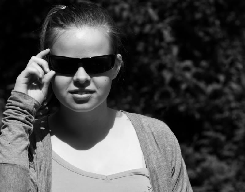
Heres one I took of my niece is there too much space or does it work?
-
28th January 2012, 11:15 AM #9Moderator

- Join Date
- May 2008
- Location
- Windsor, Berks, UK
- Posts
- 16,775
- Real Name
- Dave Humphries :)
Re: Very basic question on composition
I did vote for number 2, but you're right, there's too much at the top. Originally Posted by Photon Hacker
Hi Vladimir,
Personally, I'd crop so the eyeline is directly into the corner, rather than exiting on right hand side (RHS) or top.
Because there was more space on RHS in #2, it got my vote.
EDIT:
Oh, I dunno, I keep going back and changing my mind where the eyes are looking now (like one of those paintings where the eyes follow you around the room
  )
)
Cheers,
-
28th January 2012, 07:01 PM #10
- Join Date
- Jan 2009
- Location
- South Devon, UK
- Posts
- 14,900
Re: Very basic question on composition
Peter. With that shot, I would crop away quite a bit from the right side, and change the width/height ratio to suit.
If she was looking to the right I would say that more space would work. But even then, not quite so much as you have here.
-
28th January 2012, 07:59 PM #11
- Join Date
- Nov 2011
- Location
- San Diego, CA
- Posts
- 163
Re: Very basic question on composition
Kinda interesting how the vote is exactly 50/50, eh?
I was hoping for more consistency one way or the other. This, probably, proves that there are no rules, there are just opinions?..
I'll tell you a little story about where my question is coming from, if you don't mind?
My first edit was #1. I thought it was well balanced due to the lines of his right and left arms exiting through the corners, while still living enough space on the right and the top. And it just looked "right" to me.
I sent it to the boy's mom, and she was very happy. So, she forwarded it to many of her friends. One of those friends was a highly experienced, professional artist/architect. And she (the Architect) said - a little more space on the right and the top would be nice, so the boy has more space to look into.
At first I objected, and said - yes, he does have this black empty "space" to look into, but there is absolutely nothing interesting there to look at! I thought it was a little disturbing to the viewer - to follow the boy's eyesight through the picture, and find nothing... Also - the amount of pure black in the picture reached about 50% - which seemed excessive to me.
Our Architect, in a meantime, saw version #2 also, and said - "better". And I thought - she is a pro - she must know what she is talking about... And hence - my poll...
And my answer is... that there is no answer
And I thought - there were "rules and regulations" to this
-
28th January 2012, 08:10 PM #12
- Join Date
- Nov 2011
- Location
- San Diego, CA
- Posts
- 163
Re: Very basic question on composition
Peter, I hope your question was not directed at me
I am the one who DOES NOT know the answers...
But I do have opinions")
My opinion about that shot is that the main problem with it not "too much space", but "too much sun"
Specifically - the big bright (overexposed even, maybe?) spot - is not exactly in the spot where our attention should be directed...
-
28th January 2012, 08:14 PM #13
- Join Date
- Jan 2012
- Location
- Burnley, Lancashire
- Posts
- 126
- Real Name
- Peter
Re: Very basic question on composition
Thanks Geoff....I see a lot of portraits taken in the landscape format....all the old time photographers at our club have the same idea as you...Portraits have to be in portrait format...I myself think mine works quite well.This is what photography is all about.We all like different ways to break the rules of old school images.
p.s Vladimir my question was open to anyone who wanted to reply
Thanks for your comment.
Peter
-
28th January 2012, 09:45 PM #14
- Join Date
- Jan 2009
- Location
- South Devon, UK
- Posts
- 14,900
Re: Very basic question on composition
It doesn't have to be in 'portrait' format. A square crop would look fine. And if you 'moved' her a little to the right that would be OK with me. Yes, her nose wouldn't then be on the thirds line but that is only a rough guide.
At the moment, to me, she looks cramped up on the left side while there is available space on the right. A bit like this was just a quick snap which didn't work out quite correct.
But that's just my opinion; let's see what others have to say.
-
29th January 2012, 01:03 AM #15
- Join Date
- Dec 2011
- Location
- Cobourg, Ontario, Canada
- Posts
- 2,509
- Real Name
- Allan Short
Re: Very basic question on composition
Have you seen some of the building that they are building to-day, a lot of them I do not care for.
Allan
-
29th January 2012, 08:05 AM #16
- Join Date
- Nov 2011
- Location
- Gold Coast, Australia
- Posts
- 1,798
- Real Name
- Mal
Re: Very basic question on composition
I like to prescribe to the theory of "Be aware of the rules, but your own eye and style take precedence" Originally Posted by vladimir
-
29th January 2012, 07:38 PM #17
- Join Date
- Nov 2011
- Location
- San Diego, CA
- Posts
- 163
Re: Very basic question on composition
Hi Mal, Originally Posted by Goldcoastgolfer
I like your theory VERY much!
To apply it to myself, though, I'd have to produce slightly modified version of it: "I am aware of the rules, but MY own eye and style take precedence". And this is hard for me to subscribe to, due to lack of experience and low level of satisfaction in my own results. I hope I can grow into that position one day. I really do.
-
29th January 2012, 07:52 PM #18
- Join Date
- Nov 2011
- Location
- Gold Coast, Australia
- Posts
- 1,798
- Real Name
- Mal
Re: Very basic question on composition
Honestly, your eye and your style won't necessarily come from more experience, but rather from the experiences that you've already had that have shaped you into the person that you are. I've no doubt based on what I've seen from your work that you've already had people respond positively to your photos. Listen to them. This should tell you that your eye and style are appealing and that you DO create great results. Originally Posted by vladimir
That doesn't mean we stop learning and trying to improve, but don't get too hard on yourself either. The last thing you want to do is kill the passion you obviously have for photography by worrying too much about the "right" way of doing things. Instead, use what you learn to improve your own style, but don't let it rule how you do things.
Ultimately people like different things, and what appeals to some may not appeal to others. The only thing you can be 100% satisfied in is that you were true to yourself. But you can't do that if you start listening to other people over your own inner voice.
Good luck with your journey. I'm looking forward to seeing more of YOUR work
Oh, and for the record, I voted for your original photo
-
30th January 2012, 03:30 AM #19
- Join Date
- Nov 2011
- Location
- San Diego, CA
- Posts
- 163
Re: Very basic question on composition
Thanks Mal!
It all sounds great and is highly motivational!
-
5th February 2012, 01:18 AM #20

- Join Date
- Nov 2011
- Location
- Northern Illinois, USA
- Posts
- 394
- Real Name
- Paul
Re: Very basic question on composition
I like number 1 best. For me, his eyes are the strongest focal point of the image. I'd crop it even tighter, even cutting off some of his hair to bring his eyes up to near the 1/3rd position in the photo. This is a nice sharp image but it looks a tiny bit too bright for my tastes on my calibrated monitor. Just my opinion... good job. Handsome young man.


 Reply With Quote