COMPOSITION: RULE OF THIRDS
The rule of thirds is a powerful compositional technique for making photos more interesting and dynamic. It's also perhaps one of the most well known. This article uses examples to demonstrate why the rule works, when it's ok to break the rule, and how to make the most of it to improve your photography.
OVERVIEW
The rule of thirds states than an image is most pleasing when its subjects or regions are composed along imaginary lines which divide the image into thirds — both vertically and horizontally:


It is actually quite amazing that a rule so seemingly mathematical can be applied to something as varied and subjective as a photograph. But it works, and surprisingly well. The rule of thirds is all about creating the right aesthetic trade-offs. It often creates a sense of balance — without making the image appear too static — and a sense of complexity — without making the image look too busy.
RULE OF THIRDS EXAMPLES
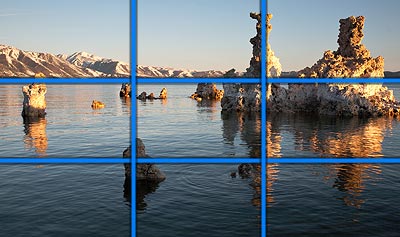
OK, perhaps you can see its usefulness by now — but the previous example was simple and highly geometric. How does the rule of thirds fare with more abstract subjects? See if you can spot the lines in the photo below:
 |
||
| Original Photo | Show Rule of Thirds | |
Note how the tallest rock formation (a tufa) aligns with the rightmost third of the image, and how the horizon aligns with the topmost third. The darker foreground tufa also aligns with both the bottommost and leftmost thirds of the photo. Even in an apparently abstract photo, there can still be a reasonable amount of order and organization.
Does this mean that you need to worry about perfectly aligning everything with the thirds of an image? Not necessarily — it's just a rough guideline. What's usually most important is that your main subject or region isn't always in the direct middle of the photograph. For landscapes, this usually means having the horizon align with the upper or lower third of the image. For subjects, this usually means photographing them to either side of the photo. This can make landscape compositions much more dynamic, and give subjects a sense of direction.

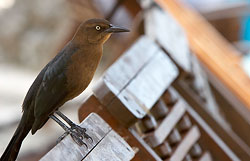 Off-Center Subjects Can Give a Sense of Direction
In the examples above, the biker was placed more or less along the leftmost third since he was traveling to the right. Similarly, the bird is off-center to give the impression that it can take off to the right at any moment. Off-center composition is a powerful way to convey or imply motion.
IMPROVE EXISTING PHOTOS BY CROPPING
Thus far we've looked at examples that have satisfied the rule — but what if they hadn't? Wouldn't they have still appeared just fine? Perhaps, but usually not. The next set of examples shows situations where cropping to enforce the rule yields a clear improvement. It is often quite amazing how you can resurrect an old photo and give it new life with something as simple as cropping it.
 Uncropped Original
(horizon in direct middle)
 Cropped Version
(horizon now along upper third of image)
In the example above, part of the empty sky was cropped off so that the horizon aligned with the upper third of the image — adding emphasis to the foreground and mountains.
LIMITATIONS

But what if there's simply nothing in the image to apply the rule of thirds to? Although rare, this might be the case for extremely abstract compositions. However, the "spirit of the rule" may still apply: give the photo a sense of balance without making the subject appear too static and unchanging.
In the example to the right, there's not even a single line or subject that can be aligned with the thirds of the image. Perhaps the C-shaped region of light can be grouped into an upper, middle and lower thirds region, but that's probably pushing it. Regardless, the image is on average brighter to the left compared to its right — effectively creating an off-center composition.
BREAKING THE RULE OF THIRDS
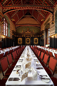
Example of beneficial symmetry
By now, the free-spirited and creative artist that you are is probably feeling a bit cramped by the seeming rigidity of this rule. However, all rules are bound to be broken sooner or later — and this one's no exception. It's time to unleash that inner rebel. That is, as long as it is for a good cause.
A central tenet of the rule of thirds is that it's not ideal to place a subject in the center of a photograph. But what if you wanted to emphasize the subject's symmetry? The example to the left does just that.
Similarly, there's many other situations where it might be better to ignore the rule of thirds than to use it. You might want to make your subject look more confronting, for example. Alternatively, you might want to knock things out of balance.
It's important to ask yourself: what is special about this subject, and what do I want to emphasize? What mood do I want to convey? If the rule of thirds helps you achieve any of these goals, then use it. If not, then don't let it get in the way of your composition.