TUTORIALS: COLOR PERCEPTION
Color can only exist when three components are present: a viewer, an object, and light. Although pure white light is perceived as colorless, it actually contains all colors in the visible spectrum. When white light hits an object, it selectively blocks some colors and reflects others; only the reflected colors contribute to the viewer's perception of color.

HUMAN COLOR PERCEPTION: OUR EYES & VISION
The human eye senses this spectrum using a combination of rod and cone cells for vision. Rod cells are better for low-light vision, but can only sense the intensity of light, whereas while cone cells can also discern color, they function best in bright light.
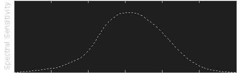
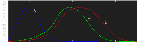
Three types of cone cells exist in your eye, with each being more sensitive to either short (S), medium (M), or long (L) wavelength light. The set of signals possible at all three cone cells describes the range of colors we can see with our eyes. The diagram below illustrates the relative sensitivity of each type of cell for the entire visible spectrum. These curves are often also referred to as the "tristimulus functions."
| Select View: | Cone Cells | Luminosity |
Raw data courtesy of the Colour and Vision Research Laboratories (CVRL), UCL.
Note how each type of cell does not just sense one color, but instead has varying degrees of sensitivity across a broad range of wavelengths. Move your mouse over "luminosity" to see which colors contribute the most towards our perception of brightness. Also note how human color perception is most sensitive to light in the yellow-green region of the spectrum; this is utilized by the bayer array in modern digital cameras.
ADDITIVE & SUBTRACTIVE COLOR MIXING
Virtually all our visible colors can be produced by utilizing some combination of the three primary colors, either by additive or subtractive processes. Additive processes create color by adding light to a dark background, whereas subtractive processes use pigments or dyes to selectively block white light. A proper understanding of each of these processes creates the basis for understanding color reproduction.


The color in the three outer circles are termed primary colors, and are different in each of the above diagrams. Devices which use these primary colors can produce the maximum range of color. Monitors release light to produce additive colors, whereas printers use pigments or dyes to absorb light and create subtractive colors. This is why nearly all monitors use a combination of red, green and blue (RGB) pixels, whereas most color printers use at least cyan, magenta and yellow (CMY) inks. Many printers also include black ink in addition to cyan, magenta and yellow (CMYK) because CMY alone cannot produce deep enough shadows.
| Additive Color Mixing (RGB Color) |
||
|---|---|---|
| Red + Green | → | Yellow |
| Green + Blue | → | Cyan |
| Blue + Red | → | Magenta |
| Red + Green + Blue | → | White |
| Subtractive Color Mixing (CMYK Color) |
||
|---|---|---|
| Cyan + Magenta | → | Blue |
| Magenta + Yellow | → | Red |
| Yellow + Cyan | → | Green |
| Cyan + Magenta + Yellow | → | Black |
Subtractive processes are more susceptible to changes in ambient light, because this light is what becomes selectively blocked to produce all their colors. This is why printed color processes require a specific type of ambient lighting in order to accurately depict colors.
COLOR PROPERTIES: HUE & SATURATION
Color has two unique components that set it apart from achromatic light: hue and saturation. Visually describing a color based on each of these terms can be highly subjective, however each can be more objectively illustrated by inspecting the light's color spectrum.
Naturally occurring colors are not just light at one wavelength, but actually contain a whole range of wavelengths. A color's "hue" describes which wavelength appears to be most dominant. The object whose spectrum is shown below would likely be perceived as bluish, even though it contains wavelengths throughout the spectrum.
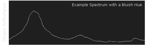
Although this spectrum's maximum happens to occur in the same region as the object's hue, it is not a requirement. If this object instead had separate and pronounced peaks in just the the red and green regions, then its hue would instead be yellow (see the additive color mixing table).
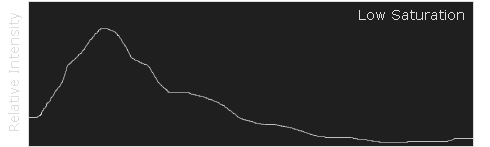
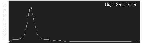
A color's saturation is a measure of its purity. A highly saturated color will contain a very narrow set of wavelengths and appear much more pronounced than a similar, but less saturated color. The following example illustrates the spectrum for both a highly saturated and less saturated shade of blue.
| Select Saturation Level: | Low | High |