
 Helpful Posts:
 I'd welcome some honest C&C please. Personally I like high contrast images with bold colour but I do wonder whether I overcook things sometimes.
These were taken with the WB set on Daylight to bring up the blue. Post processing included boosting the vibrance generally, a very small amount of saturation boost and increasing the reds/yellows specifically.
These are some of a series I took at sunrise at Wellington Point, Brisbane yesterday.
Results 1 to 16 of 16
Thread: Overcooked, too much contrast?
-
26th March 2011, 10:26 PM #1


- Join Date
- Dec 2010
- Location
- Brisbane, Australia
- Posts
- 441
- Real Name
- Mark
Overcooked, too much contrast?
-
26th March 2011, 10:43 PM #2

- Join Date
- Nov 2010
- Location
- Manila, Philippines
- Posts
- 3,804
- Real Name
- Willie or Jiro is fine by me.
Re: Overcooked, too much contrast?
Mark, take this with a grain of salt. The colors are really great. Even your POV when you took the shot is really awesome. IMHO, what hurt your images is the lack of texture and detail on the black areas. When I saw these images, The colors and the perspective immediately caught my attention. After some time, my eyes wandered on the black areas and I seem to be wanting to find out what they are. They may be rocks with some vegetation in it but I am not so sure. I wish you could help me eyes by adding some fill lights on those areas because they seem to occupy a good portion of space in the frame. Just a thought. Lovely shots, btw. I wish I could visit some of these places some time. Cheers.

-
26th March 2011, 11:02 PM #3
- Join Date
- Dec 2010
- Location
- Brisbane, Australia
- Posts
- 441
- Real Name
- Mark
Re: Overcooked, too much contrast?
Thanks Jiro. I'm conscious of the fill light issue and always try to add some back in after playing with the exposure. But this is often lost again (I see now
 ) when increasing the contrast with Levels or Curves. Point taken
-
26th March 2011, 11:12 PM #4
- Join Date
- Dec 2008
- Location
- New Zealand
- Posts
- 17,660
- Real Name
- Have a guess :)
Re: Overcooked, too much contrast?
My thought exactly too. As a rule, you generally only get away with large black areas with silhouette shots. Originally Posted by jiro

eg:
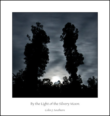
What you CAN to though, is control the scene by choosing how much detail you reveal; in this shot, the lower portion of the scene is actually green grass on a golf course - the green wasn't a good colour to have in this shot - and it wasn't very interesting detail - but I needed SOMETHING there ... so I left just a hint of detail (you may or may not be able to see it depending on you well your monitor is setup)

-
27th March 2011, 12:14 AM #5
- Join Date
- Dec 2010
- Location
- Brisbane, Australia
- Posts
- 441
- Real Name
- Mark
Re: Overcooked, too much contrast?
Shadows lightened by ~15%. Any better?
I noticed that a lot of detail in the black foreground area is lost when displayed in Flickr.

-
27th March 2011, 01:23 AM #6
- Join Date
- Nov 2010
- Location
- Manila, Philippines
- Posts
- 3,804
- Real Name
- Willie or Jiro is fine by me.
Re: Overcooked, too much contrast?
A bit better, Mark. On a personal taste I would like to see some more fill light on those areas. It would now probably be a matter of screen calibration. Mine is not that professionally calibrated so go easy on me. Originally Posted by whited3
 I did some minor edit if you don't mind. Here's my adjustment.

Maybe a bit bright for your taste.
Last edited by jiro; 28th March 2011 at 01:26 PM.
-
27th March 2011, 01:56 AM #7

- Join Date
- Nov 2010
- Location
- Owensboro, KY
- Posts
- 1,530
- Real Name
- Brian
Re: Overcooked, too much contrast?
Really nice contrast in the skies! I need to learn how to do that.
-
27th March 2011, 02:11 AM #8
- Join Date
- Dec 2010
- Location
- Brisbane, Australia
- Posts
- 441
- Real Name
- Mark
Re: Overcooked, too much contrast?
I've had a go at the others too.


Jiro, your version looks (on my monitor) as if its lit up like a neon sign") This screen calibration thing is a real pain. I use three different monitors; my desktop (used for editing) and work laptop were calibrated using a Spyder. My work extended desktop monitor was not. Even so, I still get three vastly different interpretations of the same image.
This screen calibration thing is a real pain. I use three different monitors; my desktop (used for editing) and work laptop were calibrated using a Spyder. My work extended desktop monitor was not. Even so, I still get three vastly different interpretations of the same image.
-
27th March 2011, 02:29 AM #9

- Join Date
- Feb 2011
- Location
- Seymour, Vic., Land of Oz
- Posts
- 1,293
- Real Name
- Ken Outch
Re: Overcooked, too much contrast?
From someone who is still trying to come to terms with the coarser details, let alone the finer technical points of photography, IMHO for pictures 2 and 3, bringing out the finer detail of the pier walkways seemed to totally distract my attention from the magnificent skies which were what really grabbed and focussed my attention in the first shots.
-
27th March 2011, 07:56 AM #10
- Join Date
- Nov 2010
- Location
- Owensboro, KY
- Posts
- 1,530
- Real Name
- Brian
Re: Overcooked, too much contrast?
I agree with Ken that the dark area of the first photo seems fine to me since there is such a beautiful sky to look at. For the second and third, the pier is so large in the photo, it's basically the subject - whether by intent or not - and would benefit from increased detail.
-
27th March 2011, 09:54 AM #11
- Join Date
- Dec 2010
- Location
- Brisbane, Australia
- Posts
- 441
- Real Name
- Mark
Re: Overcooked, too much contrast?
Brian, happy to PM you my work flow process (for what its worth) if you're interested. I use CS5. Originally Posted by speedneeder
-
28th March 2011, 11:35 AM #12

- Join Date
- Feb 2010
- Location
- Cairns, Queensland
- Posts
- 304
- Real Name
- Grant
Re: Overcooked, too much contrast?
Your question is really interesting, Mark. I think that a landscape image should be a reasonably accurate depiction of what you actually saw. Digital manipulation to enhance and recreate the "atmosphere" of the scene is very appropriate, but when colours are saturated to an unrealistic level it does not do the scene justice and is easily spotted by anyone with a basic knowledge software. I sometime think we are in danger of creating an expectation of a virtual world that bears little resemblance to nature. As to whether your images are overcooked I guess you are the one who was on the spot and best to judge whether they are a good representation of what you saw on the day. I know, from my experience early morning fishing in SE Queensland I have seen colours (particularly the sky) as vibrant as your images.
Grant
-
28th March 2011, 01:23 PM #13
- Join Date
- Sep 2010
- Posts
- 2,064
Re: Overcooked, too much contrast?
What a great conversation! I just want to add my vote by saying that I like the reworked view with the dark rocks lightened and I like the pier photos like you had them originally. These are beautiful! They feel, to me, just like the ocean at daybreak - fresh, blue, with that white/gray, misty wash over everything. The reflections and " lightly shadowed" areas (where the sun hasn't hit, yet) on the pier, just take me there!!! So fresh! I'm jealous.
-
28th March 2011, 02:12 PM #14Moderator

- Join Date
- Feb 2009
- Location
- Glenfarg, Scotland
- Posts
- 21,402
- Real Name
- Just add 'MacKenzie'
Re: Overcooked, too much contrast?
I agree Originally Posted by Katy Noelle
One of these discussions where there isn't 'right' and 'wrong'. Instead there are people having a really constructive discussion about aspects of picture-making. It's one of the threads you want to store in the memory banks and point people to when they're trying to learn about different ways of managing light.
-
28th March 2011, 09:39 PM #15
- Join Date
- Dec 2010
- Location
- Brisbane, Australia
- Posts
- 441
- Real Name
- Mark
Re: Overcooked, too much contrast?
Ok, so I see two (probably) separate goals in post processing these sort of images. The first would be a record of that moment/place, true to what was at the time (although I accept this is open to interpretation). The second goal would be "art" for want of a better word. What I'm after in my landscape shots is somewhere in between these two, something not surreal or saturated and still true to the original image.
IMHO that is
-
28th March 2011, 09:54 PM #16
- Join Date
- Nov 2010
- Location
- Owensboro, KY
- Posts
- 1,530
- Real Name
- Brian
Re: Overcooked, too much contrast?
I would love to know some details of your work flow. I hope to be trying my hand at some landscapes in the smokey mountains soon


 Reply With Quote