
I'm learning Photoshop Elements and am having a bit of a struggle understanding how to decide on a color space to work in. My end product will be to print using an ink jet printer. What most confuses me is the idea of choosing a color space outside of the range of my monitor.
I believe most (all?) monitors operate in the sRGB color space; if so, why would I choose AdobeRGB1998 as my work space? Wouldn't I be unable to see on the monitor the full gamut of Adobe1998 if the monitor only shows the smaller gamut of sRGB?
 Helpful Posts: 0
Results 1 to 4 of 4
-
25th April 2008, 03:06 AM #1New Member

- Join Date
- Apr 2008
- Posts
- 1
Choosing a color space to work in...
-
25th April 2008, 08:50 PM #2Administrator
- Join Date
- Apr 2008
- Location
- California, USA
- Posts
- 1,473
- Real Name
- Sean
Re: Choosing a color space to work in...
Your choice of which working space to use is indeed quite important for effective color management. Some of the most common working spaces are sRGB and AdobeRGB1998, because the closely mimic the gamut of monitors and inkjet printers, respectively. If you have not done so already, be sure to also take a look at this site's page on choosing between AdobeRGB1998 and sRGB as your working space, and more fundamentally, on color spaces in general.
So which one should you choose? There are many opinions, but perhaps the most mainstream is to choose a working space which closely matches the color space of your intended output device. This way you minimize color distortion caused by perceptual or relative colorimetric rendering during the color space conversion (from your working space into the output/printer space). Here's some example color gamuts for a mainstream photo lab printer ([COLOR=DimGray]gray) compared to sRGB ([COLOR=White]white) and Adobe RGB 1998 ([COLOR=Black]black). In this situation, note how anything larger than sRGB would be overkill (although the astute observer might realize this image is just a cross-section of the color space at 50% luminance, but it still illustrates the point).
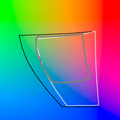
comparison of color spaces at 50% luminance
(example of where anything larger than sRGB might be overkill)
On the other hand, you are right to be cautious of using a working space which is larger than what your LCD/CRT monitor can actually display. Keep in mind though that many photo-oriented LCD monitors can actually output the full Adobe RGB 1998 color space, including the one I am viewing with as I write this. If you were using a monitor which can only output sRGB, then the worst that will happen is that working space colors outside the gamut of your display (likely the intense greens in the case of Adobe RGB) will be compressed to fit within your display's color gamut by Photoshop's color management engine. This would require a bit of a leap of faith on your part when doing any image editing, but is by no means a reason in itself not to use a color space which is larger than your monitor's.
If you do not use a color space which is similar to your printer, then there is really no way of fully utilizing the the printer's color gamut, which is also not a good option.
-
25th April 2008, 09:24 PM #3New Member
- Join Date
- Apr 2008
- Location
- Montreal Canada
- Posts
- 8
Re: Choosing a color space to work in...
As mentioned by McQ it is a good idea to use as wide a color space as possible. Most printers will be able to give you a better result using a wider color space such as prophoto (16 bit files) or adobe RGB (either 16 bit or 8 bit). You should test this on your printer. Limiting yourself to sRGB is not the way to get the best image from your printer. A lot of photographers shoot using the raw format for this reason.
Shooting raw lets you make prints with a wider range of colors than a jpg sRGB file.
If you post to the web you just have to convert your file to sRGB after you have resized it.
Make sure you save with a new name! so you don't overwrite your original (if jpg).
-
25th April 2008, 09:48 PM #4Administrator
- Join Date
- Apr 2008
- Location
- California, USA
- Posts
- 1,473
- Real Name
- Sean
Re: Choosing a color space to work in...
To add to Poljazz's comments, one thing to be very cautious of when using a high gamut working space is image posterization. This is why it is so important to use RAW and 16 bit files when working in spaces as large as ProPhoto RGB and others. If you are not, that is one reason why I would advise using a working space which is no larger than your output/printer space.

 Reply With Quote