
 Helpful Posts:
 Originally Posted by xpatUSA
 Hello gang. First post. Maybe this can help:
Beyond the locus of spectrally pure colors
Mark D. Fairchild* Munsell Color Science Laboratory, RIT, Rochester, NY, USA 14623-5604
The spectrum locus of a CIE chromaticity diagram defines the boundary within which all physically realizable color stimuli must fall. While that is a physical and mathematical reality that cannot be violated, it is possible to create colors that appear as if they were produced by physically impossible stimuli. This can be accomplished through careful control of the viewing conditions and states of adaptation.
The CIE 1931 xy chromaticity diagram is widely recognized by the horseshoe shape of the spectrum locus. This locus of spectrally pure colors is simply defined by the standard color matching functions, the computation of chromaticity coordinates, and the fundamental limitation of monochromatic stimuli that have energy at a single wavelength and no energy at any other visible wavelength.1 More commonly, the spectrum locus is referred to as defining the boundary of the gamut of all physically possible colors. This, however, is an error. The spectrum locus does define the gamut boundary for physically possible stimuli, but it does not limit the color appearance of stimuli. Specification of color appearance requires more information about the stimulus and adaptation state of the observer2 and it is entirely feasible that a stimulus in one viewing condition might appear to be produced by a stimulus from beyond the locus of spectrally pure colors in some other reference viewing condition.
Results 41 to 54 of 54
-
10th June 2015, 01:25 AM #41New Member

- Join Date
- Jun 2015
- Location
- Santa Fe
- Posts
- 5
- Real Name
- Andrew Rodney
Re: Why Do We Need Colour Working Spaces
-
10th June 2015, 02:40 AM #42
- Join Date
- May 2015
- Location
- Toronto, Ontario, CA
- Posts
- 12
Re: Why Do We Need Colour Working Spaces
This is quite helpful to me. Thank you, very much.
Mick
-
10th June 2015, 05:38 PM #43
- Join Date
- Feb 2012
- Location
- Texas
- Posts
- 6,956
- Real Name
- Ted
Re: Why Do We Need Colour Working Spaces
Welcome Andrew, I will tread lightly in your presence . . Originally Posted by Andrew Rodney

Personally, I was being pedantic about the grammar more than about the meaning of the phrase.
Of course, in the USA, it is quite common to use a noun as an adjective, which Mark D. Fairchild has done. If only he had graced it with a hyphen . . .
I suppose that either phrase is equally good, since we all know what is meant. As a speaker of English English, I'll continue with "spectral locus" anyway.Last edited by xpatUSA; 10th June 2015 at 05:46 PM.
-
12th June 2015, 08:09 PM #44New Member
- Join Date
- Jun 2015
- Location
- Santa Fe
- Posts
- 5
- Real Name
- Andrew Rodney
Re: Why Do We Need Colour Working Spaces
All capture devices produce RGB, not Lab, not CMYK. If you examine RGB working spaces simply plotted in 2D in ColorThink, you can see they have very simple and similar shapes. They look triangular in shape, while the Spectrum Locus is a rather different 'horse shoe' shape. That is because RGB working spaces are defined using three primaries (Red, Green Blue) along with a white point and some TRC/Gamma setting. They are all 'synthetic' constructs, some, like ProPhoto RGB have no basis in any real capture or output device. It's got a very large color gamut that attempts to fill as much of the of the Spectrum Locus as the designers specified with the location of those three primaries. Two primaries fall outside the Spectrum Locus. No matter how one extends the primaries, it's difficult to make them large enough to enclose all the colors represented in the Spectrum Locus (all three primaries would be 'illegal' or imaginary 'colors' as would anything that doesn't fit within the Spectrum Locus). It's dangerous to define color numbers (I'd prefer to call them device values) that do not represent colors. The area of ProPhoto RGB or any color space we create that falls outside that plot are not visible and thus not colors. So there is one reason we don't have an RGB color space (working space being one kind of color space) that contains all the colors defined within the Spectrum Locus. Originally Posted by Mick Sang
You could just use Lab but there are issues with that color model and further, to get Lab you have to convert from some RGB color space.
You mention numerical values. But numerical values are not necessarily colors. Case in point besides just those numerical values in ProPhoto RGB that fall near or at the primaries outside the Spectrum Locus. Take sRGB. it isn’t possible to see a difference between values 2/255/240 and 1/255/240 as they have the same Lab values (90/-54/-8). Two sets of RGB numbers define one color. As such, we can’t count that example as defining two colors, we can’t see any difference between them.
Simple matrix profiles of RGB working spaces when plotted 3 dimensionally illustrate that they reach their maximum saturation at high luminance levels. The opposite is seen with print (output) color spaces. Printers produce color by adding ink or some colorant, while working space profiles are based on building more saturation by adding more light due to the differences in subtractive and additive color models. To counter this, you need a really big RGB working space like ProPhoto RGB again due to the simple size and to fit the round peg in the bigger square hole. RGB working spaces have shapes which are simple and predictable. Then there is the issue of very dark colors of intense saturation which do occur in nature and we can capture with many devices. Many of these colors fall outside Adobe RGB (1998) and when you encode into such a space or smaller, you clip the colors to the degree that smooth gradations become solid blobs in print, again due to the dissimilar shapes and differences in how the two spaces relate to luminance. So the advantage of ProPhoto isn't only about retaining all those out-of-gamut colors it's also about maintaining the dissimilarities between them, so that you can map them into a printable color space as gradations rather than ending up as blobs.
Here is a link to a TIFF that I built to show the effect of the 'blobs' and lack of definition of dark but saturated colors using sRGB (Red dots) versus the same image in ProPhoto RGB (Green dots). The image was synthetic, a Granger Rainbow which contains a huge number of possible colors. You can see that the gamut of ProPhoto is larger as expected. But notice the clumping of the colored red vs. green dots in darker tones which are lower down in the plot. Both RGB working space were converted to a final output printer color space (Epson 3880 Luster).
http://www.digitaldog.net/files/sRGB...ot_Granger.tif
There are no perfect RGB Working Spaces or we'd use just one. As discussed earlier, if you use an Adobe raw converter, it processes the data using ProPhoto RGB primaries but a linear TRC. As such, using any working space but ProPhoto RGB for your master renderings from raw potentially clips colors you captured and might be able to print. So the decision of what color space to use is pretty simple here, even Adobe recommends ProPhoto RGB/16 bit in the Lightroom preferences. You could convert into Lab but again, you're coming from ProPhoto RGB, with the possible illegal colors, anything outside ProPhoto RGB doesn't become color values or colors we can see even if it did fit perfectly within the Spectrum Locus (which wouldn't be the case anyway). So at least with Adobe raw converters, the 'answer' is pretty simple; encode into the ProPhoto RGB working space.
-
13th June 2015, 08:10 PM #45

- Join Date
- Jul 2012
- Location
- Cheshire, England
- Posts
- 3,668
- Real Name
- Dave
Re: Why Do We Need Colour Working Spaces
Hi Andrew,
I too step with trepidation, but could you expand on "illegal" or "imaginary" colours. There are lots of non-human eyes that can see beyond the Spectrum Locus. Could these appear anywhere in an rgb (or maybe I mean "rgb type") plot?
Dave
-
13th June 2015, 08:27 PM #46Moderator

- Join Date
- Mar 2012
- Location
- Ottawa, Canada
- Posts
- 21,945
- Real Name
- Manfred Mueller
Re: Why Do We Need Colour Working Spaces
Originally Posted by davidedric
This is a 2-D representation of the Prophoto colour space, with the CIE 1931 xy chromaticity diagram showing the colours normally considered visible to humans. All of the points of the ProPhoto diagram (the trianglular shaped part of the diagram) that fall outside of the CIE diagram are viewed as "imaginary colours"; i.e. we can't see them.
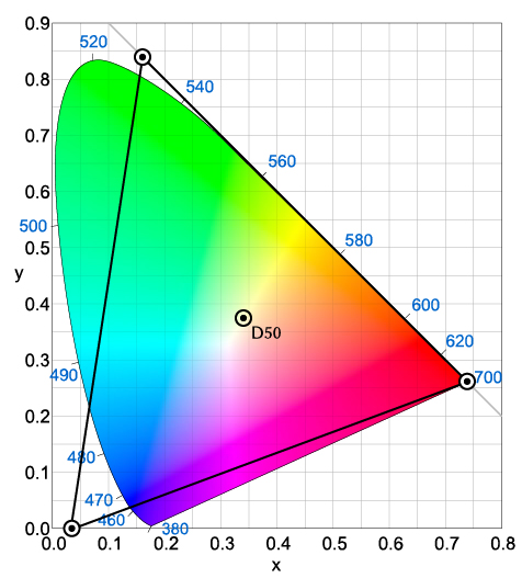
Attribution: "CIExy1931 ProPhoto" by Fred the Oyster - en:File:CIExy1931 ProPhoto.png. Licensed under Public Domain via Wikimedia Commons - https://commons.wikimedia.org/wiki/F...1_ProPhoto.svgLast edited by Manfred M; 13th June 2015 at 08:43 PM.
-
13th June 2015, 08:34 PM #47New Member
- Join Date
- Jun 2015
- Location
- Santa Fe
- Posts
- 5
- Real Name
- Andrew Rodney
Re: Why Do We Need Colour Working Spaces
"Colors" quotes on purpose we humans can't see (based on the Standard Observer). Originally Posted by davidedric
Color, is a perceptual property. So if you can't see it it's not a color. Color is not a particular wavelength of light. It is a cognitive perception that is the end result of the excitation of photoreceptors followed by retinal processing and ending in the visual cortex. We define colors based on perceptual experiments.
Therefore, a coordinate in a "color space" outside the spectrum locus is not a color. The two of three primaries of ProPhoto RGB is an example.
Non humans and their perceptual property isn't pertinent in this context. You can't map an imaginary color from one colorspace to another as the math (and experimental data) for each colorspace breaks down outside the spectrum locus.
-
13th June 2015, 08:54 PM #48
- Join Date
- Dec 2011
- Location
- Cobourg, Ontario, Canada
- Posts
- 2,509
- Real Name
- Allan Short
Re: Why Do We Need Colour Working Spaces
Andrew just a little side note, you need to watch the use of the word Adobe as the company has a number of programs that use raw converters. Adobe LR assigns their ProPhoto RGB to images in development, whereas images that are converted using Adobe Camera Raw can be assigned Adobe RGB 1998, ColorMatch RGB, ProPhoto RGB, or sRGB IEC61966-2.1. It is just that you make it sound as if using an Adobe product the auto default is to ProPhoto which it is not. Your other statement I agree with.
Cheers: Allan
-
13th June 2015, 09:10 PM #49New Member
- Join Date
- Jun 2015
- Location
- Santa Fe
- Posts
- 5
- Real Name
- Andrew Rodney
Re: Why Do We Need Colour Working Spaces
They have just two raw converters: ACR (Adobe Camera Raw, a plug-in) and Lightroom, both use the same engine (the ACR engine) which uses the same processing. That's how we can go back and forth from ACR and LR. Originally Posted by Polar01
There's no assigning of any profiles. All the processing is conducted using ProPhoto RGB primaries with a linear TRC. One can convert that to any number of color spaces in both products, and even convert to Lab or an output color space.Adobe LR assigns their ProPhoto RGB to images in development, whereas images that are converted using Adobe Camera Raw can be assigned Adobe RGB 1998, ColorMatch RGB, ProPhoto RGB, or sRGB IEC61966-2.1.
Again, it isn't since the color space all processing is conducted within is ProPhoto RGB primaries and a vastly different TRC than ProPhoto RGB so one shouldn't call this unnamed color space ProPhoto RGB.It is just that you make it sound as if using an Adobe product the auto default is to ProPhoto which it is not.
MelissaRGB is ProPhoto RGB primaries with a 2.2 TRC and it's used in Lightroom outside soft proofing for the RGB numbers and the Histogram, but again, that's not the color space the processing is conducted within.
http://www.ppmag.com/reviews/200701_rodneycm.pdf
-
19th June 2015, 12:49 AM #50
- Join Date
- May 2015
- Location
- Toronto, Ontario, CA
- Posts
- 12
Re: Why Do We Need Colour Working Spaces
Thank you Mr. Rodney and all who have kindly replied to my question as to why we need colour spaces and why the Spectrum-Locus could not suffice as the one and only working space. My question now seems to be rather infantile. But, I do not regret asking it at all. Instead, I realise that one must begin somewhere in order to gain a deeper understanding of complex concepts and sometimes such innocent questions are necessary.
After reading and giving a good deal of thought to all of the information in this thread, it seems to me that the answer to my question, in a nutshell, is as follows:
The Spectrum-Locus is a 2 dimensional plot of the the results of certain visual stimuli to the brain of the standard human observer which are defined as colours. It is not a mathematical grid or matrix designed to suit the functionality of machines. It is rather a map or record of the average human's response to a range of frequencies of light which, as visual stimuli, create responses in the brain which are subsequently defined as colours.
Conversely, RGB working spaces are mathematical matrices of RGB numerical values which are derived from and bounded by the three primaries, include a white point and Tone Reproduction Curve/Gamma, are plotted in 3 dimensions and are designed to encompass portions of the Spectrum-Locus. As such, RGB working spaces accommodate the functionality of RGB capture and output devices.
If any portion of this is not correct, I would appreciate a correction. Otherwise, Im sure this could be said better. But, I think I'm on the right track. Please correct me, if not.
Thanks very much, again, for all of your help with this topic.
Mick
-
19th June 2015, 12:59 AM #51New Member
- Join Date
- Jun 2015
- Location
- Santa Fe
- Posts
- 5
- Real Name
- Andrew Rodney
Re: Why Do We Need Colour Working Spaces
Sounds good to me Mick. Carry on.
-
19th June 2015, 02:31 AM #52Moderator
- Join Date
- Mar 2012
- Location
- Ottawa, Canada
- Posts
- 21,945
- Real Name
- Manfred Mueller
Re: Why Do We Need Colour Working Spaces
Not just RGB; CMYK as well for any printed output. CMYK in its purest form, of course as adding spot colours or additional neutrals and colours expand the CYMK workspace.
-
19th June 2015, 12:49 PM #53
- Join Date
- Feb 2012
- Location
- Texas
- Posts
- 6,956
- Real Name
- Ted
Re: Why Do We Need Colour Working Spaces
I read somewhere that Melissa uses the sRGB tone reproduction curve of 2.4 gamma and 12.92 for the straight bit, so I guess you meant 2.2 equivalent? Is Melissa white point also D65, not D50? Originally Posted by Andrew Rodney
Pardon my pedantry.Last edited by xpatUSA; 19th June 2015 at 02:45 PM. Reason: deleted confusing link comment
-
19th June 2015, 02:07 PM #54
- Join Date
- May 2015
- Location
- Toronto, Ontario, CA
- Posts
- 12
Re: Why Do We Need Colour Working Spaces
Well, with your vote of confidence, I am extremely happy. Thank you,very much. Originally Posted by Andrew Rodney
All the best,
Mick

 Reply With Quote