Helpful Posts:
 There's no question in my mind that a lot of studio still work looks more dramatic, on the net,
with a black background, but...a lot of perusing the "for sale" artistic websites tells me that black
isn't a popular background for the type of stuff that I cough out.
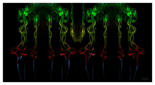
As I have been working with smoke of late, I offer this as a case in point...called The Valkyrie and
her Pet. With the exception of manipulation, the smoke on black is SOOC followed by an inverted image.
In your humble opinion...which might be more saleable at the local Art Show? FYI...it is 40" wide @ 300ppi.
Results 1 to 20 of 25
Thread: Still trying to grasp colors
-
25th March 2015, 11:11 AM #1

- Join Date
- May 2011
- Location
- SE Michigan
- Posts
- 4,511
- Real Name
- wm c boyer
Still trying to grasp colors
-
25th March 2015, 11:25 AM #2

- Join Date
- Dec 2009
- Location
- WNY
- Posts
- 36,717
- Real Name
- John
Re: Still trying to grasp colors
I believe you'll find a market for both, but the version on black will have more appeal to various age groups. My first comment upon seeing the blue on black version was "wow", instant appeal.
-
25th March 2015, 11:28 AM #3
- Join Date
- Mar 2015
- Location
- Torbay
- Posts
- 39
- Real Name
- Mike Langdon
Re: Still trying to grasp colors
Personally I really love the white background, I think it would look very nice framed as a piece of art. I would happily have it on my wall

-
25th March 2015, 11:34 AM #4

- Join Date
- Dec 2013
- Location
- Florida USA/Dunstable Beds.
- Posts
- 1,435
- Real Name
- Brian Grant
Re: Still trying to grasp colors
Blue/black or white/gold?
Is this a dress thing????
Both are interesting but I would crop to a banner/panorama format. The vacant top third doesn't add much to the linear image.
-
25th March 2015, 02:04 PM #5

- Join Date
- Jul 2011
- Location
- British Columbia, Canada
- Posts
- 7,244
- Real Name
- Christina
Re: Still trying to grasp colors
Hi Chauncey,
Absolutely gorgeous, and simply amazing. While I love the blue and black, if hanging on a wall in my home I would go for the white and gold for the simplicity and more neutral colouring.
-
25th March 2015, 02:34 PM #6Moderator


- Join Date
- Mar 2012
- Location
- Ottawa, Canada
- Posts
- 21,946
- Real Name
- Manfred Mueller
Re: Still trying to grasp colors
Chauncy - I think it really depends on what art people are selling. I suspect that this is really what is happening here.
I find that smoke works best on dark, and I do think that the two images that you show clearly demonstrate that this type of photography works better on the black than white. Frankly, one doesn't see too much smoke photography for sale...
Just as an aside; when people approached me to buy some of my work it was either my night shots or my snow shots, so it really doesn't much matter. You need to establish your own market niche and try to sell what you consider sellable. Tell all those street vendors with the paintings done on black velvet that dark backgrounds don't sell...
-
25th March 2015, 02:52 PM #7
- Join Date
- Dec 2013
- Location
- Turkey
- Posts
- 12,779
- Real Name
- Binnur
Re: Still trying to grasp colors
I like them both, but I would buy the white one. I agree with Brian about the crop.
-
25th March 2015, 03:11 PM #8
- Join Date
- Dec 2009
- Location
- WNY
- Posts
- 36,717
- Real Name
- John
Re: Still trying to grasp colors
As a sometimes practicing artist, I think the white background can sometimes symbolizes a creativity block, it sometimes hinders writers and artists when the creative juices just aren't flowing. Artists have a tendency to want to fill the void.
-
25th March 2015, 04:46 PM #9

- Join Date
- Jun 2013
- Location
- Chennai India
- Posts
- 627
- Real Name
- Haseeb Modi
Re: Still trying to grasp colors
I think each has its own place. The first one may do well in a dark lit bar or pub whereas the second image will go with brighter surroundings.
-
25th March 2015, 04:55 PM #10
- Join Date
- May 2011
- Location
- SE Michigan
- Posts
- 4,511
- Real Name
- wm c boyer
Re: Still trying to grasp colors
Okay...as the girl/bear is on it's own layer and you were going to hang it in your living room...
what colors would be most pleasing?
-
25th March 2015, 05:01 PM #11
- Join Date
- Dec 2013
- Location
- Florida USA/Dunstable Beds.
- Posts
- 1,435
- Real Name
- Brian Grant
Re: Still trying to grasp colors
Well, as graphic, not representational art I would offer it in both and probably add a few more color combinations.
White on gold would look good, black on white and vice versa. Red/white, red/gold, pale green/ochre, I would think I could spend a few hours coming up with combinations that would work.
-
25th March 2015, 05:28 PM #12Moderator
- Join Date
- Mar 2012
- Location
- Ottawa, Canada
- Posts
- 21,946
- Real Name
- Manfred Mueller
-
25th March 2015, 05:34 PM #13
- Join Date
- Dec 2009
- Location
- WNY
- Posts
- 36,717
- Real Name
- John
Re: Still trying to grasp colors
The blue/black is more pleasing. To me it has that "wow' factor while the white/gold seems more subtle. Even though both uses the same void space, the black seems more mysterious while the white seems sterile and unassuming. Originally Posted by chauncey

-
25th March 2015, 10:43 PM #14
- Join Date
- May 2011
- Location
- SE Michigan
- Posts
- 4,511
- Real Name
- wm c boyer
Re: Still trying to grasp colors
Interesting but...I always thought the word "tacky" is understated when referencing black velvet artwork.Tell all those street vendors with the paintings done on black velvet that dark backgrounds don't sell
With that mindset...why am I even considering black backgrounds...Dah")
-
25th March 2015, 10:57 PM #15Moderator
- Join Date
- Mar 2012
- Location
- Ottawa, Canada
- Posts
- 21,946
- Real Name
- Manfred Mueller
Re: Still trying to grasp colors
So tacky sells. Just ask Elvis... Originally Posted by chauncey
He seems to be one of the common black velvet "victims". I actually remember someone I knew who had one.
-
25th March 2015, 11:06 PM #16
- Join Date
- May 2011
- Location
- SE Michigan
- Posts
- 4,511
- Real Name
- wm c boyer
Re: Still trying to grasp colors
As did I. but the operative word in "one", and I spent my younger years in a Appalachia type area...I actually remember someone I knew who had one.
the one with the washing machine as a yard decoration.
-
26th March 2015, 12:04 AM #17
- Join Date
- Feb 2012
- Location
- Texas
- Posts
- 6,956
- Real Name
- Ted
Re: Still trying to grasp colors
Also, perhaps venturing away from pure neutral backgrounds into the world of opposite colors as in L*a*b* or even complementary coloring as found in house-painting for example Originally Posted by GrumpyDiver


Perhaps golden smoke over dark blue-cyan, for example. Just my 2cts worth . .
-
26th March 2015, 03:34 AM #18
- Join Date
- Mar 2015
- Location
- Euchareena NSW Australia
- Posts
- 50
- Real Name
- Trish Berthon-Jones
Re: Still trying to grasp colors
I agree with Saorsa. What appeals to people varies according to the current fashions in style, different personal tastes, and what emotions different colours evoke. If people are going to hang a picture, then they will be thinking 'what does this picture mean to me?', and 'how does it go with the room decor?' So, offer a few different colour renditions. I feel that both are great versions but each has a different feel. Very fluid images, I love them both. For me, the gold would look best on the walls at home. If displaying at an art show, you could perhaps consider a tryptich or a frame with four different colour renditions in it. I'd also support a bit of cropping. Play with it and see what you think. Gold on black, red on gold......
-
26th March 2015, 07:51 AM #19

- Join Date
- Dec 2013
- Location
- Chesterfield, Missouri/Melbourne, Australia
- Posts
- 17,827
- Real Name
- Izzie
Re: Still trying to grasp colors
I kinda like Ted's idea...complimentary colours -- there! do your homework...
+1 to Ted!!!
-
26th March 2015, 09:59 AM #20
- Join Date
- Nov 2013
- Location
- Lahore, Pakistan
- Posts
- 225
- Real Name
- Lukas Werth
Re: Still trying to grasp colors
For me it's the black one, hands down. Fascinating against merely interesting.
Lukas


 Reply With Quote