
so heres a few older pictures from before i started on here. comments and critiques please
i would love to get some feedback on these
 Helpful Posts: 0
Results 1 to 20 of 20
Thread: Feedback Please
-
16th March 2010, 04:20 PM #1


- Join Date
- Mar 2010
- Location
- New Jersey, USA
- Posts
- 505
- Real Name
- Jason
Feedback Please
Last edited by Dave Humphries; 16th March 2010 at 07:50 PM. Reason: separate images
-
16th March 2010, 04:48 PM #2
- Join Date
- Mar 2010
- Location
- New Jersey, USA
- Posts
- 505
- Real Name
- Jason
Re: Feedback Please
so it seems like the files got distorted a little when i uploaded them. sorry about that. im not sure how to fix it
-
16th March 2010, 04:57 PM #3Moderator

- Join Date
- Feb 2009
- Location
- Glenfarg, Scotland
- Posts
- 21,402
- Real Name
- Just add 'MacKenzie'
Re: Feedback Please
Okay. Originally Posted by Rhoads238

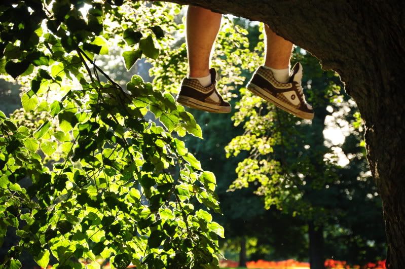
#4 is the pick of the bunch for me. There's a lovely narrative to it. You 'sort of' know what's going on, but don't know the whole story. And the lighting seems nice to me.
#1. I think the flower is in the wrong place. It would probably be a reasonably straightforward crop job to get it sitting on the vertical/horizontal thirds intersection at the bottom left. This, I think, would give it much greater prominence. The same action would address what I think is the excess vacant space at the top right.
#2 & #3. These are not unpleasant images. But I don't think they have anything that raises them up above the field and makes you want to stay with them for any time. Again, for me, the question is, 'What are these pictures trying to tell me?' On #2, the right-hand edge of the walkway is a vertical in the image. If you cropped along that edge, you would put more attention onto both it and the yachts on the left-hand side.
-
16th March 2010, 06:59 PM #4
- Join Date
- Oct 2009
- Location
- Maryland, USA
- Posts
- 1,015
- Real Name
- Rick
Re: Feedback Please
I can't add much to Donald's comments. I do really like #4, a brilliant shot.
One alternative suggestion for #1 (unfortunately not possible with the existing image). The same composition might work with a deeper depth of field. I could imagine the image with the flower and the water balancing opposing corners. But with the lily pads going out of focus, they cause the water to be perceived as background, so it doesn't balance the flower. If the flower/water balance was the intent, maybe try again with more depth of field.
Cheers,
Rick
-
16th March 2010, 08:18 PM #5
- Join Date
- Aug 2009
- Location
- Canada
- Posts
- 3,113
- Real Name
- Wendy
Re: Feedback Please
Agree with Donald and Rick on #4 great shot with great lighting. Also agree about the crop on #2 it would be a much stronger image if cropped to the right side of the dock.
Strangley I also like #3. I'm always finding this kind of thing where there is a beautiful nature scence with something manmade in the way, but that's the way things are, so I've kind of got it in my mind to capture these scenes and either make them completly ugly, or find some kind of compatibility between man and nature. That sounds silly, I know, but maybe someone will know what i mean. :/ Long story short. I like it, but can't really explain why. Sorry
#1 is my least favourite, although it is the type of shot I usually like to take, I think I agree with Rick that DOF and focus is just to soft to give it enough impact.
Wendy
-
16th March 2010, 08:33 PM #6

- Join Date
- Jun 2008
- Location
- Manchester
- Posts
- 787
- Real Name
- Mark Fleming
Re: Feedback Please
I like 'em all. The only thing I would say is that #1 lacks "pop" and maybe slightly underexposed. Apart from that they're great.

-
17th March 2010, 05:18 AM #7

- Join Date
- Sep 2009
- Location
- WA
- Posts
- 183
Re: Feedback Please
I love #4, it's brilliant. Agree about cropping #1. Overall really pleasing pictures, great start!
-
17th March 2010, 08:05 AM #8
- Join Date
- Aug 2009
- Posts
- 4,049
Re: Feedback Please
#1 lacks 'pop' as Mark said. If you edit and look at the histogram it's all bunched to the left (darks). It looks much improved with more lights added. You have to watch that, both when you take the shot and when you PP.
#2 looks much improved by completely cropping the boats on the right up to the right edge of the pier - always keep it simple is what I say. Have an edit I can post if you want.
#4 Yes, very good composition. Well caught.
-
17th March 2010, 01:46 PM #9
- Join Date
- Mar 2010
- Location
- New Jersey, USA
- Posts
- 505
- Real Name
- Jason
Re: Feedback Please
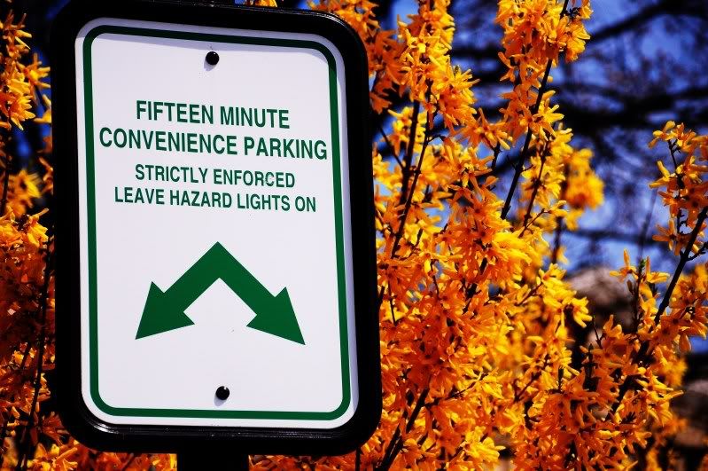
thanks everyone for the feedback. i see what your all saying about #1 not having enough pop. i also feel that this type of shot is over done. although that didnt stop me from taking it. by the way it was taken from a fountian at vanderbilt mansion in hyde park (as was #4). ill be posting many more pictures of the mansion soon. ill probably be taking many more pictures of the mansion in the future. the park itself and the sourrounding area is absolutely beautiful. im really looking foward to taking many more pictures of the hudson valley this spring. #2 was taken in obviously a convience parking spot at the culinary institute. and #3 was taken at a marina in new jersey near my home. #4 has to be one of my all time favorite shots although i wish it was a child sitting in the tree.
Carregwen- i would love to see your edited post.
-
17th March 2010, 01:57 PM #10Moderator

- Join Date
- May 2008
- Location
- Windsor, Berks, UK
- Posts
- 16,737
- Real Name
- Dave Humphries :)
Re: Feedback Please
It isn't? (a child sitting in the tree) Originally Posted by Rhoads238
Good set though, look forward to seeing more.
Do you have any PP software yet?
-
17th March 2010, 02:18 PM #11
- Join Date
- Oct 2009
- Location
- Maryland, USA
- Posts
- 1,015
- Real Name
- Rick
Re: Feedback Please
I took a quick pass at "popping" #1 a little in photoshop. Please let me know if it's okay to post this: otherwise, I'll take it down.
I did a filter>vignette>lighten to lighten the sides/corners. I don't know if what's there is lens vignette or post-processing. Then I did curves with "increase contrast" and rolled off the top end, because there isn't much in the histogram at t he right. Then I added a second curves layer with a gradient lighten to lighten the bottom more than the top.
This is rough, but an idea of another approach. You should be able to do similar operations in most PP software, although you may have to switch to GIMP to do some of the more complex things if you're using a simpler package as your main editor.
Cheers,
Rick

-
17th March 2010, 02:36 PM #12
- Join Date
- Mar 2010
- Location
- New Jersey, USA
- Posts
- 505
- Real Name
- Jason
Re: Feedback Please
no its not a child its a friend of mine who is 23 years old but still enough of a child to climb up in a tree. i have another picture of him posted in this fourm Creepy Door. hes the double exposure picture, leaning back in a chair. Originally Posted by Dave Humphries
still no PP softwear. i downloaded gimpshop but it wouldnt start up. a loading window would appear and a bar would go half way and freeze. im not sure as to why this happens though. i would love to have something for post processing but it seems a little like cheating. right now i dont use it because i want to work on composition and using the camera propperly. im hoping to get a copy of photoshop in the future though. im a little tight on money as im in college so my next purchase is going to be a quality tripod.
rick55- i dont mind at all if anyone edits my pictures. i love to see what other people would do. the vignette is from the lens i was using. again i dont have anything for post processing. good job overall though. im going to save your edited picture. i really like how the flower stands out more now.
-
17th March 2010, 08:11 PM #13
- Join Date
- Aug 2009
- Posts
- 4,049
Re: Feedback Please
Certainly! Originally Posted by Rhoads238
Before...
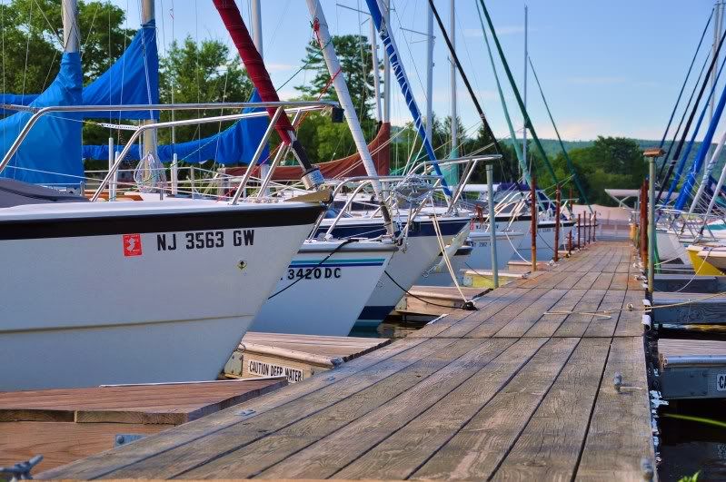
And after. I thought the boards a nice feature and they give a great sense of depth, and the boats on the left are the main subject. But by having that extra boat detail on the right you seemed to split the shot in two, with the empty (boardwalk) area in the centre. Now, the boardwalk seems to lead you into the boats and forces you to look to the left. It also gives the lines in the boards more emphasis. I also added a curves layer in CS4 to give it a bit more bite.
What a load of c**p I talk sometimes.")

-
18th March 2010, 01:26 AM #14
- Join Date
- Mar 2010
- Location
- New Jersey, USA
- Posts
- 505
- Real Name
- Jason
Re: Feedback Please
thanks for the insight on everything. the picture looks great. although i think i would leave a little more of the photo when croping. just to show how wide the pier is. however i do agree with you that it splits the picture if you dont crop it. so i may crop it but just alittle less. but everything else looks great. i definately see how croping it makes it look like your being lead to the yatches. Originally Posted by carregwen
-
18th March 2010, 10:32 AM #15
- Join Date
- Feb 2009
- Location
- Bucharest,Romania
- Posts
- 1,367
Re: Feedback Please
When someone sees lake flower and so on first impulse is toward poetry not war so below you'll see something which betters such feel.
Thank You for looking atLast edited by Dave Humphries; 18th March 2010 at 02:03 PM.
-
18th March 2010, 10:46 AM #16
- Join Date
- Aug 2009
- Posts
- 4,049
Re: Feedback Please
Actually, Radu, that is quite an improvement. I have always been a bit wary of the misty soft-focus look, but I think it definitely adds something here, and makes the viewer concentrate on the flower. Originally Posted by Radu Dinu Cordeanu
-
18th March 2010, 12:25 PM #17

- Join Date
- Jan 2010
- Location
- North Pole, Alaska
- Posts
- 247
Re: Feedback Please
Rob's crop does a lot to improve 2 by focusing the viewer's eye on the subject. I think you'll find if you try to include more of the pier you'll end up putting some of the distracting elements back in, especially the green and red poles on the right edge of the pier. Originally Posted by Rhoads238
4 is very good.
-
18th March 2010, 01:30 PM #18
- Join Date
- Jul 2009
- Location
- Kolkata - INDIA
- Posts
- 537
Re: Feedback Please
Well done Radu Originally Posted by Radu Dinu Cordeanu
-
18th March 2010, 03:18 PM #19
- Join Date
- Feb 2009
- Location
- Bucharest,Romania
- Posts
- 1,367
Re: Feedback Please
About the second I should be looked for the simetry as below.
Radu Dinu
-
18th March 2010, 03:31 PM #20
- Join Date
- Mar 2010
- Location
- New Jersey, USA
- Posts
- 505
- Real Name
- Jason
Re: Feedback Please
wow that looks amazing! great job. its far better than the original. i wish i did it myself. now im going to have to retake that shot on a foggy day so i can call it mine Originally Posted by Radu Dinu Cordeanu

i cant get over how good it looks. great job again... i was really excited to see this when i woke up today


 Reply With Quote