
 Helpful Posts:
 Took this today in colour, but with B&W conversion in mind.
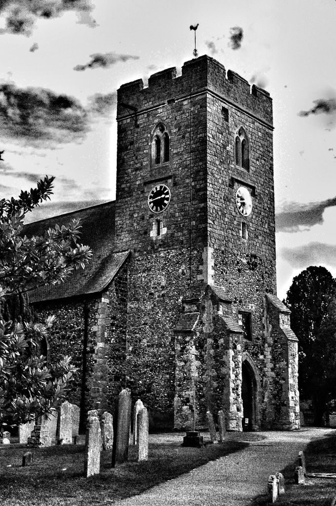
Only my second attempt at this kinda thing. Am I on the right track?
Was after a kinda etched look.
C&C welcomed please.
Results 1 to 5 of 5
Thread: The church (old Woking)
-
15th October 2012, 11:47 PM #1


- Join Date
- Nov 2011
- Location
- S, London
- Posts
- 168
- Real Name
- Steve
The church (old Woking)
-
16th October 2012, 12:00 AM #2
- Join Date
- Dec 2011
- Location
- Cobourg, Ontario, Canada
- Posts
- 2,509
- Real Name
- Allan Short
Re: The church (old Woking)
Steve: love the church, however I am not that keen on the way you converted to B&W, did you use a plug-in or did you do it yourself.
Cheers:
Allan
-
16th October 2012, 01:40 AM #3
- Join Date
- Oct 2012
- Location
- Portland Oregon
- Posts
- 161
- Real Name
- Connie Keyes
Re: The church (old Woking)
It is a little dark masking some of the detail of the stone, and the tree in the back is close to becoming a dark blot. The clock on the face/right is sort of blown out. It is a great building and will look really good with a fiddling. Ghosts of Christmas past will be lurking between the headstones before long.
-
16th October 2012, 02:33 PM #4
- Join Date
- Nov 2011
- Location
- S, London
- Posts
- 168
- Real Name
- Steve
Re: The church (old Woking)
Thanks for the feedback peeps.
Alan. I did the B&W conversion via an app on my iPad. I do all my PP on it at the moment as its all I've got at the present time. Would I be better of shooting in B&W to start with?
Connie, I think a little more tinkering is in order, thanks for the pointers.
-
16th October 2012, 06:46 PM #5Moderator

- Join Date
- May 2008
- Location
- Windsor, Berks, UK
- Posts
- 16,739
- Real Name
- Dave Humphries :)
Re: The church (old Woking)
Hi Steve,
I think you have overdone the contrast for my taste; in addition to crushed blacks there is blown sky.
You have done well on the perspective, the nearest corner of the tower, almost in the middle of the shot, is just on vertical as (I feel) it should be. Also the small amount of perspective distortion is just right for the composition - it looks natural.
I might try losing a small amount off the right hand edge; just enough to lose the distant headstone sitting on the path.
It is a bit "sharp in places and smudgy in others", which could be caused by several things; a jpg original processed and saved too many times, or sharpening applied with too a high threshold (possibly to avoid sharpeneing noise).
If you have a RAW original, I think there is potential to improve the result.
Hope that's helpful,

 Reply With Quote