
 Helpful Posts:
 ... or is subject matter?
Seems that this 'industrial' series of pictures are of little interest to members. I entered a few in Mini Comps and got poor results. Would love some constructive comment ... is it subject matter, the framing, lighting, picture quality whatever that does not appeal? If someone has the time to be candid please.
Results 1 to 20 of 22
Thread: Are they that bad?
-
16th September 2012, 11:41 AM #1


- Join Date
- Nov 2009
- Location
- Aussie in Norway
- Posts
- 901
- Real Name
- Ron
Are they that bad?
-
16th September 2012, 02:14 PM #2

- Join Date
- Jul 2008
- Location
- Southern California, USA
- Posts
- 17,394
- Real Name
- Richard
Re: Are they that bad?
Ron, just because your images did not get a lo of votes in the Mini Comp, that doesn't mean that they are bad. In fact, I think that #3 is quite interesting and nicely composed.
IMO, some times it is the "luck of the draw" when submitting an image to the Mini Comp. There are times in which I cannot make up my mind which images to vote for because they are all so good. There are other times when one or two images really stand out and there is no decision for which to vote. If you just happen to submit your image in a Mini Comp with the above parameters, it is difficult to get a lot of votes.
However, there have been other Mini Comps in which I cannot decide for which to cast my vote. In this case, it is not because many of the images are very good but because there is no image which I particuly consider good. Obviously, if a person is astute (lucky) enough to submit an image when the competition is lower, it is easier to gain votes.
I would not let a "poor showing" discourage you from submitting images.
OTOH: While the images in question are quite nice, they are (IMO) more of a documentary type, rather than stand alone images of the type which might receive a better showing.
-
16th September 2012, 02:36 PM #3

- Join Date
- Sep 2012
- Location
- Gloucester, UK
- Posts
- 334
- Real Name
- Warrick
Re: Are they that bad?
Hi
By the way first time on these forums. Anyway to your photos. Firstly the subject matter is boring to most people unless you are a digger spotter The main issue I have with them is framing. For the first shot I want to see the digger not the trees on the left in the background. So if you moved around to get more of the digger in shot or even got closer to focus on one area of the digger. Photo two again just changing your position would of helped with this shot, again maybe getting in closer might of helped. Photo three for me too much foreground that is not adding to the photo. Get closer so we can see more detail.
Monochrome shot. I would of focused on one thing not two. Also the sky for me is too bright and my eyes tend to focus on that. Last two photos, nice shots of trees
Anyway with critiques It's one persons opinion so that is mine. Hope it's been helpful. Others may disagree with me.
-
16th September 2012, 02:47 PM #4Moderator

- Join Date
- Feb 2009
- Location
- Glenfarg, Scotland
- Posts
- 21,402
- Real Name
- Just add 'MacKenzie'
Re: Are they that bad?
Despite some suggestions given from time-to-time about the fact that as we're a photographic learning forum, we should maybe try to apply some broad objective analysis to voting and consider the merits of all styles of picture, votes in all competitions tend to be biased towards the landscape type of image. Now, those that come up tops are usually very good, but they do tend to start with something of an advantage ... and that comes from a landscape shooter.
Some superbly crafted and technical images by the best of portraitists get nowhere in monthly competitions, for example.
So, what I'm suggesting is that these images are not vote winners. That is very different from saying they are not good images. I think they are, especially that fifth one. If you want to win competitions (or sell images) you have to appeal to the audience, not necessarily produce interesting images. Life's like that!Last edited by Donald; 16th September 2012 at 03:07 PM.
-
16th September 2012, 03:15 PM #5Moderator

- Join Date
- May 2008
- Location
- Windsor, Berks, UK
- Posts
- 16,739
- Real Name
- Dave Humphries :)
Re: Are they that bad?
Hi Ron,
I made the mistake of reading the other replies before writing this, but I did form my opinions before that, so let's hope I can remember
#1 there is too much to look at, if I were there, I would be framing on the bucket and rocks OR the pipework.
#2 I want to see 'the business end', but it seems to be partially buried in the rocks and the hose that loops out doesn't help, nor does the yellow bit top right.
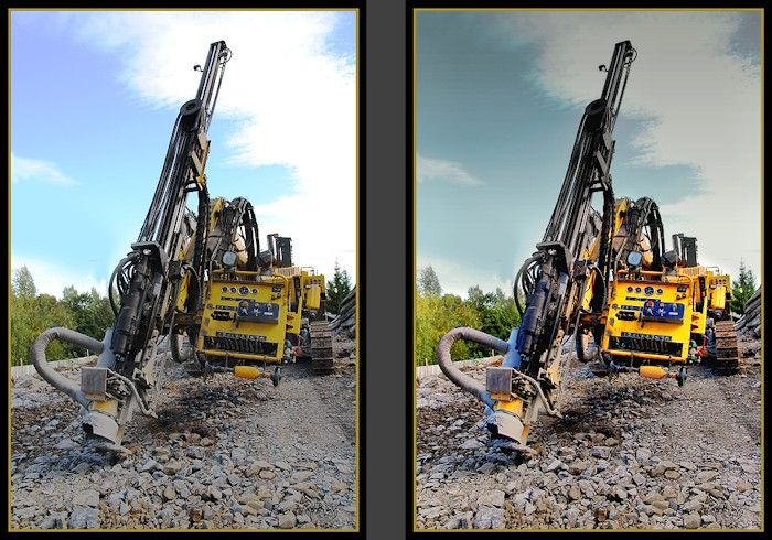
#3 the best, we can see what we're looking at, I might have done something with the subject vs sky brightness/contrast/saturation, to compensate for it being in shade.
In fact I can now see I was wrong about the business end (in #2) above - it isn't buried at all, but the similar rock dust colour and (unexpected) irregular shape meant I couldn't tell the depth of the image elements - not without other (missing) clues that might have been available from light/shadow, or a narrow DoF (in #2).
#4 too much to look at, although I might well have taken the same composition myself
Not sure that the tip of the elbow top left 'connecting' with the gap in the clouds did you any favours.
#5 and #6, just too much tree I'm afraid, even though you got focus on the man in #5, a closer crop might help
#6 not sure what the subject is - and I bet the red and green channels were blown on the central digger
Not sure what H&S is like in Norway, but I suspect you couldn't get in amongst the machines, even when they weren't in use
With that kind of access, and a fast wide/ultra-wide angle lens, used at wider apertures, the results would have been better.
Hope that helps,
-
16th September 2012, 04:54 PM #6
- Join Date
- Jul 2012
- Location
- Shoreham-by-Sea
- Posts
- 144
- Real Name
- Christopher
Re: Are they that bad?
I wonder if it would help if you asked yourself who your intended target audience is?
You might think in categories like these:
Advertising images for the digger manufacturer.
Advertising images to be used by a plant hire company.
Technical detail pictures for the engineer and mechanics enthusiast.
General interest pictures featuring the digger to be used in news items, or in PR material used by construction site developers or, conversely, by anti-digger environmental activists.
Once you know the interests and expectations of your audience, you are half way to knowing how best to present the digger - how best to photograph it, that is - to fit that niche.
-
16th September 2012, 06:09 PM #7
- Join Date
- Jan 2009
- Location
- South Devon, UK
- Posts
- 14,420
Re: Are they that bad?
I think, Ron, I mostly agree with previous comments.
For me, the technical quality of the photography is good but those camera angles lack interest.
Being more specific.
#1, I would have preferred the foreground rock to be sharper. But the overall scene is too static. For example, something similar but with one of the rocks being lifted by the bucket would have worked well.
#2, just doesn't say anything to me.
#3, shows the whole scene which adds more interest, but would have been better with an operator there as well; even if he was just standing beside the machinery.
#4 looks good to me. Possibly a bit confused on the right side, and still no operator etc.
#5 has interesting action but the camera angle just doesn't work cleanly for me. I can't clearly see what is actually happening.
#6 is a confused static scene.
But, I repeat, for me the actual camera work is good.
Can you do a reshoot and work with the operators? Recently, I had a 'with permission' visit to a couple of local demolition/building sites (some shots on my Project 52 thread). It meant donning hard hat, boots and yellow jacket but I was able to pick my camera angles. Which allowed me to include a bit more of the overall scene and show the general operation, even when machinery wasn't actually working.
For example Project 52 by Geoff F
But my photography, in poor weather conditions, isn't as good as yours.Last edited by Geoff F; 16th September 2012 at 06:14 PM. Reason: link added
-
16th September 2012, 06:22 PM #8
- Join Date
- Apr 2011
- Location
- Ontario (mostly)
- Posts
- 6,667
- Real Name
- Bobo
Re: Are they that bad?
On the subject of minis and diggers - there was one that did win and is a featured photograph.
https://www.cambridgeincolour.com/fo...chmentid=19028
-
17th September 2012, 12:45 AM #9

- Join Date
- May 2011
- Location
- Fort Mill, South Carolina, USA
- Posts
- 6,294
- Real Name
- Frank Miller
Re: Are they that bad?
Hi Ron, for images with strong bold lines like these, try comparing them with the frameless versions to see if perhaps the frame is competing with the image. I personally like frames for most images but they don't always add to the composition.
Most importantly, don't be discouraged. It take time to perfect your style so keep on shooting industrial images and you'll keep on improving!
-
17th September 2012, 01:20 AM #10

- Join Date
- May 2012
- Location
- Canada (west coast)
- Posts
- 2,021
- Real Name
- Bruce
Re: Are they that bad?
Good industrial photos are not easy to do, as I know only too well (I should post a picture I took a number of years ago of the coupling on a railway tank car
).
Having said that, I enjoyed a number of yours in particular 2 and 4.
-
17th September 2012, 01:48 AM #11

- Join Date
- Jul 2012
- Location
- NY
- Posts
- 277
- Real Name
- Orlando
Re: Are they that bad?
Ron, they are not bad photo's just what it's against. As I've already posted on the forum on the same question of one of my photo's, I've learned to look at my photo's differently if I want to compete.
I always vote whether I'm in it or not. Since it's a multi-selection vote I usually would vote for more than one photo if I find them interesting, in focus, with good white balance etc. But most important is that they stand out from the norm. If I find myself looking at photo for awhile then it'll most likely get my vote. I don't know if every other voter does the same but that's what I look for. Even if the others did the same, their taste are different. But for the most part I've found my votes have been pretty much in sync with others. There are a few times where mine didn't match and so I'll look at the ones that received the most votes just to see what brought there attention. So I'd know what to put in a competition.
But just remember, you don't know who is voting. The only thing you know is that they are members of CIC. So it can range from beginners to professionals.
-
17th September 2012, 03:03 AM #12
- Join Date
- Jul 2011
- Location
- A Pacific Island
- Posts
- 941
- Real Name
- Andrew
Re: Are they that bad?
Each of us takes into account many different things when voting on the mini comps as can be easily noted in the spread of the positive results. Personally, flowers and cats are the first I disregard unless something the photographer did caught my eye before I passed it. What really grabs me are wide gamut B&W, exotic locations, landscapes and environmental portraits. We all have different things that interest us and even if it's a good photograph, those biases will come into play. Farm equipment would have tweaked my interest over the excavating equipment. It's just my background. We all look for something that interests us and makes us linger for awhile. We all see construction equipment every day. The last two are just rocks and trees and dust. Again, every day items usually holding us up in traffic. I do have a suggestion for the first four though. In your photos they are idle chunks of semi-interesting steel. If you have access, get shots of them doing something the rest of us don't get to see from behind the barriers. Unusual situations. Something to make us stay longer. Environmental portraits of the operators seriously concentrating on their tasks would present more of a story. Give it another try.
PS. If anybody wants to learn more these mini comp forums are a good place to do it. Go back through the history, re-evaluate the submissions, and understand for yourself why one, or four, stood out.
-
17th September 2012, 03:26 AM #13

- Join Date
- Apr 2012
- Location
- Pennsylvania, USA
- Posts
- 292
- Real Name
- Scott
Re: Are they that bad?
Good competent shooting. I agree the subject matter is not the typical "vote bait" for this crowd, so that was an issue.
1.) First and foremost, I think a shot of something like this would be more much dramatic if you were very low to the ground, and thus you were shooting up at the machine from close up. That would make the machines look even bigger, and you'd get good texture on the rocks and on the scars on the teeth, etc...
Assuming you would not be embarassed lying on the ground in front of the construction crew, anyway.
2.) Also, it would be cooler if the machine appeared to be "doing something" powerful-looking in the shot. Scraping/digging/lifting/pulling etc...
-
17th September 2012, 05:06 AM #14
- Join Date
- Feb 2012
- Posts
- 396
Re: Are they that bad?
1. Your subject is a niche which is going to appeal to a smaller audience than more mainstream subjects such as landscapes.
2. I agree with all of Dave Humphries' comments regarding the images. There are a number of compositional problems that make it hard to see exactly what the subject of the image is. I think that in additional to better framing/cropping you could also make better use of depth of field to isolate the subject clearly and make it stand out frm the rest of the image.
-
17th September 2012, 09:20 AM #15
- Join Date
- Nov 2009
- Location
- Aussie in Norway
- Posts
- 901
- Real Name
- Ron
Re: Are they that bad?
I am really 'mind blown', not expecting such an active response. Thanks a million guys for taking time out to dig
 into my pictures. Very much appreciated and with a lot of very useful comment for me to chew over. When I did submit a few of these in Mini Comps I realised that they would not appeal to the masses but all good experience. I am not really into landscapes as such, preferring to try my hand at action ... this is also a weather factor!
The pics were 'opportunity' so I gave it a go ... also sneaking a few when the workers were absent. I could not get very close otherwise I would have used my Nikon prime 1.8 lens which I think would have allowed me more structure. Low angle shooting for some of the hardware would have been good but this ageing frame of mine limits what is possible ... that's an excuse, I should have shot blind holding the camera low down.
I am going to be AWOL (away) for 2-3 weeks but I promise that I will continue to review all that you say and follow up more in this thread.
Thanks again ... such activity is why this forum is so successful.
Ron
-
17th September 2012, 09:58 AM #16

- Join Date
- Sep 2009
- Location
- Burton on Trent, UK
- Posts
- 4,788
- Real Name
- Steve
Re: Are they that bad?
Is that your garden Ron; I like the sepia one and the dusty action shot. I read somewhere that diagonal lines represent action and vertical power, so maybe Mmm I don't know
-
17th September 2012, 01:20 PM #17

- Join Date
- Oct 2011
- Location
- Southern California
- Posts
- 310
- Real Name
- Virginia
Re: Are they that bad?
Hi, Ron -
I don't know whether this will help or not, but one of the things I do is keep a set of not more than ten images that I consider the best pictures I've ever taken. I may swap out one of the current stack in two years. But, I've been doing this for nearly 60 years, and two pictures that I took in the 1960s and 1970s are still in the top ten.
One is of JFK at the Tomb of the Unknowns in Arlington. It is "best" only because a puff of wind hit one of the state flags to his right exactly as I was snapping the photo so that the flag framed him on the top and right of the image. The soldier presenting the flag the sidewalk provided the left framing element and the sidewalk was the base of the photo.
The other is of bright red chairs in stacks 10-12 chairs high on the sidewalk in front of a bar in Strasbourg, Alsace, as I was walking from the train station to a meeting. The chairs and the sidewalk had just been washed and were sparkling in the morning sun which is evident but not obnoxious in the image. (Personally, I hate "sparkle/star" effects unless I choose to have them, but that's another story.)
Why I mention these two is that I recognized them as special when I first saw the print from the JFK picture and the slide from Strasbourg. And, they're two very different subjects.
Since then, I've become interested in patterns of various kinds. And, very often, those patterns involve "industrial" subjects, including military objects. About four years ago, I had the opportunity to visit the Rosie the Riveter National Historic Park where a Liberty ship is being restored up there in the SF Bay area. They're the ships that the US built in assembly-line fashion during WWII to ship stuff to Oz as well as to Europe. I took pictures of things like standpipes, stairs, railings, lifeboats, etc. But, the one that made my top ten is one of a hawser wrapped around the cleat making sure the ship was going to stay connected to the pier where it was docked. And, like the early pictures, I knew it was special when I saw it on my monitor.
Finally, the last picture to be swapped into the top ten (summer 2011) is a back/top lit dandelion in the El Dorado National Forest which has gone to seed and each of the little elements forming the fuzzball is in the depth of field and everything in the background and foreground is COMPLETELY out of focus. Again, I recognized this image as a particularly good one.
Why I mention these images is to give you the idea about focusing on what is unique about the view of each of the machines you're interested in capturing. Sometimes, it's the activity where you might want to have a really tight cropping of the machine and the area where it's digging. Sometimes, it's a big machine looking tiny in a particular environment, for example, on the edge of a fjord or, as I frequently see, working along a wash out in the middle of Death Valley.
The main thing that struck me about your imags was the fall colors in the last two images. At first, I thought were just more pretty fall pictures like all the others, except that, looking back, these two images are the only ones with fall color. What that says to me is that the fall colors are overwhelming what you really want me to see. And, that, in turn, tells me the leaves need to be majorly trimmed out, whether it's by taking new pictures or cropping the ones you already have.
Next, I've been keeping track for a while of what seems to fly in the themed challenge, not counting, but rather just mentally noting why I think the top three each month made the top three. Mostly, people pictures and, quite different but still striking in a traditional sense, landscape pictures seem to do it. Additionally, objects arranged in particularly unusual ways get noticed.
Finally, you might want to try approaching your machines the way I do trains. I'm interested in the springs and wheels in old trains, patterns as you might suspect. But, the interlocks between the cars are also interesting as are some degrading patterns, such as rust, mold, or worn paint, on the outside of various train cars. When I was a little kid, the depot at one end of a shortline (29 miles long) was across the street from my Dad's gas station so I used to go across the street and look at the details of the engine, particularly, but also of the caboose. So, even with my Brownie camera and my Kodak Hawkeye, I have pictures of the same objects that I now photograph with my DSLR.
So, keep on keepin' on and you'll get there.
virginiaLast edited by drjuice; 17th September 2012 at 01:26 PM. Reason: correct spelling and punctuation
-
17th September 2012, 05:52 PM #18
- Join Date
- May 2012
- Location
- Canada (west coast)
- Posts
- 2,021
- Real Name
- Bruce
Re: Are they that bad?
I like that idea. I've recently been looking at photos I took several decades ago and some of them still remain my favourites -- even if clarity with an old camera is not up to today's standards.Virginia wrote:
one of the things I do is keep a set of not more than ten images that I consider the best pictures I've ever taken. I may swap out one of the current stack in two years. But, I've been doing this for nearly 60 years, and two pictures that I took in the 1960s and 1970s are still in the top ten.
-
18th September 2012, 03:40 AM #19
- Join Date
- Feb 2012
- Posts
- 396
Re: Are they that bad?
One of the most important ways to improve is learning to not allow yourself the luxury of excuses/reasons when evaluating images. I know that I certainly used to let myself upgrade an image based on something that I couldn't do. Originally Posted by RonH

An OK photo would have been great if I had been able to get up a little higher - but that wasn't possible. Still I would evaluate the quality of the image, based on what it would have been, had I been able to get up higher. I was cutting myself some slack because I knew that there was a reason why the shot wasn't great. Unfortunately, truly great shots are ones that stand alone, without the need for an explanation of their shortcomings and when other people view our photos they don't know the backstory - the reasons/excuses. They only judge the image on its merits, and we need to do the same thing when evaluating our images in order to improve.
I'm definitely in agreement with Virginia, in that I have a top photo list. Unfortunately I have only really been shooting for a year so there are some images in my top list that I am not entirely happy with. However, I know that I am unhappy with them, have identified their faults and am working hard to capture more great images to replace them.
-
18th September 2012, 08:14 AM #20

- Join Date
- Feb 2011
- Location
- Hertfordshire, England
- Posts
- 1,437
- Real Name
- Philip
Re: Are they that bad?
Ron, I like the subject matter here, just as I enjoy photos of other technology - bridges, railways, traction engines, etc.
Although I don't have the experience to know for sure what the problem is, there is something about these shots that makes them 'not quite there'. The last two are just too chaotic, but in the others I suspect it could be that the lighting was rather harsh, and the exposure might have been slightly too great, as the light parts look too bright. Perhaps on a day with softer, warmer lighting, the first four images might have worked better for me.
I agree with Dave that #3 is the best composition. However, the bright sky overpowers the rest, and the machine doesn't pop out of the image as perhaps it should. On that day, a gentle GND filter might have helped, together with fill-in flash. Starting with the original full-size image, it should be possible to achieve those effects (and much better than this quick example!) in PP:
(Send a PM if you would prefer me to remove this.)
Cheers.
Philip


 Reply With Quote