
 Helpful Posts:
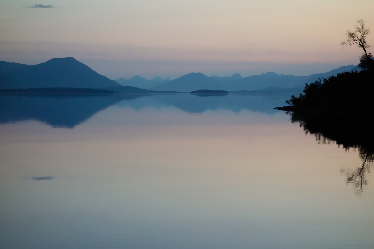
 I recently returned from a week in the southwestern Alaska backcountry, a float plane fly-in camp on Lake Nerka within the huge Wood-Tikchik State Park. It contains a series of glacially carved lakes connected by short stretches of river. My friends and I spent part of our time fly fishing, and the rest of the time was devoted to exploring and photographing this incredible wild and scenic area. I took three cameras with me on this sojourn.
Over the next few weeks I'll be posting some of the images here that I think are worth sharing with you, and/or that I would particularly appreciate feedback on. This first image falls into both categories. It was taken a little before midnight, not long after the sun had dropped below the horizon. It's one that I'm fond of, as it encompasses a piece of the view from the front of my tent, that wowed me each morning and evening. The camera used here was the recently released Sony RX100.
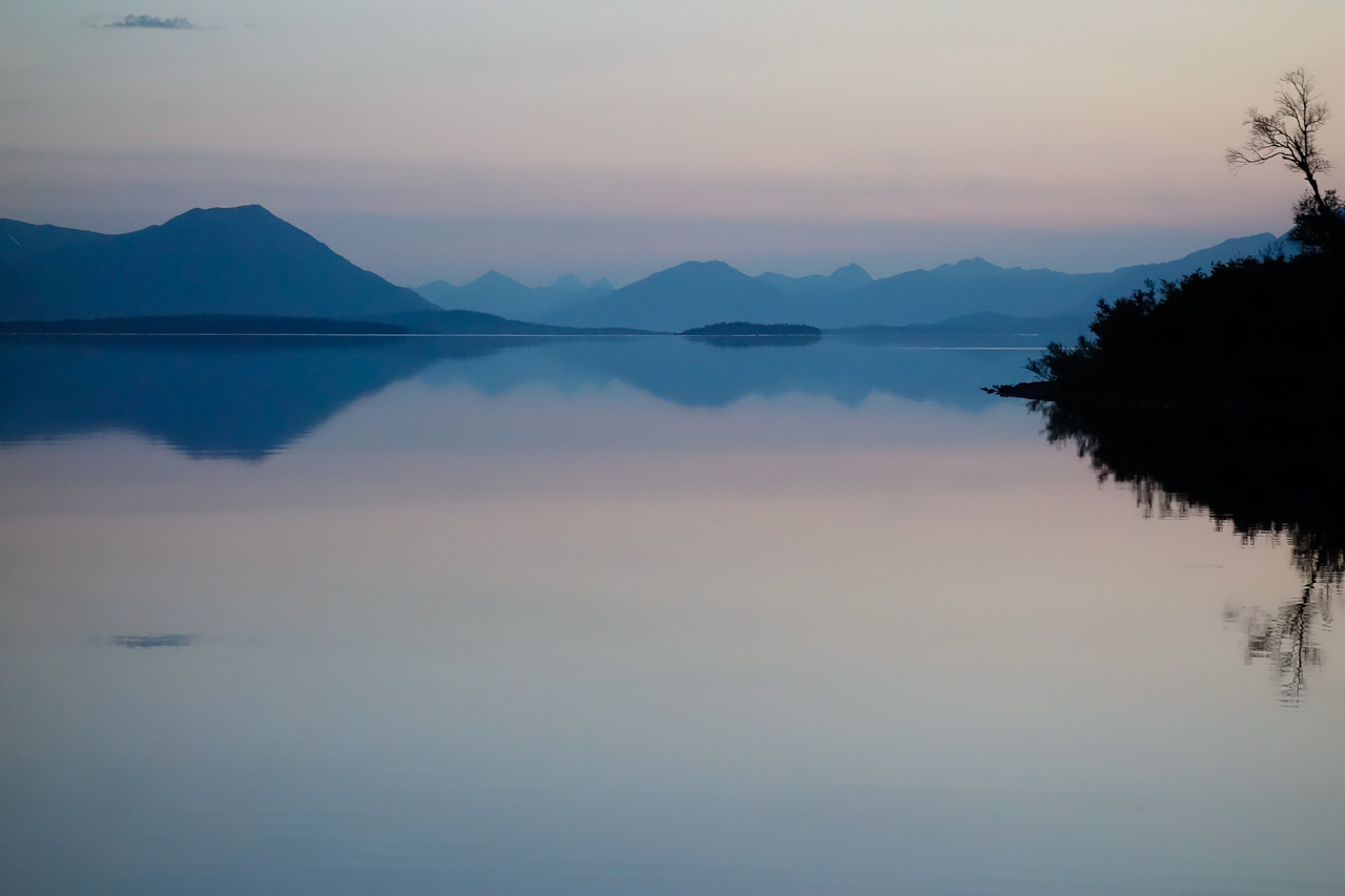
Now, I'm partial to the original composition, but a friend favors the second, more symmetrical one, where part of the bottom has been cropped. At times I find myself leaning that way, too. So maybe you good folks could help decide. I would greatly appreciate your views on whether the first, second--or indeed, either--of these versions is particularly engaging. And of course C&C of any other sort is welcome, as always.
(Please click on the images for larger, higher quality display.)
And here is the cropped version.
Results 1 to 19 of 19
Thread: Alaska #1. Midnight Sunset
-
25th August 2012, 06:20 PM #1

- Join Date
- Mar 2012
- Location
- Oregon, USA
- Posts
- 212
- Real Name
- Arlen
Alaska #1. Midnight Sunset
Last edited by Arlen; 25th August 2012 at 06:39 PM.
-
25th August 2012, 06:23 PM #2
- Join Date
- Jul 2012
- Location
- Chicago, IL, USA
- Posts
- 803
- Real Name
- Gretchen
Re: Alaska #1. Midnight Sunset
I don't know, I normally like things cropped close, but I think the first version shows the scope of the environment in which you are. Alaska is so much bigger than most maps show. I just love this photo.
-
25th August 2012, 07:31 PM #3

- Join Date
- Mar 2010
- Location
- New Jersey, USA
- Posts
- 422
- Real Name
- Steve
Re: Alaska #1. Midnight Sunset
Very difficult choice. Might favor #2. Both are ecellent. Cannot wait to see the rest.
-
25th August 2012, 08:00 PM #4

- Join Date
- Apr 2012
- Location
- New Jersey, USA
- Posts
- 800
- Real Name
- Ken Curtis
Re: Alaska #1. Midnight Sunset
I favor the first image, but would suggest cropping off the top immediately below that dark splotch in the upper left. That splotch draws my eye away from the remaining scenery, which you have captured magnificently. I love what you've done.
My other suggestion is to give up fly fishing and spend full time doing photography.
-
25th August 2012, 08:07 PM #5

- Join Date
- Aug 2012
- Location
- Northampton
- Posts
- 1,848
- Real Name
- Phil Page

Re: Alaska #1. Midnight Sunset
Both are great, a very peaceful and serene. Looks as if you have a choice of aspect ratios for your desktop wallpaper on your laptop/monitor!
-
25th August 2012, 10:01 PM #6
- Join Date
- Jul 2012
- Location
- Oklahoma City, Oklahoma
- Posts
- 161
- Real Name
- Rollin E. Drew
Re: Alaska #1. Midnight Sunset
Arlen, a lovely landscape. The second image stresses the rule of thirds which I prefer but the first image's extended foreground also gives depth to the image. I envy your Alaskan fly fishing adventure.
-
25th August 2012, 10:46 PM #7

- Join Date
- Aug 2012
- Location
- New York NY USA
- Posts
- 459
Re: Alaska #1. Midnight Sunset
Arlen, the very first thing I would do is to go back to your RAW files and process them with a color temperature of at least 6000 degrees Kelvin: there are an immense range of subtle reddish pinks waiting to be brought out in those photos, and it wouldn't hurt the images to have the mountains less blue and more neutral in color. Decide on your cropping after you see what colors might be reflected there in the water.
Light at high elevations can often be very blue in color although we never notice it at the time; but definitely give the midnight sun colors a chance to come out!
-
25th August 2012, 11:01 PM #8
- Join Date
- Aug 2012
- Location
- Olhão, Algarve, Portugal
- Posts
- 38
- Real Name
- Eduardo Rijo
Re: Alaska #1. Midnight Sunset
I really like it without the croop!
-
25th August 2012, 11:43 PM #9
- Join Date
- May 2012
- Location
- northern Virginia suburb of Washington, DC
- Posts
- 19,064
Re: Alaska #1. Midnight Sunset
The second crop definitely works for me. I agree about the overly strong blue tone. Consider increasing the saturation of the pink tones even if doing so doesn't reflect reality.
-
26th August 2012, 01:39 PM #10
- Join Date
- Oct 2011
- Location
- Ontario, Canada
- Posts
- 189
- Real Name
- Helen Wood
Re: Alaska #1. Midnight Sunset
Tough choice but for me it's #2 as it is more suggestive of a panorama.
-
26th August 2012, 03:57 PM #11
- Join Date
- Mar 2012
- Location
- Oregon, USA
- Posts
- 212
- Real Name
- Arlen
Re: Alaska #1. Midnight Sunset
Well, it looks like the cropping choice may be an even closer call than I had imagined. So far at least, the informed viewing public seems as undecided as the local rabble.
I guess this is a hard one.
Ken: The "dark splotch" at the upper left is a small cloud, and it is reflected in the water below. I set the shot up the way that I did to purposely capture that cloud pair, because it seemed to echo and balance the similar pair of objects (the tree) on the other side. But I would be interested in more opinions about that decision.
John and Mike: Thanks for your thoughts on the colors. Probably the thing that most grabbed me at that particular moment on that evening was the soft, muted nature of the hues on that part of the horizon. There were other sunset shots from this trip (some of which I'll probably show later) where the warm colors were much more intense and attention-grabbing. I liked those, too, but this one was different, and I tried to retain its subtlety. I agree that blue skies often yield overly blue pictures--particularly on snow--that we don't notice at the time of capture. In this case, the image above is pretty close to the way I remember it. Still, after your comments I made a version that is just a bit warmer, but the overall saturation and brightness is close to the same, for comparison.
I think I still prefer the original. However, I know that color preferences can be an individual thing, and it's possible that the next time I look at this I could change my mind.
I really do appreciate all of your comments, and welcome any more thoughts and opinions.
-
26th August 2012, 04:20 PM #12
- Join Date
- May 2012
- Location
- northern Virginia suburb of Washington, DC
- Posts
- 19,064
Re: Alaska #1. Midnight Sunset
I especially like that you have so carefully thought through everything that led to your decisions.
I immediately noticed the play between the pair of clouds and the pair of trees that you planned. It's interesting that I think the tighter crop emphasizes that more and you apparently think that about the other crop.
As for the colors, I do like the slightly warmer blue tone in the final version. I was suggesting only that you consider bumping up the pink tones as an alternative that you might like. Rather than increasing their saturation, maintaining the soft, subtle shades works very nicely for me, especially in this tranquil image.
As for deciding whether to go with the informed viewing public that participates here or going with the choice of the local rabble, always go with the latter. "Rabble" has such a nice sound to it.
-
26th August 2012, 05:03 PM #13
- Join Date
- Mar 2012
- Location
- Oregon, USA
- Posts
- 212
- Real Name
- Arlen
Re: Alaska #1. Midnight Sunset
It does, doesn't it? I just might have to use that word a little more often. Originally Posted by Mike Buckley

I agree with you that the cropped version emphasizes the two-pair interplay, which is a big part of why I included it. Right after I made that crop, I thought, yes, I like this better. Then the next day I changed my mind and decided the greater sense of depth and presence (a feeling that the viewer is part of the scene) in the original was more important. Add the local rabble swaying me back in forth--well, you can see why I asked for more opinions.
-
26th August 2012, 06:55 PM #14
- Join Date
- Mar 2012
- Location
- Oregon, USA
- Posts
- 212
- Real Name
- Arlen
Re: Alaska #1. Midnight Sunset
Let me add here that it's OK for anyone to say that you just don't care for this image in any version. I realize that most sunset pictures have a lot of saturated color, and to some folks this may appear to be just a washed-out failed attempt.
-
26th August 2012, 09:00 PM #15
- Join Date
- May 2012
- Location
- northern Virginia suburb of Washington, DC
- Posts
- 19,064
Re: Alaska #1. Midnight Sunset
The two crops show the same scene but display it differently. Not much different from hearing a piece of music performed with different nuances and at different tempos. I used to have about 5 different recordings of Horowitz playing a simple piece over the decades. Each rendition was a bit different. In that context, especially considering that you are vacillating between the two crops, consider keeping and enjoying both of them.
-
27th August 2012, 05:11 PM #16
- Join Date
- Apr 2012
- Location
- New Jersey, USA
- Posts
- 800
- Real Name
- Ken Curtis
Re: Alaska #1. Midnight Sunset
Arlen, just my opinion, but you do not need that cloud in the upper left. The trees on the right do not need symmetry with the clouds. If you were to crop as I suggested, you could clone out the cloud's reflection. Originally Posted by Arlen
-
28th August 2012, 02:19 AM #17
- Join Date
- Mar 2012
- Location
- Oregon, USA
- Posts
- 212
- Real Name
- Arlen
Re: Alaska #1. Midnight Sunset
Ken, you might be right. I'll mull it over. Thanks again for giving this your attention.
-
9th September 2012, 01:45 AM #18
- Join Date
- Jul 2012
- Location
- Hackensack, NJ
- Posts
- 228
- Real Name
- George
Re: Alaska #1. Midnight Sunset
Arlen, I like the uncropped version because the added foreground draws you in. I especially like the trees and reflection as real world example of the Mandelbrot fractal. If you are not familiar with fractals google images for mandelbrot. I do like the tones - almost looks like a monochrome. BTW, I've also purchased an rx100 but haven't posted anything yet. Looking forward to see what you can do with it.
-
9th September 2012, 02:09 AM #19
- Join Date
- Jul 2012
- Location
- Chicago, IL, USA
- Posts
- 803
- Real Name
- Gretchen
Re: Alaska #1. Midnight Sunset
OMGosh, George! It is like a mandlebrot.

 Reply With Quote