
Hi Brian,
This is in response to "This one is for Vladimir" thread, which made me realize the other day (quite some time ago - now I realize) that I was underequipped for the kind of portraits I wanted to make. So I went fixing the problem. Got myself a softbox, reflectors, gels. Found a black fleece blanket for the background... and, of course, the model...
My model was actually the reason behind the whole project. I think she is perfect, and I am not going to accept any opinions otherwise!.. Because she is my daughter
So, here goes the result of one of my first attempts to use the new equipment. You (and anybody else willing) are welcome to comment and critique anything in the image - except the model
Obviously - I was trying to channel the image in your thread I mentioned in the beginning.
 Helpful Posts: 0
Results 1 to 14 of 14
-
3rd May 2012, 05:23 AM #1

- Join Date
- Nov 2011
- Location
- San Diego, CA
- Posts
- 163
This one is for Brian (speedneeder)
Last edited by vladimir; 3rd May 2012 at 08:22 PM. Reason: Replaced the image with much larger version. Still learning how to get here the size I actually want.
-
3rd May 2012, 06:04 AM #2
- Join Date
- Dec 2008
- Location
- New Zealand
- Posts
- 17,660
- Real Name
- Have a guess :)
Re: This one is for Brian (speedneeder)
Hi Vladimir,
It's off to a good start, but still about 1 stop under-exposed (easily fixed in post-processing). Could benefit from a slight output sharpen too.
Normally the eye is attracted to the brightest thing in an image first -- in this case it's the white clothing over the shoulder (not what we want) -- so I'd be inclined to darken that with a vignette. Last but not least, you've got beautiful light across the face, but it doesn't start until the eye reaches the right-hand side of the image; I'd be inclined to get that portion further left by cropping away some of the space behind the head, and extending it in front of the eyes so that the eyes have some space to look into. All easily fixed in PP - so great start in my opinion.
-
3rd May 2012, 09:32 AM #3
- Join Date
- Dec 2008
- Location
- New Zealand
- Posts
- 17,660
- Real Name
- Have a guess :)
Re: This one is for Brian (speedneeder)
Here's a quick example of what I'm meaning ...

-
3rd May 2012, 01:20 PM #4
- Join Date
- Mar 2012
- Location
- Ames, Iowa, USA
- Posts
- 197
- Real Name
- Jim
Re: This one is for Brian (speedneeder)
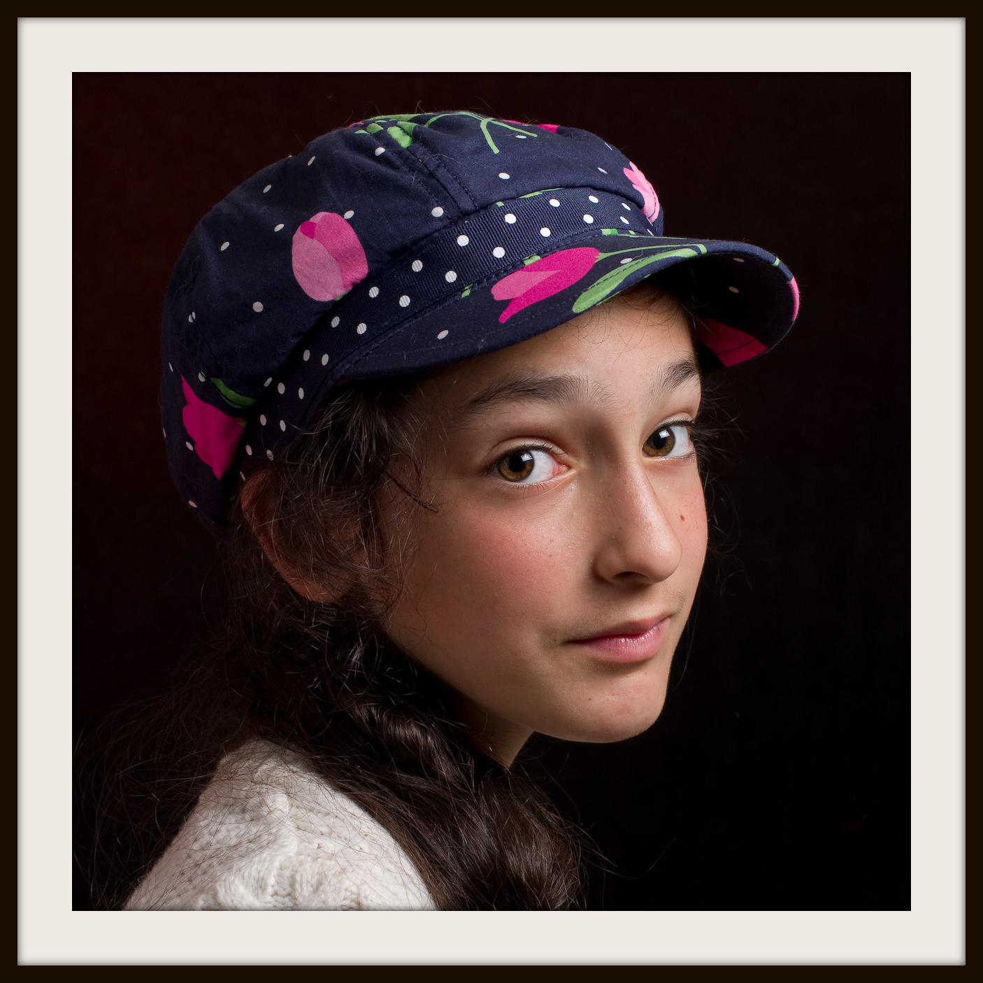
Vladimir, I could wish the hair in back was better illuminated. Also, I was wondering what you thought of the focus? Does it seem as if the camera selected her cap upon which to focus? I like the cap, but perhaps you can make sure the focus is on your model's eyes.
IMO, Colin may have moved the frame too far to the right. His dodging of the sweater is very good, but you can suggest that she wear a darker sweater next time.
-
3rd May 2012, 03:03 PM #5
- Join Date
- Jul 2011
- Location
- A Pacific Island
- Posts
- 941
- Real Name
- Andrew
Re: This one is for Brian (speedneeder)
I agree with Jim regarding the focus that's a bit too far to the rear. Her hat band and hair in front of her ear are more finely detailed than her eye lashes. Focusing manually or opening the aperture a bit would help. You can also get that softer overall portrait look overall and blur out those sharper areas. It's only photographers that notice these differences anyway.
-
3rd May 2012, 08:09 PM #6
- Join Date
- Dec 2008
- Location
- New Zealand
- Posts
- 17,660
- Real Name
- Have a guess :)
Re: This one is for Brian (speedneeder)
I agree! Originally Posted by Designer

Unfortunately, I committed myself once I rebuilt the frame
Burning, not dodgingHis dodging of the sweater is very good, but you can suggest that she wear a darker sweater next time.
-
3rd May 2012, 08:17 PM #7
- Join Date
- Nov 2011
- Location
- San Diego, CA
- Posts
- 163
Re: This one is for Brian (speedneeder)
Thanks for the comments!
I like Colin's edit, but it's not something I would do myself. Maybe I will grow up and feel more freedom to add empty space to my pictures, but for now - I tend to be more conservative with that.
For the exposure fix - I actually tried to get the "dim light" impression, but I am not sure if underexposure is ever a good way to achieve that. Any advise to that affect would be highly appreciated
Vignette was missing. I totally agree.
The focus in the wrong spot, however, is not a problem. I think it's just an "illusion" in a downsized version of an image. I updated the original post with the bigger version, and there you can see that the eyes are quite sharply in focus. Or maybe I need to upgrade my glasses.
And the hair in the back - I actually wish it was less illuminated - not more. Because those hairs were not supposed to be there at all. All of them were supposed to be in a braid on her shoulder.
-
3rd May 2012, 08:44 PM #8
- Join Date
- Dec 2008
- Location
- New Zealand
- Posts
- 17,660
- Real Name
- Have a guess :)
Re: This one is for Brian (speedneeder)
Hi Vladimir, Originally Posted by vladimir
I think you may have missed the point with that. It's not about "adding space around the photo" - a square crop is fine - the problem is that you've got the eyes into the right-hand side of the shot, which emphasises the back of the head just as much as the front. The eyes are the highlight of any portrait, but you haven't given them any space to "look into", which is considered a fundamental faux-pas of portraiture (which I might add I've been guilty of myself on many occasions!).
Compare your shot to this one ...
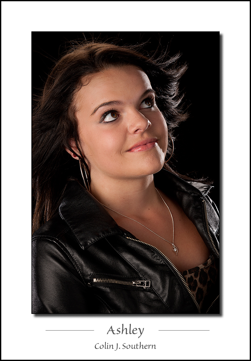
The difference is in how much spare there is behind the head, and where that puts the eyes relative to the horizontal boundaries of the frame. Can you see what I'm getting at?
Here's another example. Which looks better?

or

Perhaps another way of explaining it would be if you were to put yourself in a very small space (perhaps a broom cupboard) - you'd instinctively put the back of your head against the back of the cupboard to give you as much space in front of your face; you wouldn't put your face against the wall and have the space at the back of your head. Kinda the same here - the crop essentially "puts the person is a box".Last edited by Colin Southern; 3rd May 2012 at 08:55 PM.
-
3rd May 2012, 09:26 PM #9
- Join Date
- Nov 2011
- Location
- San Diego, CA
- Posts
- 163
Re: This one is for Brian (speedneeder)
Well, Colin... Originally Posted by Colin Southern
If she were looking to her left (say - like in your examples) - it would be easier for me to agree with all that. And even then - I had a thread here some time ago, where I tried to figure out just how much space should be there for my model to "look into", and I came to conclusion that "how much" is actually a matter of taste.
In the case at hand, on the other hand, she looks straight at us. Let's compare this to the classic:

Mr. Vermeer put his model's eye, which is closer to us, smack in the middle (on horizontal axis). In mine - maybe it's a tiny bit more to the right than in the middle. That tiny bit is worth fixing, I agree. The rest is a matter of taste. Do you agree?
-
4th May 2012, 01:44 AM #10
- Join Date
- Dec 2008
- Location
- New Zealand
- Posts
- 17,660
- Real Name
- Have a guess :)
Re: This one is for Brian (speedneeder)
Hi Vladimir, Originally Posted by vladimir
I think it's one of those "It's OK to break the rules so long as the picture works" type situations. In the case of the Vermeer shot it works because the back of the head piece provides a contrasting highlight into what would otherwise be a very dark area (and it works very well) -- I don't think the "exception to the rule" would have worked anywhere nearly as well if that contrasting highlight wasn't there.
In the case of your shot - and my example below - I don't think it works as well as it would have if we'd followed "the rule" (or put another way, "if I had to shoot it again, I'd do it differently").
Please don't think of my retouch as being the "optimal example" though -- as I mentioned above, once I extended the canvas and reconstructed the frame, I realised that I'd "painted myself into a corner) a bit -- I certainly wouldn't normally leave that much room. I guess the point I'm trying to get across is that folks often immediately think "portrait orientation" for a portrait shot, whereas I'm finding I'm getting better results shooting them landscape orientation for the reasons I mention above.

-
4th May 2012, 03:24 AM #11
- Join Date
- Nov 2011
- Location
- San Diego, CA
- Posts
- 163
Re: This one is for Brian (speedneeder)
I agree completely! I though just that after I posted the "Girl with a Pearl Earring" here. Almost responded to my own post, but then thought - nah, Colin will notice the same thing - I'll let him comment Originally Posted by Colin Southern
Thanks for doing that!
And having said all that - I still think Isabella's portrait is classic, and I wouldn't want it to be composed in any other way... Just me...
Generally - for the canvas orientation in portraits - I am so torn between "portrait" and "landscape", that I end up with square most of the time.
-
5th May 2012, 03:16 AM #12

- Join Date
- Nov 2010
- Location
- Owensboro, KY
- Posts
- 1,530
- Real Name
- Brian
Re: This one is for Brian (speedneeder)
Vladimir!
I'm glad to see your post And thank you for for your compliment.
I agree, your model is perfect! Your photo has already been critiqued plenty and I don't have anything to add there. I will cast my vote for 'well done' though. All photos are a matter of taste aren't they?! Keep shooting
-
5th May 2012, 05:17 AM #13
- Join Date
- Nov 2011
- Location
- San Diego, CA
- Posts
- 163
Re: This one is for Brian (speedneeder)
All photos are a matter of taste of a person who made a photo, absolutely! Originally Posted by speedneeder
Good photos are a matter of "good taste".
How to make photos, which look to others like they are done with "good taste" - that is the question!
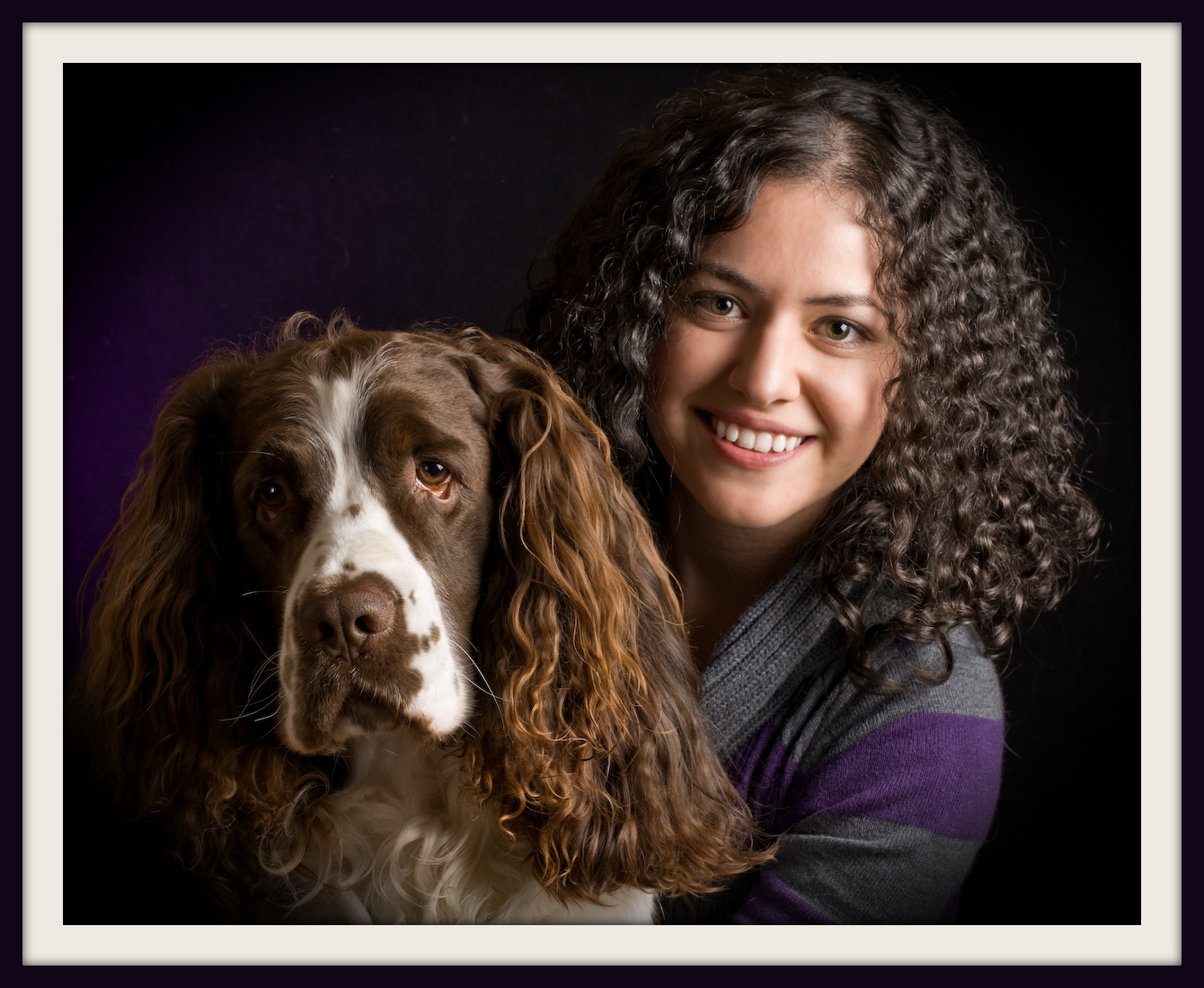
Well, since you asked - here is another couple of my close relativesKeep shooting
-
5th May 2012, 06:58 AM #14
- Join Date
- Nov 2010
- Location
- Owensboro, KY
- Posts
- 1,530
- Real Name
- Brian
Re: This one is for Brian (speedneeder)
Very nice Vladimir. The light and shadows are great.


 Reply With Quote