
 Helpful Posts:
 This is a really nice picture. I definitely think the flagpole has a place in the picture, and I'm sitting on the fence about whether or not the ironwork motif could be removed, but it certainly isn't a big distraction. How did you get the nice bronze tone to the picture? Mine came out a lot more grey as opposed to the nice colours you have when I look back on them. Do you think this due to perhaps the exposure at the time of the picture or have you used post production for this on yours? Great picture overall.
Results 21 to 40 of 184
Thread: Project 52 by Dave Humphries
-
9th January 2012, 07:42 PM #21


- Join Date
- May 2008
- Location
- Tunbridge Wells, Kent
- Posts
- 121
- Real Name
- Rebecca
Re: Project 52 by Dave Humphries
-
9th January 2012, 09:05 PM #22Moderator

- Join Date
- May 2008
- Location
- Windsor, Berks, UK
- Posts
- 16,737
- Real Name
- Dave Humphries :)
Re: Project 52 by Dave Humphries
Wow, thanks all, I knew it was nice, but I wasn't expecting such great feedback, it brought a lift to the end of a none-to-pleasant work day.

Hi Donald, Originally Posted by Donald
Thanks, you're right, it did turn out almost exactly as I had hoped, although I tend get so wrapped up in the detail, I can miss out in the satisfaction part")
Thanks Sam, that's a pretty good endorsement Originally Posted by Sam Smith
Hi Wendy, Originally Posted by ScoutR
That's a very good criteria, I must remember that.
I did toy with the idea of separately processing the two halves, but I didn't need to, it pretty much was like this. Originally Posted by Goldcoastgolfer
Thanks Frank, yes I hadn't thought of it like that, almost an accident, eh? Originally Posted by FrankMi

Hi Peter, Originally Posted by Letrow
I re-did the crop four times before settling on this, the main reason being to get the bridge itself into the middle 'third', there's a cloud at the top I didn't want to clip, but maybe I shouldn't have been such a slave to 'the rule'.
Thanks Tony Originally Posted by TonyM
Thanks Rob Originally Posted by Rob Douglas
Thanks Rebecca - you remember I said I did the crop four times, well, I did the white balance six times! Ideally I was after a bluer sky, but that came at the expense of a greyer light under the arches, so the arches had to win didn't they? I settled on the Adobe Camera RAW (ACR) preset for "Shade" (7500K and +10 Tint) which should be correct for the side of the bridge we're looking at. Originally Posted by beckyhumphries
I definitely didn't want to over expose it, so yes, I had to be careful at shooting time not to blow the red channel. Beyond that I cranked a few things up in ACR; Exposure + 0.1 stop, Recovery 30, Clarity +50, Vibrance +30 - I'm think next time we are together we should do an ACR workshop - maybe I'll even get you shooting RAW too
Once again, thank you all for taking the time to post such nice reviews.
The one thing I forgot to do was to try out the new Bamboo to do the editing, doh!
Cheers,
-
9th January 2012, 10:36 PM #23Moderator
- Join Date
- May 2008
- Location
- Windsor, Berks, UK
- Posts
- 16,737
- Real Name
- Dave Humphries :)
Re: Project 52 by Dave Humphries
This was shot about an hour and a quarter before the one I posted earlier, it's when I saw the light going through the arches and knew I had capture that.
The bridge at Henley (at 13:23)
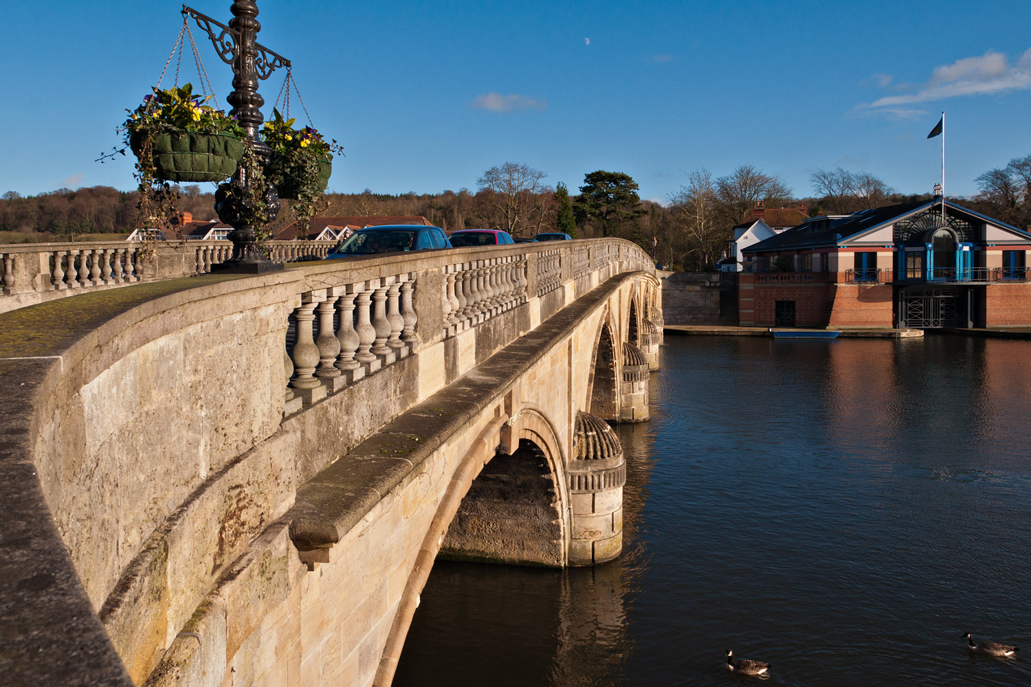
Nikon D5000 + Nikon 18-200mm VR: 18mm, 1/500s, f/11, iso400 (216-45483)
F11 and click image to see at 1,500px × 1,000px
I shot 6 more from here shortly after this, with different takes on the sunny side of the bridge, and while this is definitely the view I was after, this one just didn't quite come out as I wanted;
a) the lens wasn't quite wide enough to get the top of the lamp in shot
b) it wasn't level, so I lost a bit in corrections (rotation, lens profile and perspective)
c) but moving back would have lost the sweep of the bridge parapet I wanted
d) the geese are a bit too low in frame
e) I should have waited until the cars had gone (but then no geese at all)
f) I still forgot to use the blooming Bamboo even though I mentioned it an hour ago
One to shoot one day I think
At least now you can see the flag pole
Thanks,
-
10th January 2012, 01:28 AM #24

- Join Date
- May 2011
- Location
- Fort Mill, South Carolina, USA
- Posts
- 6,294
- Real Name
- Frank Miller
Re: Project 52 by Dave Humphries
Hi Dave. Any time I have people or vehicles in an image where they may or may not look good in the final result, I try to remember to shoot multiple identical images so that I have options to choose from in PP and particularly the option to merge them in or out as appropriate. Nice shot of the moon!
-
10th January 2012, 10:41 PM #25Moderator
- Join Date
- May 2008
- Location
- Windsor, Berks, UK
- Posts
- 16,737
- Real Name
- Dave Humphries :)
Re: Project 52 by Dave Humphries
Thanks Frank, Originally Posted by FrankMi

Yes, so do I usually (it's a good tip), I just didn't bother here as I knew I didn't have a wider enought view for this shot. Stupid thing is I had the Canon S100 in my pocket which goes to an equivalent of 24mm (this is equiv 28mm), so might have done the trick, but withthe D5000 in hand, I forgot it was there
Earlier in day I was taking several shots down by the river as the pesky gulls where wheeling all over the sky and getting in all the shots when they were not required
Cheers,
-
23rd January 2012, 08:47 PM #26
- Join Date
- May 2008
- Location
- Tunbridge Wells, Kent
- Posts
- 121
- Real Name
- Rebecca
Re: Project 52 by Dave Humphries
*Motivation motivation motivation*
A shocking 15 days since your last Project 52 entry
Looking forward to the next one, the unedited version was very good if you are going for the shot I think you are going for!
-
23rd January 2012, 09:39 PM #27
- Join Date
- May 2011
- Location
- Fort Mill, South Carolina, USA
- Posts
- 6,294
- Real Name
- Frank Miller
Re: Project 52 by Dave Humphries
Ut-oh, Dave. I think you've just been spoken to!

-
1st February 2012, 11:20 PM #28Moderator
- Join Date
- May 2008
- Location
- Windsor, Berks, UK
- Posts
- 16,737
- Real Name
- Dave Humphries :)
Week 3 of Project 52 by Dave Humphries
I'm really late with this series, which was shot at the beginning of Week 3.
I visited Boulters Weir at Maidenhead was struck by the fact the water was so NOT flat as it tipped over the edge. What makes it an interesting place is that you can get down so you're just eye level with the river's surface above the weir. Here is a link to someone else's picture - I was standing in the green puddle in front of the wall, shooting out to left side of this picture.
Wk3-0: The scene setter, to make sense of what follows.
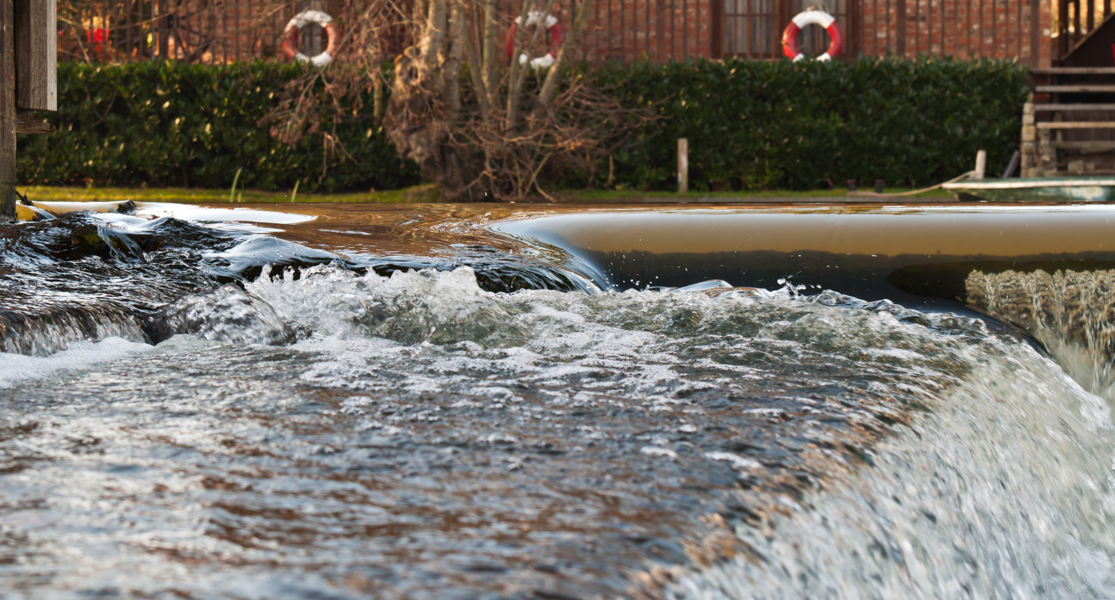
Nikon D5000 + Nikon 70-300mm VR: 70mm, 1/180s, f/8, iso800 (217-45664)
F11 and click image to see at 1,600px × 862px
So here are a few close ups, some not as close as I now wish, and I completely missed the area of cavitation bubbles on the right of the above image which looks interesting now.
Wk3-1: Unflat, glassy top and raging water in foreground.
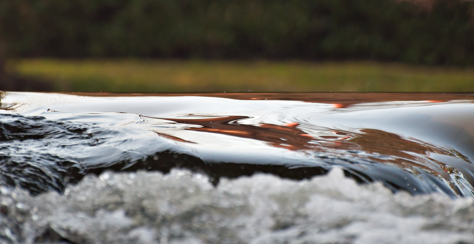
Nikon D5000 + Nikon 70-300mm VR: 220mm, 1/1000s, f/5.3, iso800 (217-45717)
F11 and click image to see at 1,600px × 823px
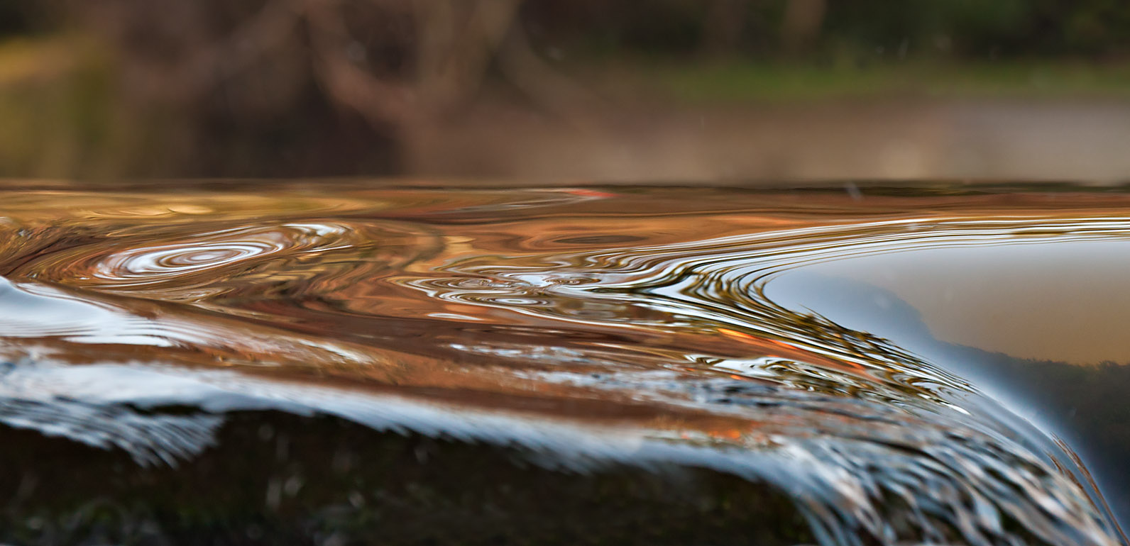
Wk3-2: Pan slightly right and we're looking through backlit water on right, for this I stopped right down to slow the shutter speed and obtain some splash 'streaks' instead of frozen drops.
Nikon D5000 + Nikon 70-300mm VR: 300mm, 1/125s, f/16, iso1600 (217-45709)
F11 and click image to see at 1,584px × 1,000px
Wk3-3: Interesting Eddys in this one, shot too wide in hindsight, this is quite a crop.
Nikon D5000 + Nikon 70-300mm VR: 220mm, 1/180s, f/8, iso800 (217-45683)
F11 and click image to see at 1,592px × 770px
Significant local contrast enhancements were made to make the most of the reflections of trees, house and lifebelts on opposite bank.
So, the intention was to explore the lighting, reflections and moving water at differing apertures and shutter speeds.
As an image, I think only the third (Wk3-2), really stands up, although I tried with composition on the others.
C&C welcomed.
Thanks,
-
1st February 2012, 11:34 PM #29
- Join Date
- Nov 2010
- Location
- Panama City, FL
- Posts
- 3,540
- Real Name
- Chris
Re: Week 3 of Project 52 by Dave Humphries
They are lovely reflections, but I'm having quite a bit of difficulty finding many areas of sharp focus, which is always a diffult chore when working with water at this distance. The last one seems to be the sharpest and holds my interest both from that standpoint, the reflective qualities and that nice, sensual line. I would, however, clone out or tone down the strip of green in the upper right part of the frame. I find it a tad distracting.
-
2nd February 2012, 04:27 AM #30

- Join Date
- Nov 2011
- Location
- Gold Coast, Australia
- Posts
- 1,798
- Real Name
- Mal
Re: Week 3 of Project 52 by Dave Humphries
Don't worry - I think there's so many Project 52 threads now that people are struggling to keep up anyway! Originally Posted by Dave Humphries
Exactly what I was thinking. A serene, reflective water surface with a turbulent waterfall directly underneath would have been quite interesting as the turbulent water looks like it materialises out of nowhere. Originally Posted by Dave Humphries
As smooth as the water is I'm not sure that I could say that it was enough to hold my attention. Originally Posted by Dave Humphries
I like the way you've capture the reflection in the smooth water here. It looks like you could put your hand in the water and touch trees behind it. I agree that it's probably the best of the lot. Originally Posted by Dave Humphries
You have to be willing really see the elements of the picture but once you decide to do that, there are some really interesting patterns caused by the reflections of light on the water - almost like a Chaos theory fractal. If all of the water was in focus I think it would have been an even better shot. Originally Posted by Dave Humphries
Well, I for one would generally shy away from reflections on moving water surfaces given how quickly the light could change as the water flowed so great job! If I had something like that nearby I'd probably visit it a couple of times to see what reflections were there with different light. Originally Posted by Dave Humphries
Great series and walk through - I enjoyed it
-
2nd February 2012, 08:38 AM #31Moderator

- Join Date
- Feb 2009
- Location
- Glenfarg, Scotland
- Posts
- 21,402
- Real Name
- Just add 'MacKenzie'
Re: Week 3 of Project 52 by Dave Humphries
I note the clear and constructive analysis that's been offered thus far and won't repeat that.
But one comment caught my eye in the original post .......
And that was my thought exactly as I undertook the first run-through of the images in the post ..... until I started looking properly. Originally Posted by Dave Humphries
Which is when the patterns in this started to show themselves (or I started to see them)
That almost mini-whirlpool effect on the left. That beautiful curve of lines over on the right just as the water begins its drop. Originally Posted by Dave Humphries
I like it.
-
2nd February 2012, 01:55 PM #32
- Join Date
- May 2011
- Location
- Fort Mill, South Carolina, USA
- Posts
- 6,294
- Real Name
- Frank Miller
Re: Week 3 of Project 52 by Dave Humphries
Hi Dave! I love this unusual and fascinating prespective on flowing water. It provides a very dynamic reflecting surface, so clear that you can see the reflected tree branches!
I think I would go back several times to get different lighting and reflections at different flow volumes which, I suspect, would change the water pattern dramatically. I would love to spend time there playing with the effects of light and motion on the reflective surface.
Here is where future cameras could be held on a boom out over the water for a better viewing angle and the scene displayed on your cell phone screen.
-
2nd February 2012, 07:58 PM #33
- Join Date
- May 2008
- Location
- Tunbridge Wells, Kent
- Posts
- 121
- Real Name
- Rebecca
Re: Week 3 of Project 52 by Dave Humphries
Hi Dad,
I really like the set-up of the Wk3-0 picture. The rubber rings in the background give it a great nautical theme and there is a very nice contrast with the slow moving calm water and rapids.
Wk3-2 is my favourite, I like how the shape of the water pulls your eyeline into the picture and the sharpness of the picture. Wk3-3 is also really nice and sharp with the focus which must have been difficult to achieve.
Great set of pictures and glad to see you have finally posted them
Definitely looks like it would be worth a trip back there to see what else you can capture.
-
2nd February 2012, 08:24 PM #34Moderator
- Join Date
- May 2008
- Location
- Windsor, Berks, UK
- Posts
- 16,737
- Real Name
- Dave Humphries :)
Re: Week 3 of Project 52 by Dave Humphries
Hi Chris, Originally Posted by MiniChris
I definitely take your point about them not being that sharp, the main problem is DoF, which, having dialled the numbers into a calculator; at 300mm is about 0.4m at a range of 7.5m (the focused distance on a couple) - not much considering the water surface and reflections way beyond.
The last one did look soft in PP, so I did put more effort into content sharpening on that one - it obviously paid off
Something to do on the reshoot pictures.
I had already cloned out posts and branches from most of the backgrounds, just see 'scene setter' shot for what's really there.
thanks for your comments,
-
2nd February 2012, 08:40 PM #35Moderator
- Join Date
- May 2008
- Location
- Windsor, Berks, UK
- Posts
- 16,737
- Real Name
- Dave Humphries :)
Re: Week 3 of Project 52 by Dave Humphries
yes, something for the reshoot Originally Posted by Goldcoastgolfer
Wk3-1 is the weakest of the bunch. Originally Posted by Goldcoastgolfer
I'd need long arms Originally Posted by Goldcoastgolfer
but I know what you mean
Yes, there's a bit on DoF and sharpening in Chris's reply above, the answer would seem to be use a narrow aperture, get closer if possible and shoot wider angle for more DoF, but this may bring in too much background distractions. I wonder if I can hang over the wall and shoot a little higher and closer? I guess a small sensor camera would help. Originally Posted by Goldcoastgolfer
Yes, the patterns change by the second and I was shooting bursts of 2 or 3 and choosing the best patterns in PP. Originally Posted by Goldcoastgolfer
Thank you Originally Posted by Goldcoastgolfer
-
2nd February 2012, 08:43 PM #36Moderator
- Join Date
- May 2008
- Location
- Windsor, Berks, UK
- Posts
- 16,737
- Real Name
- Dave Humphries :)
Re: Week 3 of Project 52 by Dave Humphries
Thanks Donald, yes those eddy/whirlpool ones were what caught my attention and got me shooting them. Originally Posted by Donald
-
2nd February 2012, 08:49 PM #37Moderator
- Join Date
- May 2008
- Location
- Windsor, Berks, UK
- Posts
- 16,737
- Real Name
- Dave Humphries :)
Re: Week 3 of Project 52 by Dave Humphries
On a dull day with overcast, it just looks miserable, it really needs bright sunshine to get the colours and detail. These were backlit, taken around lunchtime, so earlier or later in the day will provide alternatives, but that may have to wait for summer as there are quite a few tall trees which block sunlight in winter mornings. Originally Posted by FrankMi
I want one Originally Posted by FrankMi
Thanks for your time and comments,
-
2nd February 2012, 09:00 PM #38Moderator
- Join Date
- May 2008
- Location
- Windsor, Berks, UK
- Posts
- 16,737
- Real Name
- Dave Humphries :)
Re: Week 3 of Project 52 by Dave Humphries
I wasn't even trying, just me being lazy, it was as wide as the 70-300 went Originally Posted by beckyhumphries
In hindsight, I'm not sure the weir support on left edge adds much, I should have cropped it off perhaps.
They are the best two and yes it took a while, didn't it Originally Posted by beckyhumphries
I will go back, probably quite soon as the weir soon clogs up with branches and stuff spoiling the even flow, they must have just cleaned it.
Thanks,
-
3rd February 2012, 10:56 AM #39

- Join Date
- Jun 2010
- Location
- Haarlem, Netherlands
- Posts
- 1,682
- Real Name
- Peter

Re: Week 3 of Project 52 by Dave Humphries
Nice colours on those water photos Dave. I like the last one best. The colour, reflections and shapes all look good and it was close enough for me. It gets to be a bit abstract.
-
5th February 2012, 04:38 PM #40
- Join Date
- Aug 2009
- Location
- Canada
- Posts
- 3,113
- Real Name
- Wendy
Re: Week 3 of Project 52 by Dave Humphries
Hi Dave, hope you're working on this weeks shot - I am, really I am
I love the third water shot. Hope you didn't get vertigo shooting these. I would have and I do a bit even looking at them, but in a good way, sort of a medatative thing looking into them and getting lost, especially when viewed large.
Wendy

 Reply With Quote