
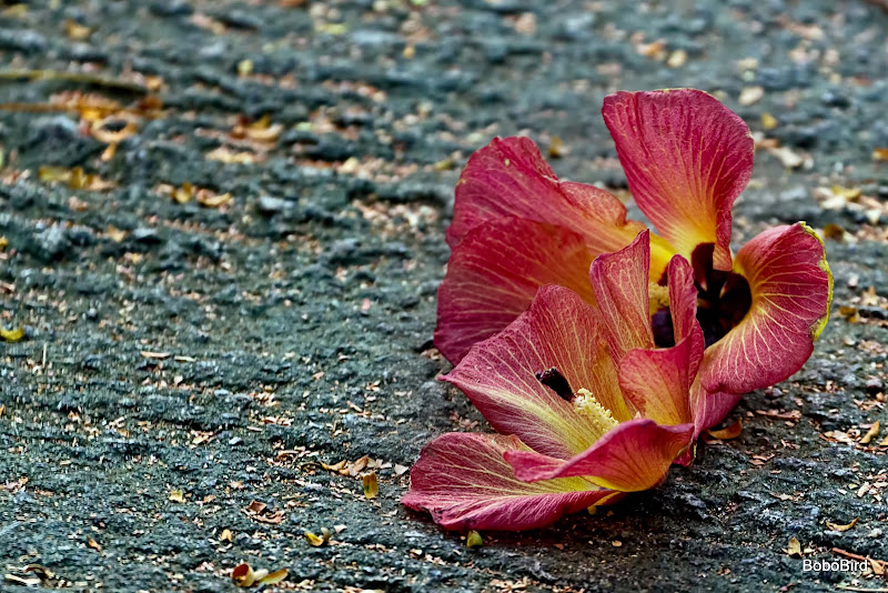
Found on a village path.
Made 2 versions - which one? and why?
Thanks as always.
v1
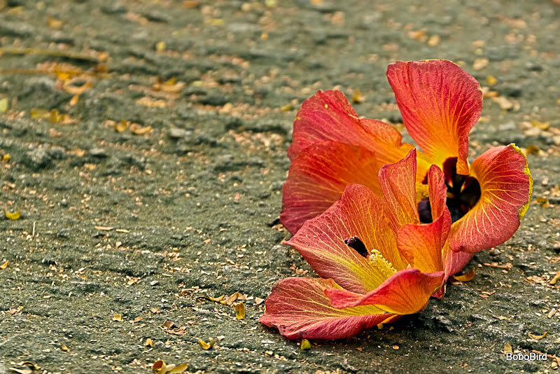
v2
 Helpful Posts: 0
Results 1 to 20 of 21
Thread: Goodbye
-
2nd November 2011, 06:02 AM #1

- Join Date
- Apr 2011
- Location
- Ontario (mostly)
- Posts
- 6,667
- Real Name
- Bobo
Goodbye
-
2nd November 2011, 08:49 AM #2Moderator

- Join Date
- Feb 2009
- Location
- Glenfarg, Scotland
- Posts
- 21,402
- Real Name
- Just add 'MacKenzie'
Re: Goodbye
V1 Originally Posted by Bobobird

Because it's more vibrant and attention-grabbing. V2 looks a bit dull and flat alongside it.
-
2nd November 2011, 08:51 AM #3

- Join Date
- Sep 2009
- Location
- Burton on Trent, UK
- Posts
- 4,788
- Real Name
- Steve
Re: Goodbye
I think v2 looks more real, and so I like it more.

-
2nd November 2011, 09:03 AM #4
- Join Date
- Apr 2011
- Location
- Ontario (mostly)
- Posts
- 6,667
- Real Name
- Bobo
Re: Goodbye
Thanks for the 1:1
-
2nd November 2011, 09:24 AM #5

- Join Date
- Feb 2011
- Location
- Hertfordshire, England
- Posts
- 1,437
- Real Name
- Philip
Re: Goodbye
I agree. Originally Posted by Donald
Obviously I don't know what the real scene looked like but, for me, the colour balance seems to be slightly yellow.
Philip
-
2nd November 2011, 09:26 AM #6
- Join Date
- Oct 2011
- Location
- Gold Coast, Australia
- Posts
- 75
- Real Name
- Wendy
Re: Goodbye
I like your depth of field in V2 but agree re: the white balance being a little yellow.
-
2nd November 2011, 09:30 AM #7
- Join Date
- Apr 2011
- Location
- Ontario (mostly)
- Posts
- 6,667
- Real Name
- Bobo
Re: Goodbye
Thanks Philip. It was early evening with the sun to the flower's north. Camera was set to Daylight which would be giving off a slightly warmish tone.
Normally I will WB correct in post but this one looked good as is so left it alone. WB correction would have removed too all the "glow" on the tiny brown leaves.Last edited by Bobobird; 2nd November 2011 at 09:35 AM.
-
2nd November 2011, 03:45 PM #8
- Join Date
- Oct 2011
- Location
- Seminole, Florida
- Posts
- 328
- Real Name
- robert
Re: Goodbye
with the EOS 50D you can WB bias in camera to slightly "embellish" the ambient flower hues; in your 50D instruction guide look at White Balance Correction, this works in both JPEG & RAW captures; it's useful with sunrise/sunset captures also to add a subtle hue bias that can be added to your WB setting to amplify sky hues.
-
2nd November 2011, 04:40 PM #9
- Join Date
- Apr 2011
- Location
- Ontario (mostly)
- Posts
- 6,667
- Real Name
- Bobo
Re: Goodbye
Unfortunately these advanced functions do not exist in the 550D/T2i.
Here is a redo from scratch with what I think is the correct WB.
Guess I need a pp checklist!!!
v3a - a bit darker
v3b - a bit lighter.

Last edited by Bobobird; 2nd November 2011 at 05:05 PM.
-
2nd November 2011, 07:51 PM #10
- Join Date
- Jan 2009
- Location
- South Devon, UK
- Posts
- 14,417
Re: Goodbye
For me, #2 has a background which is just a little too dark. But #1 is a little too sharp and unnatural.
So I would just give the second one a tiny bit of a tweak. But I do mean tint.
I do prefer the colours of the first two compared with your redo. But I don't really know what the 'natural colour' should be here.
-
2nd November 2011, 08:00 PM #11
- Join Date
- Feb 2011
- Location
- Hertfordshire, England
- Posts
- 1,437
- Real Name
- Philip
Re: Goodbye
V3b is the one I prefer, Bobo.
Philip
-
3rd November 2011, 09:49 AM #12
- Join Date
- Apr 2011
- Location
- Ontario (mostly)
- Posts
- 6,667
- Real Name
- Bobo
Re: Goodbye
Thanks Geoff - it was just a ordinary concrete path.
Thanks Philip - yes me too. Appreciate the feedback about the colour cast, had missed that entirely.
-
3rd November 2011, 11:11 AM #13
- Join Date
- Sep 2011
- Posts
- 674
Re: Goodbye
The 1st one. It just grabs my attention better.
-
3rd November 2011, 04:23 PM #14
- Join Date
- Jan 2009
- Location
- South Devon, UK
- Posts
- 14,417
Re: Goodbye
Well if it is 'standard' concrete I would say none of them have 'correct' natural WB. The first one is probably closest to concrete. The last two look more like tarmac.
-
3rd November 2011, 06:36 PM #15
- Join Date
- Apr 2011
- Location
- Ontario (mostly)
- Posts
- 6,667
- Real Name
- Bobo
Re: Goodbye
LOL, my head is exploding.
v2 WB was at 4500 or 4600 and obtained by using the WB picker from a neutral gray spot.
v1 WB was at 5200, standard in-camera setting on the 550D/T2i.
Made 5 different versions and at the end of the day I still found v1a conveys the beauty of the flower best. Guess it is really difficult to critique intent.
In future will stick to just one version if critique is needed - should have listened to Donald who once said that 2 or more makes commenting difficult.
-
3rd November 2011, 08:15 PM #16Moderator
- Join Date
- Feb 2009
- Location
- Glenfarg, Scotland
- Posts
- 21,402
- Real Name
- Just add 'MacKenzie'
Re: Goodbye
At which point you switch off from all that we're saying and ask yourself - Which of all these versions most truly represents what I saw in my head when I looked through the viewfinder and pressed the shutter? That's the 'correct' one. Originally Posted by Bobobird
-
3rd November 2011, 08:29 PM #17
- Join Date
- Apr 2011
- Location
- Ontario (mostly)
- Posts
- 6,667
- Real Name
- Bobo
Re: Goodbye
Simple answer? It should be v1b.
Was walking up this path, late afternoon sun to back and was wondering if anything could be done with the twinkling little dead leaves. Came across the flower and walked right past it but on a whim looked back and was caught by the backlighting. Zoomed in fully and snapped a few in some haste as my friends who were ahead started calling out to me.
-
3rd November 2011, 08:38 PM #18Moderator
- Join Date
- Feb 2009
- Location
- Glenfarg, Scotland
- Posts
- 21,402
- Real Name
- Just add 'MacKenzie'
Re: Goodbye
You mean the second one in your first posting; i.e. v2? Originally Posted by Bobobird
-
3rd November 2011, 09:12 PM #19Moderator

- Join Date
- May 2008
- Location
- Windsor, Berks, UK
- Posts
- 16,737
- Real Name
- Dave Humphries :)
Re: Goodbye
V2 is my choice too
-
3rd November 2011, 10:29 PM #20
- Join Date
- Oct 2011
- Location
- Seminole, Florida
- Posts
- 328
- Real Name
- robert
Re: Goodbye
Bobo, it might be helpful for folks trying to help you if you would mention what PP software you are using for editing; i sometimes send images to my pro photo brother for comments & he starts telling me all the changes he would make with CS5 to my images, the problem is i use Lightroom 2.7 & PSE 8. General observations are easy to reference to most editing softwares for corrective actions, but some things are software specific. i wish there was a way for the EXIF data for posted images to be accessible, if there is i haven't found it yet. i like v3a & v3b a lot better than v2a & v2b as you have removed the yellow cast from the latter. I've found WB is sometimes tricky depending on the subjects environment,i.e. usually "daylight" is a neutral tone compared to "shade" with its slight yellowish cast & "cloudy" has a slight yellow,light orange cast that's useful for embellishing sunsets, while "flash" has a more pronounced yellow cast . Often, i'm forced to use "auto" to render the scene more like what i see when the image was recorded. I mainly shoot in RAW & find i have to alter the WB slightly in Lightroom to "tweak it" to better reflect what i remember it being. To see what the WB settings produce you might find it helpful to shoot a series of sequential images in a well naturally illuminated scene at the WB settings available on your camera, this could give you another tool for image enhancement.


 Reply With Quote