
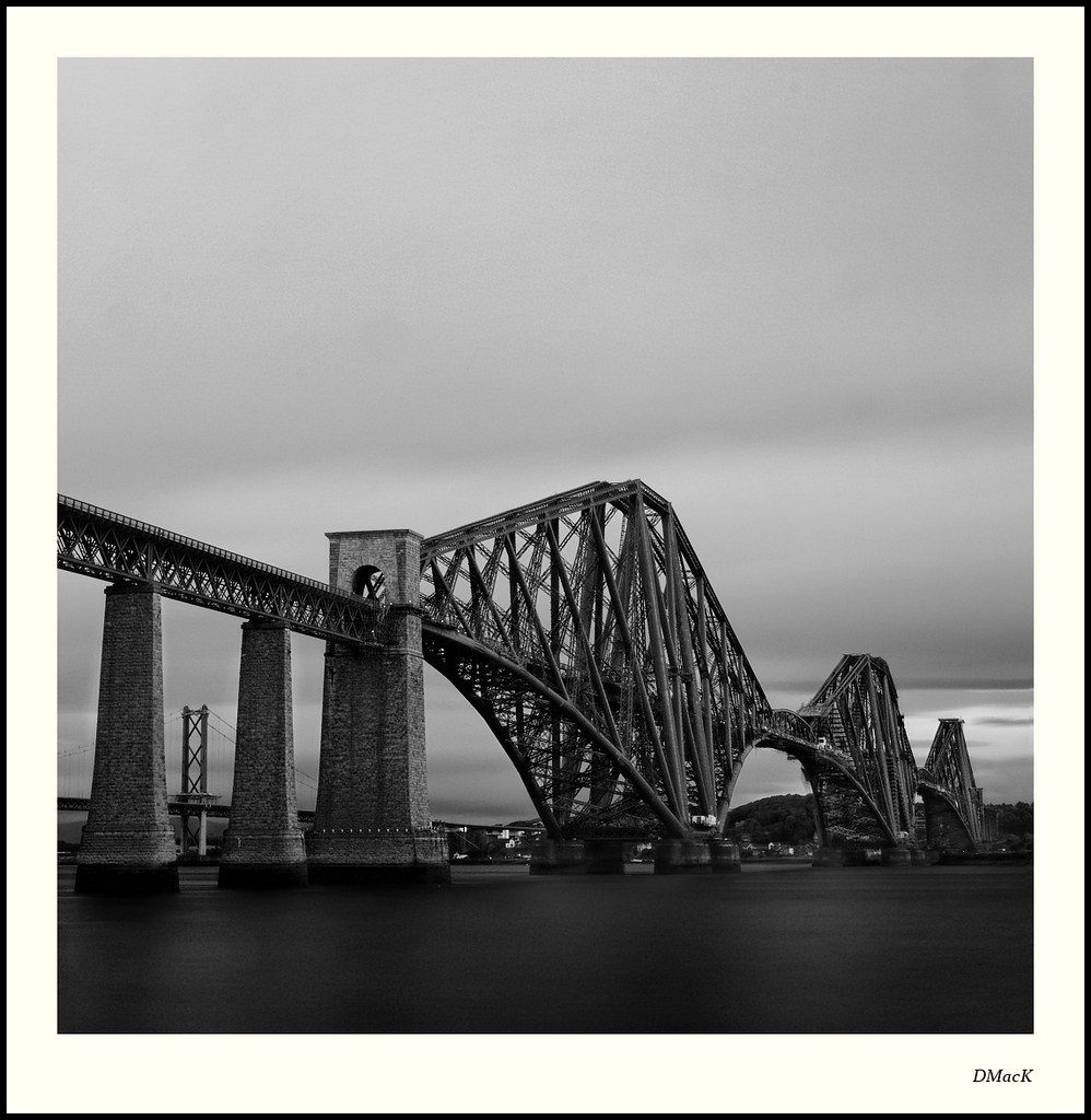
In discussing this one yesterday, I said I was going to go back this morning and try again for a long exposure.
It was a much better morning weather-wise so, consequently, it was much brighter. Because I haven't (yet) reached the height of a Vari-ND or even a Lee Big Stopper, I had to improvise to cut back the light. So, in addition to my 3-stop ND, I mounted the 2-stop GND the 'wrong' way round and then put the 3-stop GND on the 'right' way round.
So, we had 5 stops of filter on the bottom half and 6 stops on the top half. Slightly different location from yesterday, as I couldn't have any foliage in the shot (it was windy).
I know which I prefer. What about you?
Today ....
40D, 17-85mm f/4-5.6 IS USM @ 30mm. ISO100. 76s@f22. 3-stop ND + 2-Stop GND inverted & 3-Stp GND.
Yesterday .....
40D, 17-85mm f/4-5.6 IS USM @ 26mm. ISO400. 1/8@f16
 Helpful Posts: 0
Results 1 to 15 of 15
-
28th August 2011, 09:43 AM #1Moderator


- Join Date
- Feb 2009
- Location
- Glenfarg, Scotland
- Posts
- 21,402
- Real Name
- Just add 'MacKenzie'
The Forth Bridge (Compare & Contrast)
Last edited by Donald; 28th August 2011 at 09:50 AM.
-
28th August 2011, 09:53 AM #2

- Join Date
- Aug 2011
- Location
- France
- Posts
- 162
- Real Name
- Rob
Re: The Forth Bridge (Compare & Contrast)
Looking at the two...
Both are good but for different reasons, so hard to come up with a preference.
I like the composition and clarity of the first, the flat light gives a technical result which is a very good "photo-documentary" image.
I also very much like the atmosphere of the second, which is far more evocative.
If you really pushed me, I say #2... no .... #1 ... DOH!
-
28th August 2011, 12:26 PM #3
- Join Date
- Mar 2009
- Posts
- 2,522
Re: The Forth Bridge (Compare & Contrast)
Donald
I prefer the todays version but I do see Rob's dilema Now to get yesterdays water on todays shot
 Actually a bit of dodging in the lower 5th may do the trick. There is less noise, speckles or whatever it is in todays image and maybe its the effect of a long exposure on such a (relatively) bright sky. It does beg the question for me though...was the sky so bright that it required the wearing several pairs of Raybans on top of each other. It has obviously worked for the bridge structure and the sky but the water has suffered. I dont know enough about the use of these filters to really understand what is going on.
Anyway regardless of all this nitpickery it is an outstanding image
-
28th August 2011, 12:39 PM #4Moderator
- Join Date
- Feb 2009
- Location
- Glenfarg, Scotland
- Posts
- 21,402
- Real Name
- Just add 'MacKenzie'
Re: The Forth Bridge (Compare & Contrast)
Thank you, gentlemen.
I do think I've got myself something worth keeping with both of these, so I'm prepared to put in the hours to get them 'right'.
Rob - the sole purpose of all the sunshade was to try and slow down the shutter speed to smooth out the water and the cloud and really turn both into just blurs, so that the bridge stand out from its surroundings. I think I've gone too dark on the water and I'm not even sure yet whether I prefer that unrealistic smoothing out. But I do need to re-process and not darken the water so much. It does give an effect, but yesterday's, at 1/8 second, retains more structure and form on the surface of the water.
Anyway, having discovered Wavelet Denoise on GIMP (I don't seem to have that GREYCstoration to which you referred), I'm going to post another version into that other thread for your comment.
Also need to get rid of that lumping great spot just above the bridge. Think it's droed raindrop from yesterday rather than a dust bunny. I hope so. I've just had the damned thing cleaned.
-
28th August 2011, 01:43 PM #5Moderator
- Join Date
- Feb 2009
- Location
- Glenfarg, Scotland
- Posts
- 21,402
- Real Name
- Just add 'MacKenzie'
Re: The Forth Bridge (Compare & Contrast)
So, I got to work with the dodge brush on the water.

and the original version again ........ (click on them to view them in teh lightroom and flick between the two)
-
28th August 2011, 01:53 PM #6
- Join Date
- Sep 2010
- Posts
- 2,064
Re: The Forth Bridge (Compare & Contrast)
Good morning!
Donald, I like the second one best. I can see how, in the first one, done today, there's more detail in the bridge and it really stands out but it's just a pic of a bridge, to me. The second one (the one shot, yesterday), with the detail in the water and the atmosphere with the mist and, even, the angle, I have a sense of a "crossing", the thrill of being able to go over something (being "carried" over) and a sense of journey. Maybe, also, a little bit of this, also, has to do with the bit of shrubbery in the one from yesterday, too - we're definitely on 'this' side of things.
On a side note, the second one looks like a trail of dinosaurs traveling elephant style - trunk to tail.
edit: sorry, I hadn't seen this very last post because I was writing this one. This is a response to your original entry.
-
28th August 2011, 02:03 PM #7

- Join Date
- Nov 2010
- Location
- Manila, Philippines
- Posts
- 3,804
- Real Name
- Willie or Jiro is fine by me.
Re: The Forth Bridge (Compare & Contrast)
Hello, Donald. I love the way you composed this shot. Personally, I would probably bring out the midtones a little bit as they look too buried on the dark areas. On the other side, what I noticed was that from your posts, your white border looks like it has a very little yellowish tint on it. Being curious, I decided to use the eyedropper tool in Photoshop to find out what is the RGB value of your border and it registered at 255R, 255G, and 243B. When I adjusted the Blue level value and restored it to a value of 255 that is the only time I noticed the yellow tint to disappear. I applied the level correction on this one and adjusted the midtones using SEP. Let me know what you think of the adjustment.

-
28th August 2011, 02:09 PM #8Moderator
- Join Date
- Feb 2009
- Location
- Glenfarg, Scotland
- Posts
- 21,402
- Real Name
- Just add 'MacKenzie'
Re: The Forth Bridge (Compare & Contrast)
Willie
I always set my border at 243. I've never used a 255 white border.
I can see what you are saying about the midtones. However, I'm not sure that you're version captures the mood of the place at 6:15am this morning. Be interestign to read what others, hopefully, want to say about this.
-
28th August 2011, 02:15 PM #9
- Join Date
- Nov 2010
- Location
- Manila, Philippines
- Posts
- 3,804
- Real Name
- Willie or Jiro is fine by me.
Re: The Forth Bridge (Compare & Contrast)
I find this very interesting. I wonder why the Red and the Green levels registers at 255 and only the Blue register at 243. Must be my old monitor playing tricks on me. Originally Posted by Donald

-
28th August 2011, 02:19 PM #10Moderator
- Join Date
- Feb 2009
- Location
- Glenfarg, Scotland
- Posts
- 21,402
- Real Name
- Just add 'MacKenzie'
Re: The Forth Bridge (Compare & Contrast)
No, Willie, Your good ol' monitor is doing just fine. Originally Posted by jiro
It is only the blue I take down to 243. That just takes a bit off pure white, and towards what I'd call an off-white cream colour. Personal taste. Might not be to everyone's liking.
-
28th August 2011, 02:21 PM #11
- Join Date
- Nov 2010
- Location
- Manila, Philippines
- Posts
- 3,804
- Real Name
- Willie or Jiro is fine by me.
Re: The Forth Bridge (Compare & Contrast)
Originally Posted by Donald
-
28th August 2011, 02:33 PM #12
- Join Date
- Sep 2010
- Posts
- 2,064
Re: The Forth Bridge (Compare & Contrast)
regarding Willie's edit.... Originally Posted by jiro
What's happened in this one is that, suddenly, I've noticed that wonderful first archway over the 'road' on the bridge. Just my experience/observation.
-
28th August 2011, 05:55 PM #13
- Join Date
- Aug 2009
- Location
- Canada
- Posts
- 3,113
- Real Name
- Wendy
Re: The Forth Bridge (Compare & Contrast)
Yesterday, despite any technical flaws that may be present (which I would not have noticed until they were pointed out, and still don't really) "Yesterday" has character and moodiness whereas "today" is just an exceptional picture of a unique bridge. Just my 2 cents. Of course both are amazing shots. Originally Posted by Donald
Wendy
Edit: I went through and read the other posts after writing my comments and lo and behold Katy and I said almost the same thing. So sorry for the repetition, but I really didn't look first.
-
28th August 2011, 06:49 PM #14Moderator

- Join Date
- May 2008
- Location
- Windsor, Berks, UK
- Posts
- 16,739
- Real Name
- Dave Humphries :)
Re: The Forth Bridge (Compare & Contrast)
Hi Donald,
I might buck the trend, but I prefer the atmospherics that have given the separation from the road bridge in yesterdays shot.
Unfortunately it has also (unavoidably) reduced the contrast on the third section and far side of the bank
As others have said, I too find the water texture is preferable to the 'super-smooth' of today - in fact thinking about it, on this subject, built to withstand the elements (clouds and water), isn't smoothing them out with a long shutter speed actually, in a subtle way, counterproductive?
That said, for the clarity of the bridge structure, I do like todays, but perhaps even Willie's version, as it reveals more of the 'nuts and bolts'.
-
28th August 2011, 07:06 PM #15
- Join Date
- Sep 2010
- Posts
- 2,064
Re: The Forth Bridge (Compare & Contrast)
That makes me feel good! Originally Posted by ScoutR


 Reply With Quote