CAMERA LENS CORRECTIONS
Lens corrections help offset imperfections present in nearly every camera image. These might include darkening near the corners of the frame, otherwise straight lines appearing curved, or color fringes near edge detail. Even though these often aren't obvious in the original photo, the benefits of their removal almost always are. However, lens corrections also have the potential to make images worse if not carefully performed, and depending on the subject, some imperfections can actually be beneficial.
 |
|
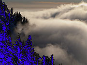
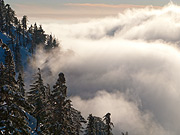
| Before | After |
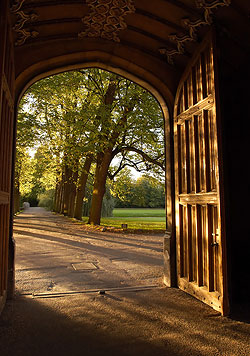
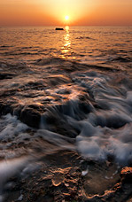
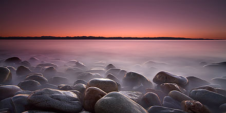
Results after vignetting, distortion and chromatic aberration correction.
Differences would be even more apparent if viewed at 100% on-screen.
OVERVIEW
The three most common lens corrections aim to address one of the following:


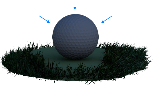
- Vignetting. This appears as a progressive darkening toward the edges of the image.
- Distortion. This appears as otherwise straight lines bending inwards or outwards.
- Chromatic Aberration. This appears as color fringing along high contrast edges.
However, lens correction software is typically only able to fix certain types of each imperfection above, so being able to identify them is key. The following sections describe the types and causes of each imperfection, when correction is possible, and how to minimize imperfections in the first place.
Most lens correction software will suffice for this tutorial, but common options include Adobe Camera RAW, Lightroom, Aperture, DxO Optics and PTLens, amongst others.
1. VIGNETTING
This describes the gradual fall-off of light towards the corners of your image, and is perhaps the most straightforward lens imperfection to observe and correct.
 |
|
| Internal Vignetting | Physical Vignetting |
|---|---|
 |
| Vignetting Removed |
|---|
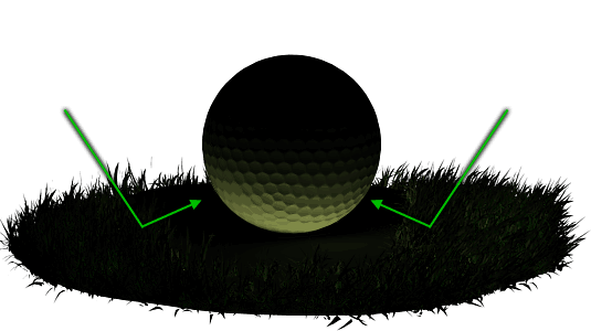
Note how internal vignetting is most objectionable only at the top left and bottom right due to the subject matter, even though the effect applies uniformly to all four corners.
Types & Causes. Vignetting can be grouped into two general categories:
- Physical Vignetting. Often not correctable except by cropping or manual brightening/cloning. Appears as a strong, abrupt darkening usually only in the very corners of an image. Caused by stacked/large filters, lens hoods or other objects physically blocking light near an image's edges.
- Internal* Vignetting. Usually easily correctable. Appears as a gradual and often subtle darkening away from the image's center. Caused by the inner workings of your particular lens and camera. It's typically most apparent at lower f-stops, with zoom and wide angle lenses, and when focusing on distant objects. Digital SLR cameras with cropped sensors are also less susceptible to vignetting because the darker edges get cropped out (when using full-frame lenses).
*Technical Note: Internal vignetting is comprised of two sub-categories: optical and natural vignetting. The first can be minimized by stopping down your lens (using a higher f-number), but the second is independent of lens setting. Natural vignetting is therefore unavoidable, unless one is able to use a lens with a narrower angle of view, or a specially-designed corrective filter that discards light toward the image's center (uncommon except perhaps with large format cameras).
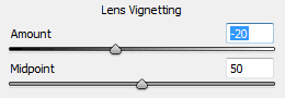
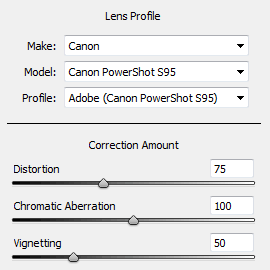
vignetting correction sliders in photoshop
Correction. Vignetting can often be fixed using a single "amount" slider, although you can sometimes also adjust the center of the vignetting correction using a "midpoint" slider (but this is rarely needed). However, correction will increase image noise toward the corners, because digitally brightening an image amplifies both the signal and the noise equally.
Artificial Vignetting. Some photographers actually add vignetting to their images in order to draw attention to a central subject, and to make the frame's edges appear less abrupt. However, you'll want to do this by applying the vignetting after any image cropping (sometimes called "post crop vignetting").
2. DISTORTION: BARREL, PINCUSHION & PERSPECTIVE
This can give otherwise straight lines the appearance of bending inward or outward, and can influence the depiction of depth:


Types & Causes. The most common categories of image distortion include:
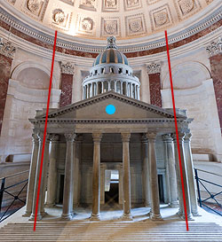 Perspective "Distortion"
Blue dot represents direction of camera;
red lines mark converging parallel lines.
- Pincushion Distortion. Appears when otherwise straight lines curve inward. Typically caused by telephoto lenses, or at the telephoto end of a zoom lens.
- Barrel Distortion. Appears when otherwise straight lines curve outward. Typically caused by wide angle lenses, or at the wide end of a zoom lens.
- Perspective Distortion*. Appears when otherwise parallel lines converge. Caused by the camera not facing these parallel lines perpendicularly; with trees and architecture, this usually means that the camera isn't pointed at the horizon.
With landscapes, distortion of the horizon and trees are usually most detectable. Placing the horizon along the center of a photo can help minimize the appearance of all three types of distortion.
*Technical Note: Perspective distortion isn't technically a true distortion because it is a natural characteristic of 3D vision. We see it with our own eyes, but our mind knows the correct 3D positioning of objects and therefore doesn't perceive these lines as converging. For more, also see the tutorials on wide angle lenses and using tilt/shift lenses to control perspective.
Correction. Fortunately, each of the above types of distortion is correctable. However, this should only be performed when necessary, such as with subjects that include straight lines or are highly geometric. Architectural photography is often most sensitive, for example, whereas many landscapes aren't noticeably affected.
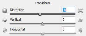
distortion correction sliders in photoshop
Editing software usually provides sliders for barrel/pincushion and perspective distortion in the vertical and horizontal directions. However, make sure to use the grid overlay feature (if available) so that you can more easily assess whether editing has made lines straight and parallel.
Disadvantages. Distortion correction usually requires cropping out curved edges of the corrected frame, which can influence composition. Correction also redistributes an image's resolution; with pincushion removal, the edges will appear slightly sharper (at the expense of the center), whereas with barrel removal the center will instead appear slightly sharper (at the expense of the edges). With wide angle lenses, barrel distortion is actually a helpful way of offsetting the corner softening that is common with these lenses, for example.
3. CHROMATIC ABERRATIONS
Chromatic aberration (CA) appears as unsightly color fringes near high contrast edges. Unlike the other two lens imperfections, chromatic aberrations are typically only visible when viewing the image on-screen at full size, or in large prints.


Correction above effective because CA consisted primarily of the easily removable lateral type.
Types & Causes. Chromatic aberration is perhaps the most varied and complicated lens imperfection, and its prevalence is highly dependent on the subject matter. Fortunately, CA can be more easily understood by separating it out into at least three phenomena:


Technical Notes: Pure lateral CA happens when the color constituents of an image are captured at different relative sizes (but are all in sharp focus). With pure axial CA, the color constituents are the same relative size, but some are out of focus. With blooming, both of these may happen, but at the small-scale of the sensor's microlens instead of image-wide at the camera lens.
- Lateral Chromatic Aberrations. The most easily correctable. Appears as opposing dual-color fringing along a radial direction from the image's center, and increasingly so near the corners of an image. Colors are often cyan/magenta, along with potentially a blue/yellow component.
- Axial Chromatic Aberrations. Uncorrectable, or only partially with adverse effects elsewhere. Appears as a single-colored halo around all sides of high contrast detail, and varies less with image position. The halo is often purplish, but its color and size can sometimes be improved by slight front or back-focusing the lens.
- Sensor Blooming. Usually uncorrectable. A unique phenomenon of digital sensors that causes spillover highlight clipping — producing highly varied sensor-level color fringing that usually appears blue or purplish. It's most prevalent with sharp, clipped specular highlights on high resolution compact cameras. The classic example is the edges of tree tops and foliage against a bright white sky.
All images are comprised of some combination of the above types, although their relative prevalence can vary dramatically depending on image content and camera lens. Both lateral and axial CA are more apparent with inexpensive lenses, whereas blooming is more apparent with older compact cameras; all are more visible at higher resolutions.
Note: Although axial CA and blooming typically occur uniformly around all edges, they may not appear equally in all directions, depending on the color and brightness of that particular edge. This can often cause these to be mistaken for lateral CA. Lateral and axial CA are sometimes also called transverse and longitudinal CA, respectively.
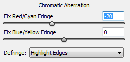
chromatic aberration sliders in photoshop
Correction. Reducing chromatic aberrations can make an enormous difference in sharpness and image quality — especially near the edges of your frame. However, only some components of CA can be mostly removed. The trick is to identify and apply the appropriate tools for each component separately — without making the others worse. For example, reducing axial CA in one region (by mistakenly using lateral CA tools) will usually make its appearance worse in other regions.
Start by using a high contrast edge near the image's corner, and view at 100-400% on-screen to gauge correction effectiveness. It is often best to start with lateral CA, using the red/cyan then blue/yellow adjustment sliders, since this is most easily removed. Then, whatever remains has to be the combined result of axial CA and sensor blooming, which can be reducing using the "Defringe" tool in photoshop. Regardless of which settings you start off with though, the key is to experiment.
 Original at 400%
 After Lateral CA
Removed
 After Blooming &
Axial CA Reduced
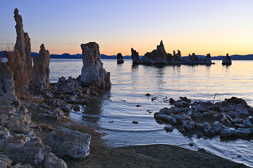
Crop is from the upper left of the water sunset image above.
Don't expect miracles though; some blooming and axial CA will almost always remain. This is especially true with light sources at night, stars and direct reflections off of metal or water.

")
AUTOMATED LENS CORRECTION PROFILES
Modern RAW development software often has the ability to perform lens correction using pre-calibrated parameters for a broad range of camera and lens combinations. This can be an enormous timesaver if available. Adobe Camera RAW (ACR), Lightroom, Aperture, DxO Optics and PTLens all have this capability in their most recent version.
Don't be afraid to change these from their default of 100% (full correction). Some might prefer to retain a little vignetting and distortion, but to fully correct for chromatic aberrations, for example. With CA though, best results are ordinarily achieved by followed this up with manual fine-tuning.
If you're using lens correction as part of your photo editing workflow, the order in which it's performed can impact results. Noise reduction is usually more effective prior to CA removal, but sharpening should be performed afterwards since this can harm CA removal. If you're using RAW development software though, don't worry about the order since these will be intelligently applied.
FURTHER READING
For similar topics, also visit the following tutorials:
- Digital Photo Editing Workflow
A good way to see how lens corrections fit in amongst all the other editing steps. - Camera Lens Quality: MTF, Resolution & Contrast
An overview of all other lens aspects contributing to lower image quality. - Understanding Camera Lenses
Includes an interactive lens quality visualization tool at the start.
MOON & NIGHT PHOTO CALCULATOR
Planning is more important than ever with moon, night and astrophotography, in part because the desired conditions may only arise a few times a year. The following calculator can be used for guidance:
Calculator in part based on formulae in the book Astronomical Algorithms by Jean Meeus.
Not intended for use within the Arctic or Antarctic circles.
Sky darkness results are for tonight through to tomorrow morning.
INSTRUCTIONS
Your current location and time zone have likely already been detected. If you want to try somewhere else, you can either (i) drag and drop the marker or (ii) enter a landmark name and/or address in the search box and click "Find Location." The results will then update automatically using your current time settings.
Example usage scenarios:
Astrophotography. The key here is knowing when the sky is as dark as possible. Use the calculator to ensure that (i) you are within astronomical twilight and (ii) the moon either hasn't risen yet or is a new moon.
Moonlit Nightscapes. The key here is knowing when you'll have the desired ground lighting. Use the calculator to ensure that (i) the time is an hour after moonrise or an hour before moonset (often ideal), (ii) this coincides with nighttime, and (iii) the moon is near a full moon to give shorter exposure times.
Lunar Photography. The key here is knowing when the moon itself appears as desired. Use the calculator to ensure that (i) the moon has risen during nighttime and (ii) the moon is at the phase you want to photograph (such as a crescent if you're after a moody cloud-shrouded shot, or gibbous to bring out its surface detail).
PHASES OF THE MOON
Typical lunar nomenclature over its 29.5 day cycle:
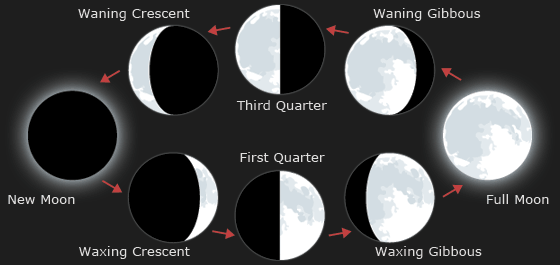
Despite all of the names, there's really just two concepts to remember:
- Size. The terms gibbous and crescent specify whether the moon is greater than or less than half illuminated, respectively. The special cases of new moon and full moon refer to no illumination and full illumination.
- Phase Direction. The terms waxing and waning specify whether the illuminated portion of the moon is growing or shrinking, respectively.
NOTES
Midnight. This describes when the sun is farthest below the horizon, and corresponds with when the sky is darkest. Whenever there is no sunrise or sunset, such as near the poles in summer and winter, this describes the time of day when the sky is least bright.
Astronomical Twilight. This describes when the sky becomes completely black and is suitable for astronomical observations of faint stars. It corresponds with when the sun dips to 18° below the horizon. However, at high latitudes during summer, the sun may never actually dip this far below the horizon.
Moonrise & Moonset. These represent when the upper edge of the moon's disc disappears below the horizon — regardless of whether that portion of the disc is currently illuminated. Just as with sunrise and sunset, side lighting from the moon will cast long shadows and often appear most striking, so the hour after moonrise and before moonset may give optimal light for nightscapes. Unlike sunrise and sunset though, the moon rise and set times are typically 50 minutes later each day.
FURTHER READING
For similar topics, also visit the following tutorials:
- Sunset, Sunrise & Twilight Calculator
This one is more useful for daylight photography. - Intro & Common Obstacles in Night Photography
Gives an overview of the unique challenges for photography at night. - Making the Most of Natural Light in Photography
Discusses how different times of day affect subject appearance.
SUNRISE & SUNSET PHOTO CALCULATOR
Planning when to be on location for the right light can make a tremendous difference in your photography. The following daylight calculator can be used for guidance:
Calculator in part based on formulae in the book Astronomical Algorithms by Jean Meeus.
Results assume an unobstructed view of a planar horizon.
INSTRUCTIONS
Your current location and time zone have likely already been detected. If you want to try somewhere else, you can either (i) drag and drop the marker or (ii) enter a landmark name and/or address in the search box and click "Find Location." The results will then update automatically using your current time settings.
TIME OF DAY & SUBJECT APPEARANCE
The color diagram gives a rough depiction of how the color temperature of sunlight transitions between each of the marked times, presuming clear skies.


Depiction of light as the day progresses from midday to dusk (or reverses towards dawn).
For locations near the poles, the above representation may no longer be representative.
Note how the contrast, direction and color temperature changes the appearance of the sphere as the day progresses. For more on types of light, also refer to the tutorial on natural light in photography.
NOTES
Accuracy. What we really see during sunrise and sunset is the sun's apparent position — not its actual position. The apparent position is determined by how the sun's image gets refracted as viewed through the atmosphere, similar to how objects underwater appear shifted relative to their actual position. Therefore, the times above may differ from actual times by up to 5 minutes, depending on weather properties such as air temperature, humidity and turbulence.
Midday Time. This describes when the sun is highest in the sky, and is often also referred to as "high noon" or "astronomical noon." For situations when there is no sunrise or sunset, such as near the poles in summer and winter, this describes the time of day when the sky is least dark (and the sun is closest to the horizon).
Sunrise & Sunset. These represent when the upper edge of the sun's disc disappears below the horizon. During this time the sky may become an intense fiery red or pink, depending on cloud cover. The hour after sunrise and before sunset is commonly referred to as the "golden hour," since this is often when sunlight appears as a rich orange.
Dawn & Dusk. These represent the start and end of civil twilight, respectively (when the sun crosses 6° below the horizon). Unlike sunrise and sunset, these times aren't necessarily visually well-defined. In general though, twilight is when a clear sky is still bright and depicts colors other than a dark blue.
UNIQUE SCENARIOS NEAR THE POLES
At locations near the poles, you may notice that sunrise/sunset or dawn/dusk is listed as "never" and a popup message appears. These scenarios might include:
- Perpetual Daylight. The sun remains above the horizon throughout the day, in which case both sunrise/sunset and dawn/dusk will be listed as "never." This can happen very close to the poles and/or near the summer equinox.
- Perpetual Nighttime. The sun remains more than 6° below the horizon throughout, in which case both sunrise/sunset and dawn/dusk will be listed as "never." This can happen very close to the poles and/or near the winter solstice.
- Perpetual Twilight. The sun remains below the horizon throughout the day, but never dips lower than 6° below the horizon. Both sunrise/sunset and dawn/dusk will be listed as "never." This can happen near the poles in the spring and fall.
- Never Brighter than Twilight. At midday the sky is bright but the sun never rises above the horizon; at midnight the sky becomes dark since the sun dips at least 6° below the horizon. Only sunrise and sunset will be listed as "never."
- Never Darker than Twilight. At midday the sun is high in the sky, but at midnight the sun never dips more than 6° below the horizon, so the sky remains relatively bright. Only dawn and dusk will be listed as "never."
Very high latitudes may also have more than one sunrise or sunset in a single day, but this calculator only mentions the first of each occurrence.
FURTHER READING
For similar topics, also visit the following tutorials:
- Moon & Night Photography Calculator
This one is more useful for night photography. - Making the Most of Natural Light in Photography
Discusses how different times of day influence subject appearance. - Understanding White Balance
Discusses the types and terminology of light's color temperature.
NATURAL LIGHT IN PHOTOGRAPHY
Paying more attention to light is perhaps the single most important step you can take to improve your photography. With many landscapes, having good natural lighting can even be more important than the choice of subject itself. Different types of natural light can also produce a wide variety of subject appearances — even though these all have the same light source. Learn how to achieve the right light for your subject by utilizing the unique qualities of your particular time of day and weather.


Three factors influence how natural light renders a subject: time of day, camera direction and weather. We'll first explore time of day under clear skies, then move onto specific weather conditions; lighting directions will be saved for a future tutorial.
OVERVIEW
Even though all natural light originates from the sun, a subject's illumination is actually comprised of several components:
| Direct Sunlight (warmer, high contrast) |
Diffuse Skylight (cooler, low contrast) |
Bounced Light (has qualities of reflecting object) |
Move your mouse over each lighting component above to isolate its effect.
Depending on the time of day, the relative amount of each component changes — resulting in an overall illumination with a different white balance or contrast. We'll start with astronomical high noon (when the sun is at its highest), then see what happens as the day progresses to sunset (or reverses to sunrise).

| Time of Day | Contrast | Colors | Direction of Sun | |
|---|---|---|---|---|
| 1. Midday | → | Highest | Neutral White | Near Vertical |
| 2. Evening & Morning | → | High | Slightly Warm | Mid to Low |
| 3. Golden Hour & Sunrise/Sunset | → | Medium | Warm to Fiery | Near Horizontal |
| 4. Twilight, Dawn & Dusk | → | Low | Cool Pastel | Below Horizon |
note: the contrast characteristics are intended only for clear skies
Time of Day. Further from high noon, the sun dips closer to the horizon. This results in lower contrast, because sunlight has to pass through more atmosphere, and more easily bounces off the ground toward the subject. In addition, the atmosphere selectively filters more of the sun's blue light — resulting in warmer light overall.
Weather. Along with time of day, the type and extent of cloud cover is the other most influential cause of lighting variation. It primarily influences lighting because it changes the balance between direct sunlight and diffuse skylight, which in turn affects the apparent contrast and color temperature of the light source. We'll discuss this more at the end.
CLEAR MIDDAY SUNSHINE

Midday lighting is primarily comprised of direct, downward sunlight. Such light has little chance to scatter and diffuse through the atmosphere, or to bounce off the ground and illuminate the subject indirectly. This results in the hardest and most neutrally-colored lighting of any time of day, and is typically the least desirable type of natural light.
Due to these drawbacks, too often photographers put their camera away — potentially missing unique opportunities. For example, water may appear more transparent, since light penetrates deeper and direct reflections off the surface are less likely. Alternatively, other types of photographs are more about capturing a particular event, as opposed to achieving an image with optimal lighting.
Overcoming Unique Challenges. Just be aware that color saturation is typically lower, and that downward shadows generally don't produce flattering portraits, or make other subjects appear as three-dimensional. Many photographers encourage liberal use of polarizing filters to manage contrast, since this is often when they're most impactful, but at this time these can also more easily make the sky appear unnaturally dark and blue. If shadows appear too harsh and colors aren't sufficiently saturated, try converting to black and white, since these may even benefit from the high contrast of midday light.
EVENING & MID-MORNING

Evening and mid-morning light becomes slightly warmer, and begins to cast noticeable shadows. Since direct light now originates from an upper side, subjects often appear much more three dimensional. Such lighting is usually much more predictable than sunsets and sunrises, primarily because this time is less dependent on the effect of surrounding mountains, or the location of the cloud line.

Overcoming Unique Challenges. Mid-evening and morning has perhaps the most compromised lighting: it's not as neutrally colored as during midday, but also not as warm or intense as a sunset. It's also less harsh and originates from a better angle than during midday, but also isn't as soft and diffuse as during twilight or overcast lighting. These qualities make it a good all-around time of day for photography, but also run the risk of making photos appear too ordinary, since one cannot use any uniquely exaggerated lighting traits to emphasize particular features in their subject.
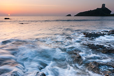
GOLDEN HOUR & SUNRISE/SUNSET
The hour just before sunset and just after sunrise (the "golden hour") is typically regarded as having the most desirable light for photography. This is characterized by horizontal light that casts long shadows and gives subjects a warm glow.
Sunsets and sunrises make for exciting and highly varied lighting, primarily because these are heavily influence by subtleties in the weather. Clouds are rendered using sunlight which reflects off them from underneath — as opposed to sunlight which has diffused through them from above — potentially causing the sky to light up with a soft, warm light.
Overcoming Unique Challenges. Sunsets and sunrises are often spectacularly vibrant in person, but this isn't always translated well into an image. Make sure that your camera's auto white balance doesn't counteract an otherwise warm-looking scene, or that the color saturation isn't overly conservative to minimize the risk of color clipping. Ironically, when the lighting is most dramatic is also when your camera is most likely to make an error with its exposure; try to take several photos, or use partial or spot metering just in case.
Sunrise vs. Sunset. Although sunsets and sunrises are in theory identical, weather patterns can cause these to be consistently different, so many photographers prefer one over the other. Some find that they're more prepared to photograph during sunset over sunrise, because light quality builds steadily prior to a sunset — whereas with sunrises, the light often starts at its best and gradually fades. In addition, being awake and on-location for a sunrise is often impractical in the summer months. On the other hand, sunrise photography is usually void of potentially distracting crowds, and more often has a low-laying mist and dew on foliage. Sunrises often also have a calm, quiescent quality — particularly with scenes involving water — that isn't present during sunsets.
TWILIGHT, DAWN & DUSK
Twilight, dawn and dusk typically describe the half hour before sunrise or after sunset — when the sky is still bright but there's no longer any direct sunlight. The primary source of light effectively becomes the entire sky, with one side appearing warm and reddish and the other becoming a cool blue or purple. This can produce wonderfully soft, multicolored lighting that gives a calm, peaceful mood to subjects.
Overcoming Unique Challenges. Perhaps the biggest disadvantages are the lack of contrast and ambient light. Hand-held shots are therefore rarely possible, and achieving a sufficient sense of depth may require more attention to composition. Cameras also often over-expose twilight scenes when using automatic exposures — potentially washing out the otherwise delicate colors — since twilight almost never contains any fully white objects.
Alpenglow. If you're lucky, a phenomenon called "alpenglow" may appear as a red or pinkish glow in the sky furthest from the setting sun, but it's never a guarantee. Alpenglow can be a helpful effect for extending a sky's warmth well beyond sunset.
SHADE & OVERCAST SUNLIGHT

Shade and overcast light typically have a cool, soft appearance, since the source of such light is spread across the entire sky, and doesn't include any direct sunlight. Textures therefore appear much subtler, and reflections on smooth surfaces are more diffuse and subdued. The color of such light is also more heavily influenced by bounced light from nearby objects, so subjects shaded by foliage can even incur a greenish tint.
Many photographers shy away from this type of lighting, but doing so is often a mistake. For example, depending on the degree of cloud cover, bright overcast light can actually be ideal for outdoor portraits and wildlife (as long as the cool white balance is corrected), since it doesn't cast harsh shadows across the subject's face. Bright overcast light may also enhance close-up photography, such as with flowers, since the appearance and saturation of colors usually improve. Alternatively, low contrast light can also be better when the subject itself is high in contrast, such as subjects containing both dark and light colors.
Overcoming Unique Challenges. A common trick is to keep the gray sky out of the photo — unless the clouds are particularly moody and highly textured. Since shadows play much less of a role, achieving a sufficient sense of depth may be difficult — just as during twilight — but this time one also doesn't have the appealing pastel lighting to compensate. Images straight out of the camera often appear more bluish than desired, so shooting in RAW and adjusting the white balance afterwards is also encouraged. Liberal use of the levels tool and curves tool may also be helpful if one wishes to use the full contrast range in a print.
OTHER SPECIFIC WEATHER CONDITIONS
Weather is effectively just a massive filter that lies between the sun and your subject. At one extreme, light could be relatively warm and highly localized, such as sunlight from a clear sky. At the other extreme, light could be cooler and envelop the subject, such as diffuse sunlight through a densely overcast sky. The thickness and extent of cloud cover is what decides where in this continuum your particular weather will have its effect.
When the sky is partly cloudy, one can effectively use the sky to paint their scene with light — if one is willing to wait for just the right moment. This is an excellent and often overlooked opportunity, especially during the middle of the day.
Alternatively, stormy weather can produce extremely high contrast light since rain clears the air of haze and dust. Sunsets after a storm are also often the most dramatic, in part because the sky can become much darker than the land — providing a nice high contrast backdrop for front-lit subjects. This is also when rainbows are most likely to appear.


Other scenarios include photography in the fog, mist or haze. This not only greatly decreases light's contrast — just as during an overcast day — but also does so progressively for more distant objects.
FURTHER READING
We also have an online tool which will automatically calculate your times and direction:
Sunrise, Sunset & Twilight Calculator for Photography
For similar topics, also visit the following tutorials:
- Understanding White Balance
Discusses the types and terminology of light's color temperature. - Introduction to Portrait Lighting: One Light Source
Understand how light influences the appearance of a portrait. - Photography in Fog, Mist or Haze
Learn how these unique weather conditions influence lighting. - Common Obstacles in Night Photography
An introduction to some of the challenging technical hurdles.
CAMERAS vs. THE HUMAN EYE
Why can't I just point my camera at what I'm seeing and record that? It's a seemingly simple question. It's also one of the most complicated to answer, and requires delving into not only how a camera records light, but also how and why our eyes work the way they do. Tackling such questions can reveal surprising insights about our everyday perception of the world — in addition to making one a better photographer.
 |
VS. |  |
INTRODUCTION
Our eyes are able to look around a scene and dynamically adjust based on subject matter, whereas cameras capture a single still image. This trait accounts for many of our commonly understood advantages over cameras. For example, our eyes can compensate as we focus on regions of varying brightness, can look around to encompass a broader angle of view, or can alternately focus on objects at a variety of distances.
However, the end result is akin to a video camera — not a stills camera — that compiles relevant snapshots to form a mental image. A quick glance by our eyes might be a fairer comparison, but ultimately the uniqueness of our visual system is unavoidable because:
What we really see is our mind's reconstruction of objects based on input provided by the eyes — not the actual light received by our eyes.
Skeptical? Most are — at least initially. The examples below show situations where one's mind can be tricked into seeing something different than one's eyes:
 False Color
 Mach Bands
False Color: Move your mouse onto the corner of the image and stare at the central cross. The missing dot will rotate around the circle, but after a while this dot will appear to be green — even though no green is actually present in the image.
Mach Bands: Move your mouse on and off of the image. Each of the bands will appear slightly darker or lighter near its upper and lower edges — even though each is uniformly gray.
However, this shouldn't discourage us from comparing our eyes and cameras! Under many conditions a fair comparison is still possible, but only if we take into consideration both what we're seeing and how our mind processes this information. Subsequent sections will try to distinguish the two whenever possible.
OVERVIEW OF DIFFERENCES
This tutorial groups comparisons into the following visual categories:
The above are often understood to be where our eyes and cameras differ the most, and are usually also where there is the most disagreement. Other topics might include depth of field, stereo vision, white balancing and color gamut, but these won't be the focus of this tutorial.
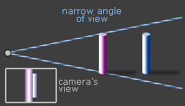
1. ANGLE OF VIEW
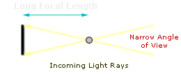
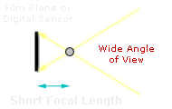
With cameras, this is determined by the focal length of the lens (along with the sensor size of the camera). For example, a telephoto lens has a longer focal length than a standard portrait lens, and thus encompasses a narrower angle of view:
Unfortunately our eyes aren't as straightforward. Although the human eye has a focal length of approximately 22 mm, this is misleading because (i) the back of our eyes are curved, (ii) the periphery of our visual field contains progressively less detail than the center, and (iii) the scene we perceive is the combined result of both eyes.
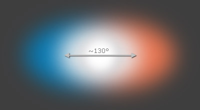
Each eye individually has anywhere from a 120-200° angle of view, depending on how strictly one defines objects as being "seen." Similarly, the dual eye overlap region is around 130° — or nearly as wide as a fisheye lens. However, for evolutionary reasons our extreme peripheral vision is only useful for sensing motion and large-scale objects (such as a lion pouncing from your side). Furthermore, such a wide angle would appear highly distorted and unnatural if it were captured by a camera.
 |
||
| Left Eye | Dual Eye Overlap | Right Eye |
Our central angle of view — around 40-60° — is what most impacts our perception. Subjectively, this would correspond with the angle over which you could recall objects without moving your eyes. Incidentally, this is close to a 50 mm "normal" focal length lens on a full frame camera (43 mm to be precise), or a 27 mm focal length on a camera with a 1.6X crop factor. Although this doesn't reproduce the full angle of view at which we see, it does correspond well with what we perceive as having the best trade-off between different types of distortion:
 Wide Angle Lens
(objects are very different sizes)
 Telephoto Lens
(objects are similar in size)
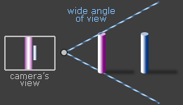
Too wide an angle of view and the relative sizes of objects are exaggerated, whereas too narrow an angle of view means that objects are all nearly the same relative size and you lose the sense of depth. Extremely wide angles also tend to make objects near the edges of the frame appear stretched.

(if captured by a standard/rectilinear camera lens)
By comparison, even though our eyes capture a distorted wide angle image, we reconstruct this to form a 3D mental image that is seemingly distortion-free.
2. RESOLUTION & DETAIL
Most current digital cameras have 5-20 megapixels, which is often cited as falling far short of our own visual system. This is based on the fact that at 20/20 vision, the human eye is able to resolve the equivalent of a 52 megapixel camera (assuming a 60° angle of view).
However, such calculations are misleading. Only our central vision is 20/20, so we never actually resolve that much detail in a single glance. Away from the center, our visual ability decreases dramatically, such that by just 20° off-center our eyes resolve only one-tenth as much detail. At the periphery, we only detect large-scale contrast and minimal color:
Qualitative representation of visual detail using a single glance of the eyes.
Taking the above into account, a single glance by our eyes is therefore only capable of perceiving detail comparable to a 5-15 megapixel camera (depending on one's eyesight). However, our mind doesn't actually remember images pixel by pixel; it instead records memorable textures, color and contrast on an image by image basis.
In order to assemble a detailed mental image, our eyes therefore focus on several regions of interest in rapid succession. This effectively paints our perception:


The end result is a mental image whose detail has effectively been prioritized based on interest. This has an important but often overlooked implication for photographers: even if a photograph approaches the technical limits of camera detail, such detail ultimately won't count for much if the imagery itself isn't memorable.
Other important differences with how our eyes resolve detail include:
Asymmetry. Each eye is more capable of perceiving detail below our line of sight than above, and their peripheral vision is also much more sensitive in directions away from the nose than towards it. Cameras record images almost perfectly symmetrically.
Low-Light Viewing. In extremely low light, such as under moonlight or starlight, our eyes actually begin to see in monochrome. Under such situations, our central vision also begins to depict less detail than just off-center. Many astrophotographers are aware of this, and use it to their advantage by staring just to the side of a dim star if they want to be able to see it with their unassisted eyes.
Subtle Gradations. Too much attention is often given to the finest detail resolvable, but subtle tonal gradations are also important — and happen to be where our eyes and cameras differ the most. With a camera, enlarged detail is always easier to resolve — but counter-intuitively, enlarged detail might actually become less visible to our eyes. In the example below, both images contain texture with the same amount of contrast, but this isn't visible in the image to the right because the texture has been enlarged.
 Fine Texture
(barely visible)
Enlarged 16X
 Coarse Texture
(no longer visible)
3. SENSITIVITY & DYNAMIC RANGE
Dynamic range* is one area where the eye is often seen as having a huge advantage. If we were to consider situations where our pupil opens and closes for different brightness regions, then yes, our eyes far surpass the capabilities of a single camera image (and can have a range exceeding 24 f-stops). However, in such situations our eye is dynamically adjusting like a video camera, so this arguably isn't a fair comparison.
 |
 |
 |
| Eye Focuses on Background | Eye Focuses on Foreground | Our Mental Image |
If we were to instead consider our eye's instantaneous dynamic range (where our pupil opening is unchanged), then cameras fare much better. This would be similar to looking at one region within a scene, letting our eyes adjust, and not looking anywhere else. In that case, most estimate that our eyes can see anywhere from 10-14 f-stops of dynamic range, which definitely surpasses most compact cameras (5-7 stops), but is surprisingly similar to that of digital SLR cameras (8-11 stops).
On the other hand, our eye's dynamic range also depends on brightness and subject contrast, so the above only applies to typical daylight conditions. With low-light star viewing our eyes can approach an even higher instantaneous dynamic range, for example.
*Quantifying Dynamic Range. The most commonly used unit for measuring dynamic range in photography is the f-stop, so we'll stick with that here. This describes the ratio between the lightest and darkest recordable regions of a scene, in powers of two. A scene with a dynamic range of 3 f-stops therefore has a white that is 8X as bright as its black (since 23 = 2x2x2 = 8).


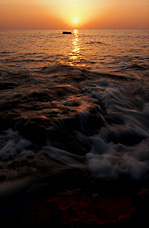
Photos on left (matches) and right (night sky) by lazlo and dcysurfer, respectively.
Sensitivity. This is another important visual characteristic, and describes the ability to resolve very faint or fast-moving subjects. During bright light, modern cameras are better at resolving fast moving subjects, as exemplified by unusual-looking high-speed photography. This is often made possible by camera ISO speeds exceeding 3200; the equivalent daylight ISO for the human eye is even thought to be as low as 1.
However, under low-light conditions, our eyes become much more sensitive (presuming that we let them adjust for 30+ minutes). Astrophotographers often estimate this as being near ISO 500-1000; still not as high as digital cameras, but close. On the other hand, cameras have the advantage of being able to take longer exposures to bring out even fainter objects, whereas our eyes don't see additional detail after staring at something for more than about 10-15 seconds.
CONCLUSIONS & FURTHER READING
One might contend that whether a camera is able to beat the human eye is inconsequential, because cameras require a different standard: they need to make realistic-looking prints. A printed photograph doesn't know which regions the eye will focus on, so every portion of a scene would need to contain maximal detail — just in case that's where we'll focus. This is especially true for large or closely viewed prints. However, one could also contend that it's still useful to put a camera's capabilities in context.
Overall, most of the advantages of our visual system stem from the fact that our mind is able to intelligently interpret the information from our eyes, whereas with a camera, all we have is the raw image. Even so, current digital cameras fare surprisingly well, and surpass our own eyes for several visual capabilities. The real winner is the photographer who is able to intelligently assemble multiple camera images — thereby surpassing even our own mental image.
Please see the following for further reading on this topic:
- High Dynamic Range. How to extend the dynamic range of digital cameras using multiple exposures. Results can even exceed the human eye.
- Graduated Neutral Density (GND) Filters. A technique for enhancing the appearance of high contrast scenes similar to how we form our mental image.
- Photo Stitching Digital Panoramas. A general discussion of using multiple photos to enhance the angle of view.

DIGITAL PHOTO RESTORATION
Digital photo restoration can work miracles by turning a faded old family portrait into an image of seemingly modern quality. Alternatively, this process can work in reverse to give a photograph a timeless feel. Performing either of these transformations yourself is not as difficult as it may seem — you just need to know which restoration tools to use.


example photo restoration from a scanned print, circa 1900
Although photos can degrade in a variety of ways, this usually includes some combination of fading, color casts (often yellowish), and localized physical damage (such as stains or scratches). Fortunately, photo editing has just the right tools for each aspect:
- Fading: levels, curves, contrast and black level tools
- Color Casts: white balance, color balance and other color tools
- Localized Damage: clone stamp, healing brush and other selective editing tools
Each of these will be discussed separately in the sections below, but before that we need to focus on the scanner itself . . .
IT ALL STARTS WITH THE SCANNER
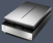
Before any digital restoration can be performed, the original photo (or film negative) needs to be scanned. This step is critical, since it ultimately determines your restoration's potential. Needless to say, try and use the best scanning equipment and software at your disposal. Everything else being equal, flatbed scanners usually provide much higher quality than similar sheetfed scanners.
Scanning Software. Often whichever software came with your scanner will work fine, especially since this caters to the capabilities of your particular device. However, sometimes this can be too limiting, in which case Vuescan and Silverfast are two notable third-party choices. Silverfast is quite powerful if you happen to have the film negative, while Vuescan is more than sufficient (and inexpensive) for printed photos.
Scanner Settings. Pay particular attention to the following:
- Resolution. In general, use a dot per inch (DPI) resolution of at least 400-600 DPI for prints, and several times this resolution with film negatives. The chosen scanning resolution will depend on the sharpness and focus of the original images, but should ideally resolve the speckles of noise/grain in the print. Try experimenting with different settings so that you can see what the image looks like on-screen.
- Precision. Scan at the highest bit depth possible: 16-bits per channel or 48-bits in total color depth, if available. This way your digital original can withstand more retouching before it begins to show signs of posterization.
- File Type. Save the scan as a TIFF file to maximize detail preservation. If your scanner and software support RAW/DNG (digital negative) files then this is even better.
- Color vs. B&W. Saving black and white photos as grayscale image files can preserve disk space, but this isn't the only consideration. A color scan can sometimes make the restoration process easier — even for a black and white image — since color makes it easier to identify and remove stains which aren't native to the photo.
- Film Negatives. These provide more flexibility — if you are fortunate enough to still have them. However, negatives are often more susceptible to physical damage, so sometimes the original photo is still a better source. Regardless, you will need to either send the negatives off for professional drum scanning, or have a film negative capable scanner.
ARCHIVE THE ORIGINAL SCANNED FILE
Before any editing, first save your original scanned TIFF or RAW/DNG file, and preferably in more than one location. All subsequent editing should be saved in a separate file. Restoration technique, personal preference, intended use and imaging technology all change — potentially requiring a new restoration at a later date (with a photo that has continued to degrade). See the tutorial on archival digital photo backup.
1. FADING: RESTORE CONTRAST & DYNAMIC RANGE
Perhaps the single most common form of degradation is fading. This causes the blacks to become less dark, and the whites to become less light. In other words: the photo begins to lose contrast.
Fortunately, this is also one of the more straightforward ageing artifacts to counteract. The most universal tool for fixing this is probably the levels tool in Photoshop (and other image editing programs). Move your mouse over the before and after labels below to see how the levels tool changes the example photograph:
Levels Adjustment Tool: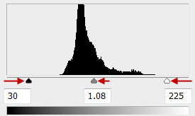 In general, you'll want to: |
 |
|
| Before | After | |
The image histogram needs to extend across as broad a range of tones as possible (from left to right above), but not so much that this detracts from the (presumed) mood of the original photograph. For example, many types of old photos never had fully black or white regions — even when brand new — giving these a softer and subtler appearance.
Other specific tips on contrast-enhancement include:


- Duplicate Layers & Opacity. Perform any contrast changes in a duplicate layer; that way the effect can be fine-tuned later using the opacity slider.
- Adjustment Layers. Alternatively, using adjustment layers is an even better solution. This has the added benefits of minimizing the risk of posterization, permitting quick and easy re-adjustment and reducing the overall file size. For contrast-enhancement in Photoshop, select "Layer > New Adjustment Layer > Levels..." from the top menu.
- Lightness Channel. You can only increase contrast of shades (and not of colors) by performing adjustments on the lightness channel; otherwise this can inadvertently exacerbate color casts, or change the overall hue. If editing in duplicate or adjustment layers, you can achieve this by setting the blending mode to "luminosity."
- Automation. These typically work by stretching the image histogram so that it spans from the far left (black) to the far right (white). The "auto contrast" and "auto levels" features are two common ways to achieve this. While this is usually desirable for modern photos, it may result in too much contrast with an old photograph.
- Curves Tool. This can provide even more specific adjustments, but is a little more difficult to use and can be overkill for many restorations. See the tutorial on the Photoshop curves tool for more on this topic.
The same tools of opacity, duplicate layers and adjustment layers are also helpful in the next two sections . . .
2. COLOR CASTS: WHITE BALANCE & COLOR TOOLS
Fading is one thing when it simply reduces contrast, however it can become harder to restore — and more unsightly — if the photograph develops an unrealistic color cast. This appears as the familiar "yellowing" of photos — even in those from a few decades ago.


The upper portion of the white diaper was clicked on using the dropper tool for the above correction.
Using the "white balance dropper tool" is often the easiest technique since it has the potential to neutralize color casts in a single step. Use the dropper tool on a region which you believe to have been (i) light neutral gray, (ii) receiving most of its illumination from the primary light source and (iii) not tinted by light bouncing off nearby colored objects.
On the other hand, sometimes there just isn't an object which satisfies the above requirements — in which case you'll need to resort to one of the following:


- Automated Correction. This attempts to remove color casts not by using any specific region of a photo, but instead by analyzing the image as a whole. In Photoshop, two ways of achieving this are by selecting (i) "Auto Color" from the image drop-down menu, or (ii) "snap neutral midtones" after clicking the "Options..." button in the levels tool. Be careful though; many of these automated methods attempt to correct both color balance and contrast in a single step. As usual, edit in a duplicate layer so that the effect can be decreased afterwards.
- Manual Correction. This typically involves using the "color balance" (or similarly named) tool to tweak the overall warmth or coolness of a photo, or relative prevalence of magenta versus green. During adjustment, the image is manually inspected until the overall color balance is desirable.
 | |
| Cooler | Warmer |
| More Green | More Magenta |
Regardless, achieving just the right color balance can be highly subjective and there isn't always one right answer. When in doubt, it's generally a good idea to err on the side of having a photo that appears slightly warmer versus cooler, or has slightly more magenta as opposed to green coloring. Experiment with the mouseover buttons below the image to the right to see for yourself.
Complications. Perhaps the most common problem is that old photos don't always develop color casts uniformly. This might be due to how the photo was stored, or could even be a result of the chemistry of the photographic paper.
Non-uniform color casts unfortunately complicate the correction process because they require targeted adjustments. For example, if one shifted a photo's overall color balance to remove a yellow cast in the shadows, this would cause the midtones and highlights to appear bluish, or vice versa. In such cases, one needs to apply color corrections selectively, either by specifying highlights or shadows within this color balance tool, or by performing color correction with the curves tool on the individual color channels.
However, other times localized color casts are caused by stains — and not some gradual process affecting the entire image. In that case, one might be better off just blending or removing these regions entirely, as discussed in the next section. . .
3. LOCALIZED DAMAGE: CLONING & HEALING BRUSH
Old photos have likely incurred plenty of imperfections in the form of dust marks, rips or tears, stains, scratches and crinkles. These can distract from the image — particularly if located on or near someone's face:
 Original Scan
 After Cloning & Healing Brush Tools
Conservative restoration using only cloning and healing brush tools; some imperfections still remain.
Move your mouse over the image on the right to directly compare before/after versions.
By far the best tools for removing these are the clone stamp and healing brush tools (in Adobe Photoshop and most other editing software). These are in fact the only two tools used to restore the above image. Each tool has the following effect:
 |
 |
||
| 1 = Source Region 2 = Target Region |
Clone Stamp | Healing Brush | |
|---|---|---|---|
- Clone Stamp Tool. This works by replacing the image content in a target region with a copy from a source region. This is most useful for situations where you need to fully reconstruct all characteristics of a source region, such as when removing a large tear or duplicating a repeating object or pattern.
- Healing Brush Tool. This also works by replacing the content in a target region with that from a source region, except it only replaces texture — while preserving the original color and luminosity. Even though less is being replaced, this often actually makes the healing brush a much more effective tool. This is most useful when removing small or isolated imperfections, and when touching up uneven transitions caused by the clone stamp.
Each tool may require extensive practice until either is used to maximal effect. Both require clicking at least twice: once (while holding ALT/option key) to select the source, then again for the target. General tips and best-practices include:
- Tool Order. Optimal results are usually achieved by using each tool in succession. One can start by replacing all missing content with the clone brush tool, then by doing a final touch-up with the healing brush.
- Source Region. Perhaps the most important aspect is learning to choose the best source region for a given target; ideally the brush size should be no larger than required by the target imperfection, and the source should be as close as possible to the target's lighting and location within the image.
- Brush Hardness. A lower brush hardness setting causes the edges of the brush to blend in better with the image — especially with the clone stamp — but this also causes blurred or washed-out detail if the source and target textures are different.
- Repetition. Take extra care not to give the appearance of repeating features amongst otherwise random texture; this is a tell-tale sign that the cloning and healing brushes have been used, and is surprisingly easy to identify — even by those not familiar with photo editing. Using a diverse range of brush sizes can help make such repeating features less noticeable.
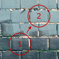
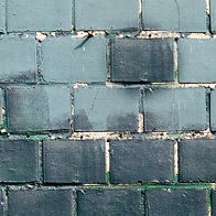
Move your mouse over the image below to see the combined effect of these tools on a large print that was digitally reassembled from torn pieces:
Restoration required extensive cloning since tears were across detailed brick textures. Photo circa 1929.
FINAL WORDS
Photo restorations require many interpretive decisions, so careful judgment is a critical aspect of the restoration process. Before you even touch the photo, ask yourself: what do you hope to accomplish, and which aspects are of highest priority to improve? Do your restorations maintain the original mood of the photo, or is that even important? All of these can influence your choice of several seemingly equal approaches to restoration.
Regardless, take your time! Proper removal of physical imperfections such as stains or scratches can be quite involved, so do not (always) expect miracles with just a few minutes of work.
For similar topics, also see the following tutorials:
- Levels Tool. A relatively simple and easy to use way of controlling image tones.
- Curves Tool. A more powerful but more complicated tonal adjustment tool.
- Digital Photo Editing Workflow. A comprehensive overview of all the typical steps.
DIGITAL PHOTO EDITING WORKFLOW
This article summarizes the most important steps to incorporate into your digital photo editing workflow (aka "post-processing workflow"). It isn't necessarily a procedure that you'll want to implement with all of your photos, but whenever you want to get that "keeper" looking just right, these steps can make all the difference.
 |
|
| Before | After |
The "after" image more accurately depicts how the scene appeared in person — a good goal for most photo editing. Only white balance, exposure compensation, shadow recovery and sharpening were applied to produce the "after" image above — all steps described in the workflow below.
OVERVIEW: TOP 10 POST-PROCESSING STEPS
Each is listed roughly in the order that they should be applied:
- White Balance - temperature and tint adjustment sliders
- Exposure - exposure compensation, highlight/shadow recovery
- Noise Reduction - during RAW development or using external software
- Lens Corrections - distortion, vignetting, chromatic aberrations
- Detail - capture sharpening and local contrast enhancement
- Contrast - black point, levels and curves tools
- Framing - straighten and crop
- Refinements - color adjustments and selective enhancments
- Resizing - enlarge for a print or downsize for the web or email
- Output Sharpening - customized for your subject matter and print/screen size
Note: Clicking on any of the steps above (or scrolling down this page) will take you to a quick summary of the most important considerations for each. Within these sections, you can also click on links which will lead you to more in-depth reading on each topic.
The above steps are virtually universal, so most photo editing software should work. If you've captured your images using the RAW file format (highly recommended), then the order of the above steps isn't as important, since they'll be intelligently applied when you develop using your RAW software. Otherwise it's critical that you follow the above sequence — especially with steps involving sharpening, resizing and noise reduction. Be careful though, extreme edits can easily cause image posterization with JPEG files.
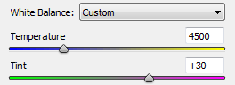
1. WHITE BALANCE
Simply getting the white balance right can often make the single biggest improvement in your photo's colors. An incorrect white balance will give your image a color cast, and can dramatically reduce both contrast and color saturation:


-
Controls. First adjust the "temperature" slider, then refine using the "tint" slider. The former controls the relative warmth of the image, whereas the latter controls the magenta-green shift.
- Problem Scenes. Paradoxically, cameras typically make the biggest white balance mistakes with scenes that are the most dramatically lit (and often could have benefited the most). Pay extra attention to white balance when shooting sunsets, indoor lighting and low-light photos, etc.
- Other Tools. If there's an object somewhere in the image which ought to be neutral gray, you can also use a "white point dropper" (or similarly named tool) to automatically set the white balance so that this object's color cast is subtracted from the entire image.
2. EXPOSURE: COMPENSATION & RECOVERY
This step presumes that you've done everything possible to get an accurate exposure at the time of capture. However, this isn't always possible (or practical).
 Under-Exposure
(clipped shadows in blue)
 Ideal Exposure
 Over-Exposure
(clipped highlights in red)
Fortunately, exposure can be fine-tuned by using the "exposure compensation" adjustment tool. Some general tips include:
- Image Histogram. Use this as an objective guide.
Refer to the following tutorial: Image Histograms: Tones & Contrast - Viewing. View the photo at a small size on-screen to make it easier to judge exposure. Also keep in mind that exposure isn't something that necessarily has a "right" answer; it often also depends on your artistic intent and just "looks right."
Refer to the tutorial on digital exposure techniques for more on this topic. - Extreme Tones. Pay careful attention to whether there are any blown highlights or lost shadow detail. If your software supports it, you might be able to recover these by using the "fill light," "recovery" or "black point" tools.
- Limitations. Avoid excessive compensation; if you increase exposure too much, noise will become visibly worse in the shadows, whereas decreasing it too much will make blown highlights more apparent. In either case, this probably means that your original exposure was way off, and you're likely better off working on a different photo.
3. NOISE REDUCTION
If your image was taken at a high ISO speed, it will likely benefit from noise reduction:
 High Image Noise Original
(taken at high ISO)
 Photo on Left
After Noise Reduction
 Best Case Scenario
(taken at low ISO)
- Order. Noise reduction is most effective when applied before any other image editing (with the exception of steps 1 & 2 above: exposure compensation and white balance).
- Types. Image noise has many types; some are easily removed while others aren't. Fortunately, noise from a high ISO speed is the type that is most easily addressed. Refer to the tutorial on image noise for a background on this topic.
- Limitations. Aim for noise reduction as opposed to complete removal, since the latter can make subjects appear unnaturally smooth. Some noise is OK and even expected.
- Dedicated Software. For problematic images, it is worth experimenting with dedicated noise reduction software such as Neat Image, Noise Ninja, Grain Surgery, or others.
- Sharpening. Noise reduction often goes hand in hand with sharpening, so this step may need to be applied in conjunction with step 4 (depending on your software). This is because they can offset eachother: sharpening increases noise, but noise reduction often decreases sharpness.
- In special cases, another technique is Noise Reduction by Image Averaging
4. LENS CORRECTIONS
The three most problematic (but correctable) lens imperfections include:
- Vignetting is most prevalent when you're using low f-stops, although some lenses are also more susceptible to this than others. A little vignetting is often beneficial, since this can draw attention to the image's center and make the frame's edges less abrupt. Also be aware that correcting for vignetting increases image noise near the corners. However, if your vignetting is actually due to physical blockage (such as a lens hood or filter), then this unfortunately cannot be corrected.
- Distortion will be most prevalent when you're using wide angle or telephoto lenses (or are using a zoom lens at either extreme). Don't try to fix this unless it's clearly visible, since doing so can slightly reduce corner resolution and alter your composition. Distortion is often acceptable with landscapes, but not in architectural photos.
- Chromatic Aberration will be most apparent at low f-stops, near the corners of your image and in regions with high contrast detail. When correcting for CA, use a high contrast edge near the image's extreme corner as a guide.
However, be aware that not all types of CA can be easily removed. If the CA doesn't appear to be helped using standard tools, you might also want to try other settings. For example, Lightroom and Adobe Camera RAW have a "fringing" tool which can reduce the more persistent types of CA (but potentially at risk of reducing detail).
For more, also see the tutorial on Improving Image Quality with Lens Corrections
5. DETAIL: SHARPENING, CLARITY & LOCAL CONTRAST
The aim of this step is to offset any inherent softening caused by your camera's sensor and lens ("capture sharpening"). It's also important that it be applied conservatively since you'll also be applying "output sharpening" in a later step. Sharpening should be performed with care because it can exacerbate other image quality issues (such as noise, chromatic aberrations, etc.). However, when done right, it can make a tremendous difference in the perceived quality of your photo:


For a background and specific techniques, refer to these tutorials:
- Guide to Image Sharpening (practical overview)
- Sharpening Using an Unsharp Mask (background on how the USM tool works)
- Understanding Sharpness (background on what factors contribute to sharpness)
- Using Local Contrast Enhancement (a technique for improving clarity)
6. CONTRAST: LEVELS & CURVES TOOLS
Images taken into the sun or near a bright indoor light source often suffer from low contrast (since these are leading causes of lens flare). Improving contrast often gives the long sought after "pop" or 3D look to your images:


- Too much contrast can make your subject look unrealistic if this was actually a trait of your scene (such as photos in the fog or haze).
- Higher contrast can also make colors appear more saturated.
Also refer to the following tutorials:
- Using the Levels Tool (in Photoshop & Other Image Editing Software)
- Using the Curves Tool (in Photoshop & Other Image Editing Software)
7. FRAMING: ROTATE & CROP
The vast majority of snapshots can be dramatically enhanced simply by cropping them to strengthen their composition. While there's no universal rules, some good principles are outlined in the tutorial on composition: the rule of thirds.


You may also want to crop your image so that it exactly matches a given print size (such as 8x10 inches). The aspect ratio of your crop can often be specified within your photo editing software — making this process much easier.
8. REFINEMENTS - COLORS & SELECTIVE ENHANCEMENTS


This is really a catch-all category, but typical adjustments might include:
- Colors - saturation, vibrance and other color adjustments. However, these are often overdone, and frequently aren't necessary if white balance, exposure and contrast have all been properly set.
- Selective Enhancements - spot removal of dust/blemishes (as shown above), creative sharpening (such as at the eyes of someone in a portrait) and selective noise reduction (in otherwise smooth areas such as the sky or skin). Important tools include: the healing brush, clone tool, layer masks and adjustment brushes. Consult your software's help file or manual to browse what options are available.
Once these have been applied, make sure to save a copy of your image, since all subsequent editing steps only depend on how and whether you intend to share this photo. This way you don't have to redo everything each time you plan on using your image for something else. Regardless, at this stage the image should now appear finished when viewed on your screen.
9. RESIZING: UPSIZE FOR PRINT, DOWNSIZE FOR WEB
Whenever you alter the display size of your image, you need to resize the file (using a process called "digital image interpolation"). The resize strategy can be quite different, depending on whether you want to make it larger or smaller.
When enlarging your image for a print:
- Always try to perform enlargements yourself instead of having this done by the printer
(otherwise it's easy to accidentally create prints which appear digital/pixelated). - If you see haloes around sharp edges, then your earlier capture sharpening may have been applied too aggressively (or with too high a radius value).
- Also refer to this tutorial: Optimizing Digital Photo Enlargement
When downsizing your image for the web or email display:
- Avoid introducing non-image patterns such as the moiré artifacts shown below.
- Also refer to this tutorial: Image Resizing for the Web and Email
 Original Image
 Downsized 50%
(unrealistic moiré artifacts)
Either way, what's often even more important than how you resize is that you make sure to follow this up with output sharpening (in the next step).
10. OUTPUT SHARPENING
Output sharpening is generally the very last image editing step applied to an image. Its settings are therefore customized for a particular output device, which may include special considerations based on the size, type and viewing distance of a print. Output sharpening can also offset any softening caused by resizing an image for the web or e-mail.
Refer to the guide to image sharpening for more on this topic.
OTHER RECOMMENDATIONS
- Backups. Once you're done, it's a good idea to make sure that you're properly archiving your digital photos using backup files. It would be a shame to lose all of this hard work spent in photo editing (and in the original photo capture).
- Monitor Calibration. The time spent photo editing is only beneficial if what you see on your screen is accurate. This is absolutely critical. If you haven't done so already, see the tutorial on monitor calibration for digital photography for more on this topic.
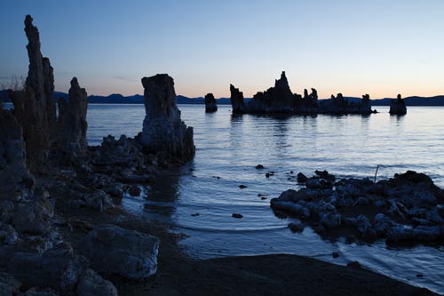
NEUTRAL DENSITY FILTERS
Neutral density (ND) filters reduce the amount of light entering the camera, enabling a longer exposure time than otherwise possible. This can emphasize motion, or make an otherwise tumultuous scene appear surreal and quiescent. Alternatively, an ND filter also enables larger apertures, which can produce a shallower depth of field, or achieve a sharper photo. Either way, this is a useful and often under-appreciated filter that deserves a deeper look. ND filters are also one of the easiest filters to use, and their effect cannot be replicated digitally — at least not with a single shot.

Exposure time:
1/8 second at f/10 and ISO100

Exposure time: 30 seconds at f/10 and ISO100
Examples courtesy of kyle kruchok.
OVERVIEW
An ND filter is nothing more than a semi-transparent piece of glass that gets placed in front of your lens. What makes it special, however, is that it obstructs a precisely controlled fraction of incoming light, and does so uniformly — thereby not altering image contrast or sharpness. The obstruction also aims to be equal across the visible spectrum, thereby not introducing a color cast (although this isn't always the case). This last characteristic also happens to be why it's called a neutral density filter.
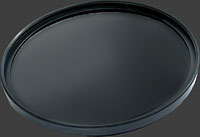
Example of a screw-on ND filter.
Even though they might appear gray or even opaque to our eyes, this isn't how your photo will appear; the camera's metering automatically compensates by letting in more light. However, the viewfinder will still appear very dark, so photographers often compose their image prior to placing the filter in front of the lens.
ND filters are specified by their light-reducing ability, where stronger filters appear as darker shades of gray. Some common specifications are summarized below:
| Filter Strength (in f-stops) |
Filter Terminology: | |||
|---|---|---|---|---|
| Light Reduction | Density | |||
| Common Uses | ||||
| 2 | 4X | 0.6 ND | → | Modest increases in exposure time, such as with waterfalls. |
| 3 | 8X | 0.9 ND | ||
| 10 | ~1,000X | 3.0 ND | → | Extreme increases in exposure time,such as blurring in broad daylight. |
| 13 | ~10,000X | 4.0 ND | ||
| 20 | ~1,000,000X | 6.0 ND | ||
Note: the light reduction factors above can also be thought of as exposure time multipliers.
Many other intermediate strengths exist, but high precision typically isn't needed with ND filters. One can often instead adjust the aperture, ISO or shutter speed by one stop without substantially changing the image.
Technical Note: Recall that each "stop" of light-reduction corresponds with a halving of light. A given filter strength therefore passes only 1/2strength of the initial incoming light, where "strength" is the filter strength in stops. For example, a 3-stop ND filter therefore only passes 1/8th the incoming light (since 1/23 = 1/(2*2*2) = 1/8).
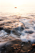
SHARPER & LONGER EXPOSURES
Neutral density filters can be used to create any combination of (i) a longer exposure time, (ii) a shallower depth of field and (iii) a sharper photograph. Of these three, the first is by far the most common application, so that's where we'll start.
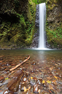 |
|
| 2 seconds | 1/10 second |
Columbia River Gorge, Oregon
Longer exposure times can achieve a wide variety of artistic effects, including softening the appearance of turbulent water, blurring waves of blowing grass, or emphasizing motion within a crowd of people. For a full discussion of these and other examples, see the tutorial on using shutter speed creatively.
However, let's focus on a specific waterfall example. Without a filter, one would use both the smallest aperture and the lowest ISO speed available. With a waterfall under soft daylight, f/22 and ISO100 might yield an exposure of 1/10 second. Unfortunately, not only is this duration insufficient, but the f-stop also had to be increased to the point of reducing sharpness due to diffraction.
Using an ND filter allows you to address both of these problems, but the extent to which either is improved depends on how you choose to allocate its effect. With a 5-stop ND filter, the same settings would yield a 32X longer exposure time — giving the water a much silkier appearance. Alternatively, one might feel that a 16X (4-stop) exposure time increase is sufficient when weighed against the potential for having a sharper photo, and could instead also decrease the f-stop to f/16.
How long of an exposure does one typically need? For full effect, multi-second exposures are usually a must. These can render clouds as streaks in the sky, blur moving people beyond recognition, or make waves appear as a uniform, low-laying mist. However, this depends on the nature of the motion, the amount of subject magnification and the desired effect. The key is lots of experimentation.
Exposure time: 60 seconds. Photo courtesy of colin southern.
During daylight, achieving this effect usually requires having a 10-stop or greater ND filter strength, which blocks all but a staggering 1/1000th of incoming light. Try revisiting the exposure settings from some of your past images to see what ND filter strengths would've been needed to achieve multi-second exposures. For example, if a given series of landscapes used a 1/50 second shutter speed at optimal aperture and ISO speed, then these would've required a 10-stop ND filter to extend this exposure time to 20 seconds.
SHALLOWER DEPTH OF FIELD
Although ND filters are primarily used to achieve longer exposures, a less common application is to enable a shallower depth of field in very bright light. For example, most SLR cameras have a maximum shutter speed of 1/4000 second, so a subject in direct sunlight might therefore require an f-stop greater than about f/4.0 (at ISO100). With a 2-stop ND filter, one could reduce this to f/2.0 — yielding a dramatic improvement in background blur and subject isolation.
Photo courtesy of alex campos. Note: above example doesn't use an ND filter, but does illustrate a situation where one could potentially help (depending on the camera's max shutter speed).
On the other hand, these situations are rare, and can usually benefit more from photographing the subject under dimmer (and likely less harsh) lighting. These situations are also unlikely to require anything stronger than a 2 or 3-stop ND filter.
DIGITAL NEUTRAL DENSITY FILTERS
Although ND filters cannot be replicated digitally, certain scenes and exposure times can be adequately emulated by employing a technique called image averaging. This works by combining several separate photos in a way that simulates a single, longer exposure:
 |
||||
| Choose Photo Averaging: | None | 2X | 4X | 16X |
In the above example, note how the water appears unusual when only two photos were averaged. Note the appearance of a double image from the distant wave crest. This effect is less pronounced with 4 photos, but hasn't been eliminated entirely.

Sun appears to make
discrete jumps across sky.
In general, better results are achieved when (i) more photos are averaged, and (ii) the exposure time of each photo is long compared to the interval between them. The above example required about 16 averaged shots to adequately mimic an ND filter, in part because each individual exposure was so brief.
Perhaps the biggest problem with averaging is that moving objects aren't always rendered as continuous streaks — no matter how many photos are averaged. Photos containing people, a visible sun, stars or other moving objects are all particularly susceptible.
OTHER TYPES & ALTERNATIVES
Filter Mounting Systems. Since ND filters have the same effect regardless of how they're shifted or rotated, using a filter mounting system isn't as critical (unlike with GND filters). However, these still have some advantages, including quicker insertion and removal, or freeing up a hand from holding the ND filter in place.
Step-Up & Step-Down Adaptors. These prevent you from having to purchase a different screw-on filter size for each lens diameter (usually listed as 77 mm, 72 mm, etc.). One could then just purchase an ND filter that fits their largest lens, and use what's called a "step-up adaptor" to have this same ND filer fit on any smaller lenses.
Variable ND Filters & Stacking. With these, the strength can be adjusted without having to switch filters, but they're also much more expensive — often even more so than a few separate filters. For more flexibility on a budget, many photographers therefore just stack multiple ND filters when they need to reproduce the light-reducing ability of a single stronger (but unavailable) filter.
Substitutes. Sometimes other filter types can be used in place of an ND filter. Depending on the size of your GND filters, these can sometimes be used as ND filters if the darker region is large enough to cover the entire lens. Alternatively, polarizing filters can function as 2-3 stop ND filters, but only if one also wants the polarized look, and only when this filter is rotated for maximum effect. Some photographers don't purchase 2 or 3-stop ND filters for this reason, and instead opt for stronger varieties (such as a 10-stops).
Filter Color Casts. Some cheaper ND filters can introduce a color cast. Luckily this isn't a major problem with digital cameras, since this can usually be corrected by adjusting the photo's white balance in post-processing. However, in extreme cases, cheaper filters can introduce color casts which don't correlate with white balance settings — making color cast removal much more difficult.
FURTHER READING
For similar topics, also visit the following tutorials:
- Camera Lens Filters: Polarizers, UV, ND & GND filters
An overview of all the types of lens filters, including a summary of ND filters. - Understanding & Using Polarizing Filters
These can often be used in place of ND filters, amongst other benefits. - Using Graduated Neutral Density (GND) Filters
These are similar to ND filters, but they only reduce light within part of the photo.
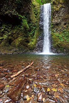
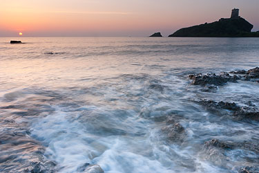
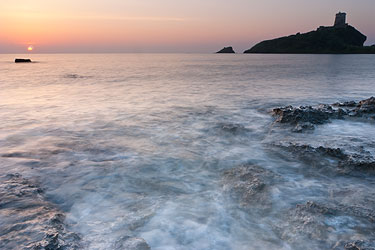
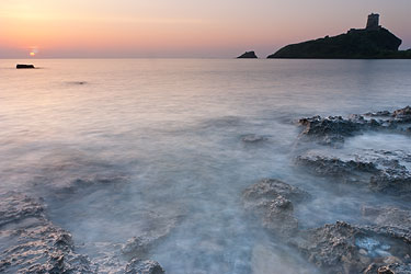
PORTRAIT FILL LIGHTING
A second light source — usually called a fill light or fill flash — can greatly improve portrait lighting. It reduces the depth of shadows and softens the appearance of facial features, amongst other traits. Best of all, a fill light is easy to create: either a simple on-camera flash or a reflector is often sufficient. However, a second light source can just as easily harm portraits. This tutorial therefore focuses on how to control the location and intensity of the fill light in order to produce a desired portrait appearance.


If you haven't done so already, also take a look at the first part of this tutorial:
Introduction to Portrait Lighting: One Light Source
OVERVIEW: TWO LIGHT SOURCES
With a single light source, the most important considerations were its direction and apparent size. While these have the same effect with a second light, they aren't typically varied independent of the main light. Instead, what's usually adjusted is the relative illumination of the secondary light compared to the main light. This controls how much the second light will "fill in" the shadows from the main light, and is why a secondary light is usually referred to as the fill light or fill flash:


note: diagrams show the effect of a fill light, not necessarily its ideal position (more on this later)
Perhaps the most common lighting scenario is to use an on-camera flash as the fill light, and sunlight as the main light. One could also use a secondary flash as a fill light in the studio, or could even use ambient light as the fill light and instead have the flash be the main light. There are many possibilities. The key is knowing how to control the qualities of your fill light — regardless of what source is being used to create it.
FILL LIGHT RATIOS
The terms "flash ratio" and "fill light ratio" describe* the relative amount of light from the main and secondary light sources, and effectively determine the overall contrast. For example, a value of 1:4 means that the fill light is a quarter the intensity of the main light. More balanced ratios produce weaker shadows:
 |
Fill Light Ratios: 0:1 no fill light |
| ↓ | |
 |
1:8 - 1:2 weaker fill light |
| ↓ | |
 |
1:2 - 1:1 stronger fill light |
 |
||||
| Choose a Fill Light Ratio: | ||||
| 0:1 | 1:8 | 1:4 | 1:2 | 1:1 |
Portraiture typically appears better with a flash ratio near 1:2. This is strong enough to produce subtle shadows, but not so strong that it eliminates shadows entirely (causing the subject to be appear flat).
However, one should always be wary of such seemingly strict rules in photography. Less fill light is often used for dark, "low key" style portraits with well-defined shadows. Similarly, more fill light might be necessary to render a brighter "high key" style, or just to provide a softer appearance (such as with a photograph of a baby). When in doubt though, the 1:2 ratio is a safe starting point.
*Note: These terms can be a little confusing, because a "fill light ratio" refers to the ratio between the secondary and primary sources of light, whereas the "flash ratio" refers to the ratio between the light from the flash and ambient light. To make matters worse, sometimes the ratio is used to describe the ratio between total light (ambient+flash) and that from flash alone. The numbers are sometimes also reversed, but the smaller number always refers to the fill light. We'll stick to the same definition throughout this tutorial, and since we'll only discuss scenarios where flash is weaker than other light sources, both terms are synonymous.
FILL LIGHT LOCATION
Unlike the main light source, the simplest location for a fill light is near the camera's line of sight ("on-axis"), but not so close that it appears in your image. That way, any shadows cast by the fill light won't be visible from the camera's perspective, so it won't matter if these appear hard (due to a small source). Perhaps the easiest way to achieve this type of fill light is to use a built-in or on-camera flash.
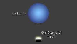 On-Axis Fill Light
(shadows fall behind the subject)
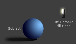 Off-Axis Fill Light
(shadows fall across the subject)
On the other hand, an on-axis fill light might be too restricting, and has a higher chance of producing direct reflections off the subject. Many therefore use a fill light which strikes their subject from a direction which partially opposes the main light ("off-axis"). This targets main light shadows more efficiently — even if the fill light ratio remains unchanged — and is therefore also less likely to affect the overall exposure.
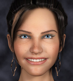
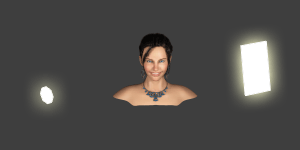
| Choose a Fill Light: |
Off-Axis Hard |
Off-Axis Soft |
On-Axis Hard |
The square light represents the main light, and the octagonal disc represents the fill light.
Above example uses a 1:1 fill ratio in order to improve visibility of fill shadows.
However, off-axis fill has its own disadvantages, with perhaps the worst being that one now has to worry about the appearance of shadows from the fill light. If these aren't made sufficiently soft, they can cause unrealistic-looking double shadows. To counteract this, the farther a fill light is placed from the camera's line of sight, the larger that light source needs to be. Move your mouse over the selections above to see this effect.
Note the second shadow to the right of her nose with the "off-axis hard" fill lighting. Also note how the on-axis fill light avoids producing double shadows even though it is a small (hard) source, but that it doesn't eliminate the shadows as thoroughly (even though it uses the same 1:1 fill light ratio).
Also keep in mind that off-axis fill lighting requires a more complex lighting arrangement, and is therefore usually reserved for portraits in a studio. An off-axis fill light also technically isn't a true fill light, since it cannot lighten all shadows visible to the camera — just those from its direction. For example, in the above portrait, the off-axis light is unable to reduce the shadows behind the hair on the upper right.
FILL FLASH CAMERA SETTINGS

Many only use flash when their scene has insufficient light for a hand-held photograph, but doing so misses out on perhaps an even more useful function: fill flash. Although it might seem counter-intuitive, portrait flash is perhaps most useful when there is plenty of sunlight. Fortunately, most cameras default to using their flash as a fill flash when the subject is well-lit* — but only if you force the flash to fire.
Cameras usually default to a flash ratio near 1:1, but this can be substantially off because it relies on your camera's metering system. To fine-tune this ratio, you'll want to apply flash exposure compensation (FEC). This modifies the amount of flash that your camera would otherwise emit, while leaving the other exposure settings unchanged.
*Note: Well-lit means that your camera doesn't deem camera shake to be a threat, which usually translates into having an exposure time that is shorter than about 1/60 of a second.
OTHER CONSIDERATIONS
Other important fill light techniques and considerations include:
Natural Fill Lighting. Thus far we've focused on scenarios where natural light is the main light source, and the camera's flash is used as the fill light. However, these roles could easily be reversed. The source of natural light usually needs to be soft though, such as from an overcast day or a subject in the shade. One also typically needs an off-camera or bounced flash in order for this to produce optimal results (see the discussion about lighting direction in the tutorial on portrait lighting).

Reflectors. These make a single light source illuminate a subject from a second direction. The reflection is dimmer than the main light, so reflectors are most commonly used as a fill light. An added benefit is that this light can easily have the same white balance as the main light, if desired. However, a disadvantage is that reflectors often don't provide enough light (even for a fill light). This is highly dependent on the reflectivity of the material, in addition to its distance from the subject. To increase illumination, reflectors are therefore usually placed as close to the subject as possible — often just outside the image frame.
Subject-Background Separation. With natural light portraits, a fill flash can help create additional subject-background separation, since the flash is likely to provide a lot more illumination to the (closer) subject than the (farther) background. You can control the strength of this effect by (i) moving closer to your subject and/or (ii) moving your subject farther from the background.
low ambient light
Ambient Light. All scenes have some amount of fill light — regardless of whether this has been added intentionally. Light from the main source bounces off walls and other objects, which collectively acts as a fill light. Shadows are therefore never fully black, and the actual amount of fill light is usually a little higher than that provided by your fill flash. However, studio lighting can still achieve very high contrast.
SUMMARY & FURTHER READING
Overall, the most important fill light choices are:
- Location: whether to place the fill near your camera's line of sight (on-axis), or off to the side (off-axis). On-axis fill is easier since one doesn't have to worry about how shadows appear, but off-axis fill gives more flexibility with placement and control over the appearance of reflections.
- Fill Ratio: the relative strength of your fill light, as compared to the main light. A good starting point is typically one part fill light for every two parts main light (denoted as a 1:2 ratio), but this will also depend on where your fill light has been located.
For background reading on this topic, also see part 1 of this tutorial:
Introduction to Portrait Lighting: One Light Source
For other similar topics, also visit the following tutorials:
- Camera Flash: Appearance
Discusses how to control the quality and appearance of light from a flash. - Our Interactive School of Portraiture (in the forums)
In particular, take a look at lesson 2: lighting and lesson 6: studio lighting.

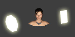
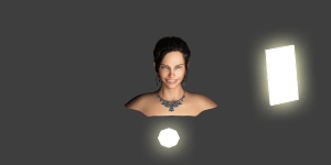
GRADUATED NEUTRAL DENSITY FILTERS
Graduated neutral density (GND) or "grad" filters are an essential tool for capturing scenes with a broad dynamic range. They're also perhaps a hidden secret of successful landscape photographers. While they have been used for over a hundred years, nowadays the grad ND effect can also be applied digitally, either during RAW development or in subsequent photo editing. In either case, knowing how to make the most of GND filters will undoubtedly have a huge impact on the quality of one's photographs.


INTRODUCTION
As we look around a scene, our eyes adjust to varying brightness levels. A standard camera, on the other hand, captures the entire scene using the same exposure. This can cause bright and dark regions to appear washed out and void of detail — unlike how they appeared in person.
Although photographic filters are often looked down upon as artificial enhancements, GND filters can actually do the opposite: help you achieve a photo which more closely mimics how the scene appeared in person.
Original Scene
 Camera Image
They work by obstructing progressively more light toward one side of the filter, and can be used in virtually any situation where brightness changes uniformly in one direction — either at a sharp boundary such as a horizon, or more gradually across the entire image. In general, wider angles of view are often enhanced more, primarily because these encompass a correspondingly greater range of brightness.
They're called graduated neutral density filters because they have (i) a graduated blend, (ii) this blend is from from clear to neutrally-colored gray and (iii) the effective density of this gray increases, thereby blocking more light.
Graduated ND filters affect two aspects of a photograph:
- Dynamic Range. One is able to capture scenes whose range of brightness exceeds the capabilities of your camera. This is the most commonly understood application.
- Local Contrast. Even though GND filters usually decrease the contrast between extreme light and dark regions, the contrast within each region actually increases* — thereby improving the appearance of color and detail. This is perhaps a less commonly known benefit, but likely causes the greatest improvement.
*This is because extreme tones are brought closer to the midtones, which are where a camera's tonal curve has the most contrast (and where our eyes are most sensitive to tonal differences).
The second advantage is why many photographers often apply GND filters even when the scene's dynamic range fits within the capabilities of the camera. This might include giving clouds more definition, for example, or making them appear more ominous by darkening them relative to everything else. The applications are amazingly diverse.
TYPES OF GND FILTERS
The effect of a given GND filter is determined by two properties:
- Strength. This refers to the difference between how much light is reduced at one side of the gradient as compared to the other.
- Rate of Transition. This refers to the rate at which the darkest side of the filter transitions into the clear side.
Of the two, the filter strength is perhaps the most important consideration. Commonly used strength specifications are listed below:
 |
 |
| Stronger | Weaker |
(white = clear)
| Strength (in f-stops) |
Brand-Specific Terminology: | |||
|---|---|---|---|---|
| Hoya, B+W & Cokin | Lee, Tiffen | Leica | ||
| 1 | → | ND2, ND2X | 0.3 ND | 2X |
| 2 | → | ND4, ND4X | 0.6 ND | 4X |
| 3 | → | ND8, ND8X | 0.9 ND | 8X |
recall that each "stop" of strength blocks twice as much light
What strength do you need? This can be estimated by first pointing your camera at the darker half of the scene, taking an exposure reading, and then pointing your camera at the lighter half and taking a second exposure reading. The difference between these two exposures is the maximum strength that you'll need to use, although you'll likely want something weaker for a more realistic-looking photo.
For example, if one placed their camera in aperture priority mode, and the camera's metering estimated shutter speeds of 1/100th second for the sky and 1/25th second for the ground, then you won't want anything stronger than a 2-stop GND filter. However, as you'll quickly realize, this isn't strictly a numbers game; the optimal strength is also highly dependent on the subject matter and look you're trying to achieve.
The most versatile strength is perhaps the 2-stop variety; anything weaker is often too subtle, and anything stronger may appear unrealistic. In either case, it's often not difficult to reproduce the results of a 1 or 3-stop GND filter in post-processing (by starting with an existing 2-stop GND photo).
| Rate of Transition: | ||
|---|---|---|
 |
 |
 |
| Softer Edge → Harder Edge | ||
white = clear (passes 100% of light)
The second important characteristic is the rate of transition. Most manufacturers have just two types: hard and soft. However, these terms unfortunately aren't standardized, so their precise rate can vary substantially from one filter brand to another.
In general, wide angle lenses require harder gradients, primarily because brightness varies more abruptly when a broader range is squeezed into the image frame. Softer transitions are often much more forgiving when they aren't optimally positioned, but their location is also much more difficult to identify in the camera's viewfinder.
HOW TO USE A GRADUATED ND FILTER
Although the GND transition region is clearly visible when looking at the filter on its own, it's location is often far from obvious when you're looking through the camera's viewfinder. The depth of field preview button can be of great help, but one ultimately needs to know what artifacts to look out for.
Three GND filter characteristics are under one's control: (i) the position, (ii) the strength and (iii) the rate of transition. Of these, only the first is controllable for a given filter, but all three are adjustable if you're applying the grad filter digitally (more on this later). Move your mouse over the filter placements below to see what happens:
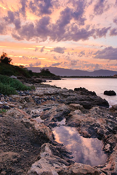 |
|
| Optimal | Higher | Stronger | Harder |
| No GND | Lower | Weaker | Softer |
Note: example uses a very abrupt gradient, even for GND filters designated as "hard."
This was done to make the different transition positions more easily identifiable.
(i) Position. Optimal placement is usually very near the horizon, although more realistic-looking results are sometimes achieved by placing it slightly lower. Be careful though: placing it too high can create a bright strip above the horizon, whereas placing it too low can make the distant land appear unrealistically dark. Pay particular attention to objects which extend above the horizon, such as trees or mountains.
(ii) Strength. Bringing the bright and dark regions into balance can be of great benefit, but this is easily overdone. Try to avoid violating the scene's tonal hierarchy; if the sky was brighter than the ground, it's almost always a good idea to keep it that way in your photo — if you want to achieve a realistic-looking result.
Note: In the above example, strength is assumed to control how much you want to brighten the foreground (as opposed to darkening the sky). The exposures for the stronger/weaker examples are therefore based on the sky (resulting in a longer exposure for the stronger filter).
(iii) Rate of Transition. This will depend heavily on the type and distribution of your subject matter. Sunsets and sunrises over water often benefit from softer gradients, for example. If your horizon is uneven and defined by trees and mountains, then a softer gradient can help avoid having the GND filter effect become too apparent within these objects. In the above example, the "harder" filter setting actually worked well for the right side of the horizon, but created an abrupt transition within objects to the left.
Note: With a physical GND filter, it's rate of transition also depends on the focal length and aperture setting of your lens. This transition will appear much softer on a telephoto lens, for example, because its gradient will be magnified more than with a wide angle lens. The gradient will also appear more blurred due to the shallower depth of field (at a given aperture setting).
Don't be afraid to get creative. In the above example, one might have been able to achieve better results by placing the transition at an angle, such that it roughly followed the rocky ocean front from the middle right up to the trees on the upper left. Similarly, one could also stack/combine multiple filters to address more complex lighting geometries.
COMPLICATIONS
Perhaps the biggest problem with grad ND filters is that one is usually restricted to gradients which transition along a line. If portions of the subject protrude above the light-dark transition, they can appear unevenly and unrealistically darkened. Susceptible subjects often include trees, the tops of mountains and people.
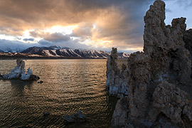 Without GND Filter
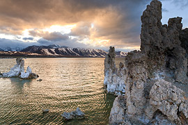 With GND Filter
(dark rock on top right)
right image uses a 2-stop GND filter
However, even darkened tops can be improved, but one usually has to resort to other tools. One can minimize their impact by using a layer mask in Photoshop (or other editing software) and manually retouching the regions that need more exposure, but this should be avoided if possible, since it's often difficult to achieve realistically, and requires a lot more work in post-processing.
DIGITAL VS PHYSICAL FILTERS
GND filters can either be applied physically, by placing one in front of the lens, or digitally, by applying an exposure gradient in RAW development (or using multiple exposures and combining these using digital editing).
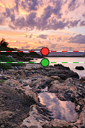
 Example of a digital GND filter in Adobe Photoshop.
A physical filter is a little more restricting because one has to choose from amongst only certain pre-made types. The resulting image also already has the gradient applied, so it can be much more difficult to correct for misplacement.
On the other hand, physical GND filters often produce higher quality results. A physical GND works by darkening the brighter regions, whereas a digital GND filter works by brightening the darker regions. The physical GND filter will therefore require a much longer exposure, resulting in dramatically less noise within the (previously) darker regions.
One could always get around this limitation of digital GND filters by just taking two separate exposures (and combining these in image editing software), but this technique can be problematic with dynamic subjects. In addition, multiple exposures requires a tripod and a remote release device — otherwise the camera may move during or between each exposure.
OTHER CONSIDERATIONS WITH PHYSICAL GND FILTERS
If you choose to stick with physical GND filters, these can become much easier to use if you find the right filter system. GND filters can typically be mounted one of three ways:
- Standard Screw-On Mechanism. This is used for most other filters, including UV and polarizing filters. However, a screw-on mechanism can make it extremely difficult to adjust the location of the GND transition.
- Free-Floating/Hand-Held. These are often quick and easy to use, but one usually cannot keep the gradient in the same location for different shots, and this also ties up the use of one hand. It also makes small adjustments much more difficult.
- Filter Holders. These usually consist of an adapter ring that screws onto the front of the camera. The square GND filter can then slide into this — permitting fine control over placement of the transition. The Lee filter holder system is the most commonly used.
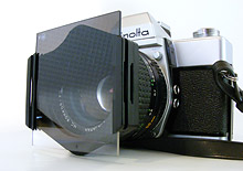
Example of a filter holder system.
Photo courtesy of scalespeeder.
Reverse grad filters. These are a variation of GND filters. Instead of an even blend from clear to gray, these special-purpose filters blend from clear to dark gray to lighter gray. This can sometimes be helpful with sunsets and sunrises, because this further darkens the otherwise bright strip near the horizon. On the other hand, one can almost always instead just darken this part later on in post-processing.
Image Quality. Anytime you place an additional glass element in between your subject and your camera's sensor, you run the risk of decreasing image quality. While this usually isn't a problem, filters which have smudges, deposits, micro abrasions or other defects can all reduce the sharpness and contrast of your photos. In addition, many GND filters aren't what are called "multi-coated," which may make them more susceptible to lens flare (especially considering that these are often used with harsh or dramatic lighting).
OTHER NOTES & FURTHER READING
Graduated ND filters are of course just one amongst many approaches to dealing with difficult lighting. Other common techniques include:
- Shadow/Highlight Recovery. This can be applied in photo editing, and is a great alternative to GND filters whenever (i) the brightness doesn't vary uniformly in one direction and (ii) the total dynamic range isn't too extreme.
- Waiting for Better Lighting. If you find that you're requiring a 3-stop or greater filter strength, consider instead just taking your photograph at a different time of day.
- High Dynamic Range. Whenever the above approaches aren't practical, another popular technique is to merge several exposures into a single high dynamic range (HDR) image, using Photoshop, Photomatix or other software packages.
For similar topics, also visit the following tutorials:
- High Dynamic Range Photography
Another powerful technique for dealing with difficult lighting. - Camera Lens Filters: Polarizers, UV, ND & GND filters
An overview of all the types of lens filters, including a summary of GND filters. - Understanding & Using Polarizing Filters
These often help reduce sky/ground brightness differences, amongst other benefits. - Understanding & Using Neutral Density Filters
These reduce incoming light similar to GND filters, but do so uniformly across an image.