INTRO TO PORTRAIT LIGHTING
Good lighting is a critical component of portraiture. It's also easily identifiable even by the casual observer. However, despite this apparent simplicity, knowing how to use light to achieve a desired look requires a much deeper understanding. This introductory tutorial discusses the most basic scenario: portraits with one light source. Subsequent tutorials will discuss setups with multiple lights, but the same principles discussed here still apply.


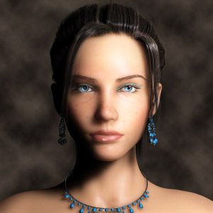
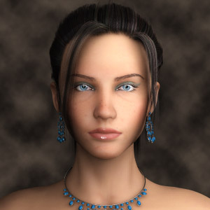
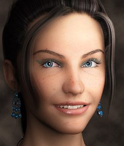
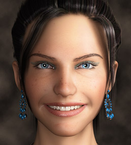
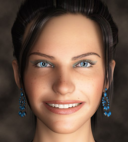
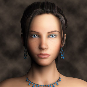
Expertly crafted model used throughout is courtesy of Nikola Dechev.
OVERVIEW: ONE LIGHT SOURCE
The primary source of subject illumination is usually called the main or key light. Although additional lights may be added to enhance a portrait, key lighting is usually performed independently. This is great news for those trying to learn portrait lighting, because it means one can ease into the process one light at a time. If and when you decide to include additional lights, everything learned here will still apply.
Only one trait controls the appearance of light on a subject: its distribution*. Even though some lighting may seem to have a magical quality, it's ultimately nothing more than this. However, for a given light source, we can separate this out into two more easily manageable characteristics:
- Direction, which controls the location of shadows and highlights on the subject, and
- Apparent Size, which controls the appearance of these shadows and highlights.
While these characteristics might seem simple and controllable, their combinations can create an amazing array of different subject appearances. Lighting can easily become unpredictable without first developing an intuition for each.
*Strictly speaking, the white balance of the light source is another trait, but for this portrait intro we're going to assume that you'll want to keep the source looking like natural light.
SIZE: HARD VS. SOFT LIGHT
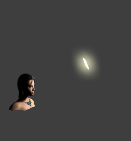
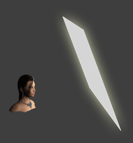
We'll start with apparent size, since this is perhaps the most common cause of poor portrait lighting. When photographers describe light as being "hard" or "soft," or use the term "light quality," they're actually just referring to the size of the light source:
| Harder Light | Softer Light | ||
|---|---|---|---|
| Light Size | → | Smaller | Larger |
| Shadows/Highlights | → | Abrupt | Gradual |
| Types of Sunlight | → | Direct | Overcast, Shade |
| Types of Flash | → | Direct | Bounced, Diffuse |
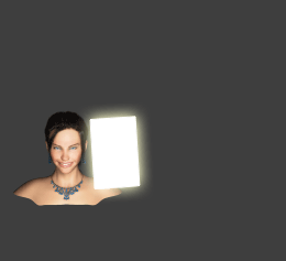
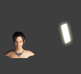
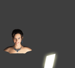
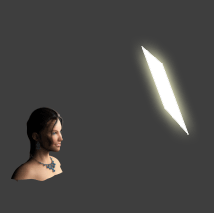
Although too much of anything can be harmful, portraits usually benefit from softer lighting. Try moving your mouse over the "harder" and "softer" options below to see for yourself how each influences the look of a portrait:
| Choose: | Harder | Original | Softer |
Note how broader and narrower light sources are termed "soft" and "hard," respectively, because of how they render the edges of shadows and highlights. This happens because a larger light source spans a greater angle across the subject. Any given region is therefore more likely to receive at least some direct lighting, causing the softer shadows. Similarly, with a smaller light source, a given region usually receives either all or none of the direct light — producing much deeper shadows. Also note how light size is equally transformative to the highlight transitions, particularly in the model's upper right hair.
However, light size doesn't just control the appearance of large-scale tones; it also determines the visibility of fine-scale texture. Pores, blemishes, wrinkles and other facial details all become more pronounced with hard light. Hard light also increases the likelihood of harsh direct reflections off a subject's skin.


The most important trick for achieving softer light is to understand that direct light is hard, but that whenever this light bounces off or travels through other diffuse objects, it becomes softer. Photographers use this to make the most of otherwise harsh light.
Tips for achieving softer light:
- Diffuser. Place a larger translucent object between your subject and the light source. This might include using a lamp shade, or hanging a white sheet or curtain over an open window that receives direct light.
- Bouncing & Reflecting. Place your subject so that they receive only bounced or reflected light. This might include moving them a little farther from an open window (just outside the direct rays), or aiming your flash at a nearby wall or ceiling.
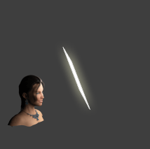
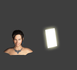
portrait with very soft light
In either case, be careful because you'll end up with a lot less light — potentially requiring a longer exposure time or a brighter flash.
At the other extreme, a light source may also be too soft (although much less common). Some might consider photos taken in the shade as appearing too flat, for example, if indirect light scatters in from everywhere. Such light is effectively enormous in size and erases all shadows. Other examples include portraits in the fog, or outside on a fully overcast day.
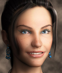
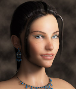
However, just how soft is "too soft" really depends on the look you're trying to achieve. For example, even though the photo on the right uses softer lighting than any other example in this tutorial, many might still consider this a desirable look for glamour portraits.
DISTANCE & APPARENT LIGHT SIZE
At this point you've perhaps been slightly misled: it's not really the physical size of the light source that matters — just its apparent size relative to the subject.
Closer light sources become softer, because this light strikes the subject from a broader range of angles — even if the light itself remains unchanged. Similarly, the opposite is also true: direct sunshine is hard light even though the sun is physically enormous. The sun is just so distant that its light reaches us from roughly one direction.
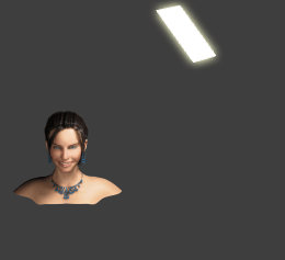
| Choose: | Farther | Closer |
On the other hand, moving a light closer also makes it brighter. If this was your primary source of light, then the look of your portrait likely won't change — your exposure time or flash intensity will just decrease to compensate. However, if much of your subject's light was previously ambient, then moving a light source closer can decrease the influence of this ambient light — effectively making the overall light harder since more of it will come from one location.
Closer light sources also illuminate the subject more unevenly, since different parts of the subject will become relatively closer or farther from the light. For example, the far side of the subject might only be 5% farther from a distant light source, but could become 50% farther when the light source is moved up close — causing it to become much darker relative to the other parts of the subject.
However, this unevenness can also be used to your advantage. A closer light source may be able to achieve better subject-background separation, since the subject will become much brighter relative to their background. On the other hand, this can also make matters worse if these were already well-separated.
DIRECTION: SENSE OF DEPTH & REMBRANDT LIGHTING
Finding the right lighting direction requires the photographer to strike a balance between several potentially competing considerations. Typically, this includes both (i) portraying a sense of depth and (ii) depicting facial features as attractively as possible.
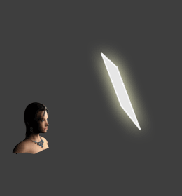
(i) Sense of Depth. Creating the appearance of depth is a key part of capturing realistic-looking portraits. However, our sense of depth doesn't work very well unless light is striking our subject from the right direction. For example, a sphere is a reasonable approximation for the shape of our heads, and it only appears three-dimensional when light strikes it from a front upper side:


Although sphere lighting is a good rough guide for portraits, a wide range of lighting angles could have been used to achieve the above sense of depth. Faces, on the other hand, aren't quite as forgiving.
(ii) Appearance of Facial Features. In addition to the head as a whole, each facial feature also has its own shadows and highlights — all of which deserve special consideration. This might include avoiding making the nose appear larger by having it cast a long shadow, or making the subject appear tired by portraying shadows underneath their eyes. Upper side lighting could cause these and other undesirable effects if not carefully positioned.
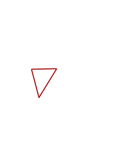
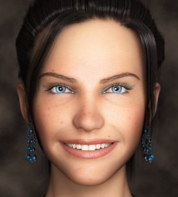
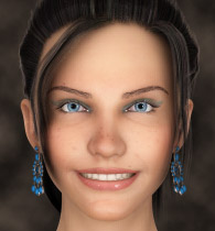
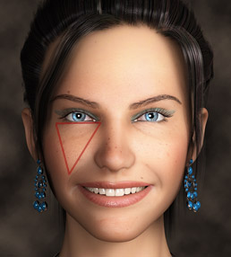
One classical* way to achieve both a sense of depth and a flattering appearance is to place the light so that the far cheek depicts a triangle of illumination. This style is often called "Rembrandt lighting" and we'll refer to this shape as the "key triangle." This restricts the lighting to a much narrower range of angles:
| Move Lighting: |
Higher | ||
| Left | Key Triangle | Right | |
| Lower |
note: visualizing the triangle is usually easier with hard lighting and a neutral expression.
In the above example it appears more rounded due to the wide smile.
Try moving the light source in any direction away from the key triangle lighting by moving your mouse over the options above. With the exception of the lower lighting, each of these options could be considered "front upper side" lighting — yet the key triangle positioning is usually considered the best all-around representation. This is because the triangular shape is an indicator of several underlying principles of good portrait lighting.
For example, when the key triangle is:
- Too Big (Tall or Wide). This means the light is too close to the subject's forward direction, and likely isn't creating a sufficient appearance of depth since most shadows are hidden from the camera's perspective.
- Too Narrow. This means the light is too far to the side of the subject, and could cause the nose to appear bigger by having it cast a longer shadow, along with potentially leaving a substantial portion of the face in shadows. However, this is perhaps the least adhered to of all the key triangle guidelines.
- Too Short. This means that the light is too high or low, and is likely causing shadows underneath the eyes or a lack of shadow definition along the jaw line, respectively. Lighting from below is often used for unsightly creatures in movies, or to create a frightening face when telling a scary story (by holding a flashlight under the face).
Also keep in mind that its exact appearance will vary greatly depending on the particular subject's facial structure and expression, so one should only use this as a rough guide.
*Note: "loop lighting" is another popular (and more commonly used) portrait style that is similar to Rembrandt lighting, except the shadow underneath the nose doesn't fully extend to the shadows on the far side of the face — producing a "looped" diagonal shadow under the nose.
 |
|
| Short Lighting | Broad Lighting |
However, with any rule there are exceptions, but usually only when this is in keeping with the spirit of that rule. For example, a side-view portrait might not need a key triangle to convey a sense of depth, but only if additional shadows have become visible on the side of the face (such as in the example to the left).
Furthermore, Rembrandt lighting is just one style amongst many, and each subject is a little different. For example, one might want hard side-lighting to accentuate a man's facial hair, or to convey symmetry by only illuminating half the face. The key is knowing how to use light to emphasize depth, shape or texture — depending on your artistic intent.
Two other common styles include short lighting and broad lighting. These are used when the subject's face is oriented at an angle. Short lighting illuminates the full face and leaves the near side of the head in shadow, whereas broad lighting illuminates the near side of the head and face but leaves the far side of the face in shadow. These and other portrait lighting styles will be the subject of a future tutorial.
CONCLUSIONS & FURTHER READING
In general, the goal of portrait lighting is to achieve softer light. This makes a subject's features appear smooth and gradual, and makes skin texture appear softer. Achieving softer light requires making the apparent size of the light source bigger. This can be done by either (i) moving the light closer, (ii) increasing its physical size, or (iii) bouncing this light off of or diffusing it through other objects.
However, the choice of lighting direction is definitely more subjective than that of hard or soft light. Even so, two lighting orientations are usually considered undesirable: lighting from underneath and directly from the front. The former isn't something that appears natural, and the latter destroys the portrait's sense of depth. In any case, one generally wants to portray their subject in a flattering light, but each subject is unique and may require a different treatment.
Regardless of the above choices, the key is to envision your artistic intent at the start, and then to adjust your lighting setup to achieve that goal.
To continue reading on this topic, also see part 2 of this tutorial:
Portraits with Two Light Sources: Adding a Fill Light
For other similar topics, also visit the following tutorials:
- Camera Flash: Appearance
Discusses how to control the quality and appearance of light from a flash. - Our Interactive School of Portraiture (in the forums)
In particular, take a look at lesson 2: lighting and lesson 3: positioning.